
FakeBg: Reptile Lair (2-D)
Fan Kreations
Pages: 1
| Artist's Remarks: | |
|
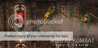
This is my first ever attemt at making an original bg. I made others in the past but they weren't that great and some were kind of copy and paste. I had Kahn crussified on the giant skull but it looked to cheesy. If you wish the borrow that bg just PM me. Enjoy.
|
| Full Scale | 393x290 | Category | Drawings (Digitally coloured) | User Views | |
| User Likes | User Ratings | 9 | Score |
 3.0 3.0
|
0


Pages: 1


© 1998-2026 Shadow Knight Media, LLC. All rights reserved. Mortal Kombat, the dragon logo and all character names are trademarks and copyright of Warner Bros. Entertainment Inc.