
Fakes by Shinnok619
Fakes by Shinnok619
0
posted08/31/2009 11:50 PM (UTC)by
About Me
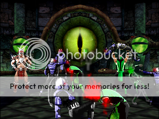
Mortal Klaybat #1 - Shinnok, Shao Kahn, Sektor, Noob Saibot and Ermac! 
Member Since
12/09/2008 02:18 PM (UTC)
these are some of my fakes...credit to Tetra_Vega for the weapons...
this one i call...Zaterra takeover
see ya!!!


this one i call...Zaterra takeover

see ya!!!

About Me
Luc-Mac
0
hey.... the stage in the reptile vs subzero fake is mine you could give me some credit for the stage

About Me

0
Their terrible.
The first fake have horribly arranged text. The next two lack in originality. I have no clue what is going on in the last. It is very clear that you used soft round brushes to make the the effects.
1/5.
The first fake have horribly arranged text. The next two lack in originality. I have no clue what is going on in the last. It is very clear that you used soft round brushes to make the the effects.
1/5.
These are not even good at all. You should get a program that actually makes effects look like they're not from Paint.
And not to mention, I strongly suggest that you credit lukiLucMac for his background to make your fake before someone considers that stealing.
And not to mention, I strongly suggest that you credit lukiLucMac for his background to make your fake before someone considers that stealing.


0
I actually like them a bit.
3/5
3/5

About Me
<img src ="http://www.comixodez.com/Sets/mkosig2.png"
www.ComiXodeZ.com
0
0/0
I remember myself kinda being like that when I started out. Just take your time to make it believable.
I remember myself kinda being like that when I started out. Just take your time to make it believable.
About Me
0
Riyakou Wrote:
Shinnok looks good, but the rest...
everyone else spoke for me.
Shinnok looks good, but the rest...
everyone else spoke for me.
Are you kidding? Shinnok's head is twice the size of his body.

About Me
Why are you reading this?
0
The first is great and the last is pretty good. Second and third could use some work though, but good job.
About Me
FB: Trans4Materia Card Game I invented "Circling Vulture, Laughing Hyena"
True story, it happened to a friend of a friend of mine... EVERYBODY!
0
I like the TYM idea for sword clashes. Kinda like the beam struggling "mini game" in DBZ games.
I also like the eye glow effect in the last one. Simple, but effective. The blood could use more shading, spray paint splotches don't look good. Try a wider spray, or make it transparent/opaque in some areas.
Ka-Tra
I also like the eye glow effect in the last one. Simple, but effective. The blood could use more shading, spray paint splotches don't look good. Try a wider spray, or make it transparent/opaque in some areas.
Ka-Tra
About Me
Mortal Klaybat #1 - Shinnok, Shao Kahn, Sektor, Noob Saibot and Ermac!
0
Thanks for the constructive critics guys,i will try to do better and...lukiLucMac,sorry...now i realize that the Abandoned Palace is yours in mortal-kombat.net I want to apologize for all of you... And i'm making a fake as apology for lukiLucMac
 for now i"m posting this
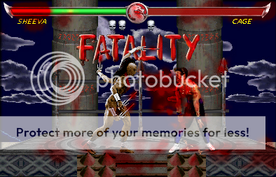
 PLZ comment...credit to Tetra_Vega for weapons and some props


 PLZ comment...credit to Tetra_Vega for weapons and some props
About Me
Mortal Klaybat #1 - Shinnok, Shao Kahn, Sektor, Noob Saibot and Ermac!
0

To lukiLucMac
credit to Tetra_Vega for props
0
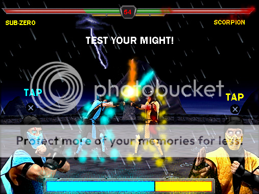
dude whats with the random blood stains everywhere like on the lifebars and the screen it really doesnt help and i can see ur getting a little better but they still dont look credible. btw nice editing on scorpions suit
Hmm...
The Sheeva and Cage pic:
The blood splatters look horrible. It looks like there's this random splotch of blood just splattered on the background of the sky right next to Cage even though I can see that he's being stabbed. You also have them on the bars and the Dragon Symbol for the timer... ehh... why?
Wouldn't the word "Fatality" be in front of Sheeva and Cage, not behind them?
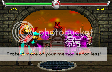
Shinnok and Kano Pic
Shinnok looks way too bright.
I know it's supposed to be a hand that's hitting Kano... but that does not look like a hand. To me, it looks like a giant purple blob with white lines attacking Kano.
Surprised that there's no blood splatter.
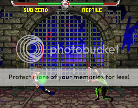
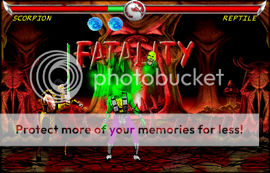
Scorpion and Reptile pic.
Reptile's blood is too bright. Literally neon. Odd how Scorpion's blood is all splattered on the ground and on the Soulando and not Reptile's.
Reptile also looks too bright. He's also neon too.
The odd looking symbols that looks like a blue moon are just something not really interesting.
And again, shouldn't the word "Fatality" be in front of everything instead of behind it?
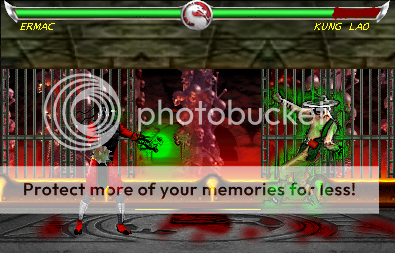
The last pic.
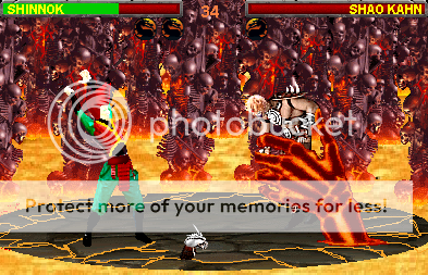
Now explain to me, what is Ermac doing exactly to Stryker? I really can't tell what he's doing.
The random numbers on the top looks odd.
The blood looks really horrible in this picture. Can you tell me why it's also on the the lifebars too? The blood doesn't do that.
All pics in general>
They're all missing shadows. All of them... Unless they're fighting in a very dark place to where you can hardly see the shadows, there should be them right underneath.
I think you can do much better than this with a fake. That's my critique on them.
The Sheeva and Cage pic:
The blood splatters look horrible. It looks like there's this random splotch of blood just splattered on the background of the sky right next to Cage even though I can see that he's being stabbed. You also have them on the bars and the Dragon Symbol for the timer... ehh... why?
Wouldn't the word "Fatality" be in front of Sheeva and Cage, not behind them?
Shinnok and Kano Pic
Shinnok looks way too bright.
I know it's supposed to be a hand that's hitting Kano... but that does not look like a hand. To me, it looks like a giant purple blob with white lines attacking Kano.
Surprised that there's no blood splatter.
Scorpion and Reptile pic.
Reptile's blood is too bright. Literally neon. Odd how Scorpion's blood is all splattered on the ground and on the Soulando and not Reptile's.
Reptile also looks too bright. He's also neon too.
The odd looking symbols that looks like a blue moon are just something not really interesting.
And again, shouldn't the word "Fatality" be in front of everything instead of behind it?
The last pic.
Now explain to me, what is Ermac doing exactly to Stryker? I really can't tell what he's doing.
The random numbers on the top looks odd.
The blood looks really horrible in this picture. Can you tell me why it's also on the the lifebars too? The blood doesn't do that.
All pics in general>
They're all missing shadows. All of them... Unless they're fighting in a very dark place to where you can hardly see the shadows, there should be them right underneath.
I think you can do much better than this with a fake. That's my critique on them.
About Me
0
Looks as if the blood is splattered on the screen rather the floor. I'm not going to bother asking about Stryker. You clearly lack a constructive approach.

About Me
Kung Lao/Smoke main. Maker of puns and bad jokes.
0
yeah...you shouldn't splatter the screen, look at the background carefully and don't splatter areas that can be seen through(like the little pillars on the bottom). it gives the feeling that you tried to rush it.
About Me
Mortal Klaybat #1 - Shinnok, Shao Kahn, Sektor, Noob Saibot and Ermac!
0
I got new fakes..i think they're better
Plz rate...oh,and by the way,try some constructive criticism,kay?
Bye
Credit to Tetra_Vega for some props and weapons


Plz rate...oh,and by the way,try some constructive criticism,kay?
Bye
Credit to Tetra_Vega for some props and weapons
0
I really don't like the blood. It is way too thin. On the first one Kung Lao's health bar looks like you shaded it in with a Paint brush. I really don't like the bleached Hell arena. Try to make your own. I really don't know what's going on in the third one. It looks like Baraka's blocking, but he is taking a lot of damage. I do like the Ermac sprite though. And the third arena.
To be perfectly frank, not really...
Ermac vs Kung Lao
What I don't get with the blood is, how come you don't make it look like it's from the game. It just really doesn't look right since it's much of a duller kind of color than the rest of the picture.
And the ceiling looks like it's the floor. The bars look like they're going behind the wall instead of like ending right at the ceiling... kinda hard to describe that part... but, do you get what I mean by they cell bars looking like they're going behind the ceiling?
And what's going on with Ermac? I can't tell if that's even him. For a second, because I see that mace, I thought it was Drahmin, then I was like, "He doesn't have telekinetic powers..." Yeah, it's kinda hard to tell who that really is.
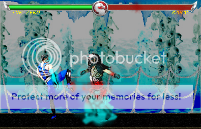
Sub-Zero vs Kabal
What's with the red spot by Kabal's name?
The background looks like you just inverse the colors in Paint by going Ctrl + I
And what's on Sub-Zero's foot? Don't answer with the word: Blood... Blood doesn't do that.
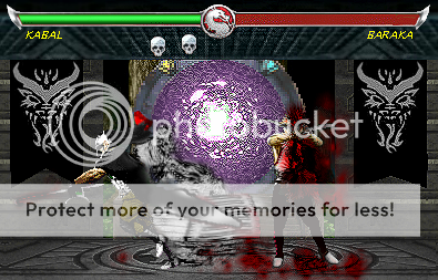
Kabal vs Baraka
I think you should either get rid of your blood splattering and switch to MK's blood, or seriously try to fix it because its still horrible.
This entire scene confuses me... Did you attempt to make Kabal wear a coat? Because what ever that black thing is connected to him looks odd and bad.
I don't get the purple thing in the background.
And what's with Kabal's bright red hand?
In conclusion
I don't think they're better, they're still the same kind of Fakes you've been submitting. You really need to learn how to make blood because just random splatters over the screen doesn't look good, or just swtich to using the MK blood that's already given to you.
Ermac vs Kung Lao
What I don't get with the blood is, how come you don't make it look like it's from the game. It just really doesn't look right since it's much of a duller kind of color than the rest of the picture.
And the ceiling looks like it's the floor. The bars look like they're going behind the wall instead of like ending right at the ceiling... kinda hard to describe that part... but, do you get what I mean by they cell bars looking like they're going behind the ceiling?
And what's going on with Ermac? I can't tell if that's even him. For a second, because I see that mace, I thought it was Drahmin, then I was like, "He doesn't have telekinetic powers..." Yeah, it's kinda hard to tell who that really is.
Sub-Zero vs Kabal
What's with the red spot by Kabal's name?
The background looks like you just inverse the colors in Paint by going Ctrl + I
And what's on Sub-Zero's foot? Don't answer with the word: Blood... Blood doesn't do that.
Kabal vs Baraka
I think you should either get rid of your blood splattering and switch to MK's blood, or seriously try to fix it because its still horrible.
This entire scene confuses me... Did you attempt to make Kabal wear a coat? Because what ever that black thing is connected to him looks odd and bad.
I don't get the purple thing in the background.
And what's with Kabal's bright red hand?
In conclusion
I don't think they're better, they're still the same kind of Fakes you've been submitting. You really need to learn how to make blood because just random splatters over the screen doesn't look good, or just swtich to using the MK blood that's already given to you.
About Me
Kung Lao/Smoke main. Maker of puns and bad jokes.
0
Shinnok619 Wrote:
Zoidberg is right, the lifebar looks like it was painted on, Apparently, you know of MKWarehouse based on your lifebars, so do a little Editing(NOTE:The following is from the MKDA Props Section), Cut a portion of the Red Lifebar on it's own(Be sure to have the edge in it) and paste it into the image.
What is happening to Ermac's right hand? it looks like the receiving end of a flail..
Shinnok619 Wrote:
Once again, work on the lifebars, the center and edges are the same, so you can just cut it in half to save time.
What happened to Subby's face? he looks like a skull almost.
The ice effects around his Arms should be more pronounced, they should have that icy smoky stuff(forgot the name of it) coming out.
Shinnok619 Wrote:
The Skulls representing wins are misaligned on the lifebars
the lifebars are lower in quality than the other ones
What is that cloudy stuff behind Kabal supposed to be? Smoke?
Overall it's good, but still not Great
About Me
Mortal Klaybat #1 - Shinnok, Shao Kahn, Sektor, Noob Saibot and Ermac!
0
let me see...less bloodsplatter and brighty colors? I think i'm getting the idea Mirage Temple  Try not to damage it too much,ok?
 BYE
BYE
 Try not to damage it too much,ok?


© 1998-2026 Shadow Knight Media, LLC. All rights reserved. Mortal Kombat, the dragon logo and all character names are trademarks and copyright of Warner Bros. Entertainment Inc.