
Final Bout 4 COLOR "neck and neck"
Fan Kreations
Pages: 1
| Artist's Remarks: | |
|
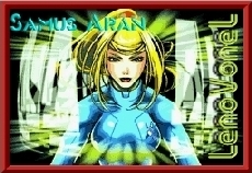
hello, heres part four. props go to the suit for the drawing. i added NO background to all these because well, suit never put one in. so the concentration is on the characters themselvs.
|
| Full Scale | 600x488 | Category | Drawing (Colored) | User Views | |
| User Likes | User Ratings | 11 | Score |
 4.5 4.5
|


Pages: 1


© 1998-2026 Shadow Knight Media, LLC. All rights reserved. Mortal Kombat, the dragon logo and all character names are trademarks and copyright of Warner Bros. Entertainment Inc.