
Frostburn
Fan Kreations
Pages: 1
Display Mature Content:
| Artist's Remarks: | |
|
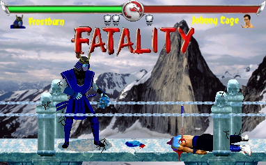
here is my first fake in a while. yes i know it is a mk2 JC sprite but live with it.
|
| Full Scale | 382x237 | Category | Fakes | User Views | |
| User Likes | User Ratings | 9 | Score |
 2.5 2.5
|
0


Pages: 1


© 1998-2026 Shadow Knight Media, LLC. All rights reserved. Mortal Kombat, the dragon logo and all character names are trademarks and copyright of Warner Bros. Entertainment Inc.