
Jax Wallpaper
Fan Kreations
Pages: 1
Jax Wallpaper
0
posted01/02/2004 08:00 AM (UTC)by
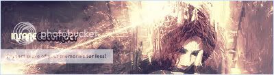
I was practicing some paintbrushing in Photoshop and I made this. I thought it turned out quite nice. Comments & Crits please.
Non-tech Version
Tech Version
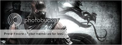
Non-tech Version
Tech Version
About Me
www.facebook.com/dyerseve88
0
Ok, i'm not really into the Non-Tech version. But, the Tech version is really cool. Both of them are good, just don't like the Non-Tech one as much...
But good job on them both.
But good job on them both.
About Me
It's time to run away with the sideshow.
Full speed, right ahead.
Don't stop, you can sleep when you're dead."
0
thats pretty cool, i like it, but um, you sorta did something wrong with the machine gun, because it looks, like its oblong shaped, but besides that good job

About Me
0
The Tech version is sweet. Great job SaiBot

0
It's wicked.
Excellent work, Saibot.
Excellent work, Saibot.

About Me
WyattHarris.com Dig it
0
Ha, might I make a suggestion. I guess that's a pipe in the middle. As in "Jax | Special Forces". With that font, my first glance I saw "Jax I Special Forces" giving Jax a very bad speach impediment. Might want to try something more defined.
Of course if it does say "I Special Forces" than just disregard this message.
Take it easy
Wyatt
Of course if it does say "I Special Forces" than just disregard this message.
Take it easy
Wyatt

0
It like what you have done, I just can't stand that model of Jax, reminds me of Killer Instinct Gold too much. Which I hate.
| RaMeir Wrote: Ha, might I make a suggestion. I guess that's a pipe in the middle. As in "Jax | Special Forces". With that font, my first glance I saw "Jax I Special Forces" giving Jax a very bad speach impediment. Might want to try something more defined. Of course if it does say "I Special Forces" than just disregard this message. Take it easy Wyatt |
lol! It is supposed to say "Jax | Special Forces", but I guess it can easily be misunderstood and that I should change it. But I'm too lazy to do so.
::EDIT:: Damn! I hate when I double post! ::EDIT::

0
Yes the Tech version is definetely better.

0
I have to go with Tech.

About Me
Anything war can do, peace can do better.
0
Bleed, your signature is great.
Good wallpaper by the way.
Good wallpaper by the way.
0
Thanks

About Me
I drank so much, no joke... I love drinking...
Drinking soda that is.
0
Pretty good. I like the tech one the most.
Pages: 1


© 1998-2025 Shadow Knight Media, LLC. All rights reserved. Mortal Kombat, the dragon logo and all character names are trademarks and copyright of Warner Bros. Entertainment Inc.