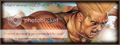
My attempt To Make Another Sig
Fan Kreations
Pages: 1
My attempt To Make Another Sig
0
posted05/21/2005 01:42 PM (UTC)byI KNow It Sucks But Im jUst Gonna Post It To see If AnyOneLikes It


About Me

0
yup, it sucks
0
endofdays Wrote:
yup, it sucks
yup, it sucks
Stop being so mean, or your going to end up like SLELICA!
Anyway the sig needs some improvement. 4/10
About Me
It's time to run away with the sideshow.
Full speed, right ahead.
Don't stop, you can sleep when you're dead."
0
it's decent, sorry, but i'm not really much of a fan of it, the renders you used though, yeah they are harder to use in sigs, especially the mk:d sub-zero one (because of the cold-sphere), the flaming background does'nt look good, it does'nt really suit either sub-zero or ermac, mainly because yellowish-red does'nt suit them, the renders are cutted out nicely though, though could be done better, i understand where you were going with ermac with those green blobs, but they dont look right though, to me atleast.
but it is nice though, alot better then some sig's i have seen, keep trying, you are improving, my advice would be to try and make sigs of mainly just one character at a time instead of having more of a montage, as then it seems crowded, and aswell it's hard deciding a neutral colour for they're background, and aswell, if the render, once it's editted out, if there's like a problem area (like with sub-zero and that cold-sphere), move the render to the side of the sig so that part is'nt in it, or make that area blend into the background.
try out different effects and tools, practice alot, and you should really get better, you've improved since your last sig, nice job, thuogh the sig, i guess i would rate it six and a half out of ten.
not trying to sound like an asshole though, if i did come off as one, i apologize, as i was'nt trying to be one, was just trying to give out some advice.


About Me

0
Skull him? Why don't you take some skulls print them out nicely fold the paper in 4 pieces and stick it up your ass. It was my opinion. Period. Stop being a suck up.
0
Anyway back on topic. The sig could use somework. The font could be a different color and like Noob said, those renders can be hard to use sometimes. Just keep trying and you'll get the hang of it. 
0
Meh... 3/10
It needs quite a bit of work. Like others have said that Deception Sub-Zero render is really hard to work with because of the iceball and the vapor coming from Sub-Zero's hand. You did a pretty good job of cutting out Ermac props for that. You should try putting an little bit of a green outer glow on Ermac. I've done that in the past and it makes him look great, really adds to that mystical feel. Um.. the flames in the background are ok I suppose but they don't really fit either Sub-Zero or Ermac. It's mostly something you would use for a Scorpion signature.
I would suggest you limit yourself to one character when making your next signature. I find it looks a lot better when the signature focus is on a single character it doesn't make the signature look to "busy."
Keeping working at it tho...and remember to do some research on the net for photoshop tutorials.
Pages: 1
© 1998-2025 Shadow Knight Media, LLC. All rights reserved. Mortal Kombat, the dragon logo and all character names are trademarks and copyright of Warner Bros. Entertainment Inc.


