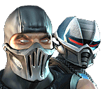
Noob vs. Sub- Custom Stuff
First of all putting a Noob Saibot sprite against a dark background is not very smart. Either you didn't realize this yourself or you did and decided to use it to hide a bad looking sprite. Either way it's rather lazy and stupid.
And I actually kind of like the rip in Sub-Zero's costume. Even though it looks more like someone burned a hole in it than ripped it, you did a pretty good job with it.
The lifebars and the names and the stuff around there is kind of horrible. I only like two things about it. The lifebars themselves. But they were made by Midway so you can't take much credit for them. And the font you used for the time. It fits in very well in there. I don't like how you can only barely see that it says "round 3" underneath it, but the font is nice. I hate the fonts you used for the names. They're not even matching. And those spears beneath the names are just bad design. They kind of cut of the lifebars from the rest of the picture which isn't good. It makes it feel like two separate pictures. It's just bad composition. But luckily you can practice that and get better at it.
Now, if I were to add my 0.02$ in this here cheery thread, I'd probably say something along the lines of the above. Though, of course, I'd never do such a thing.


About Me
<img src ="http://www.comixodez.com/Sets/mkosig2.png"
www.ComiXodeZ.com
0
I was in the wrong with that statement for generalizing that all of your fakes were like that Max. I do apologize as I do KNOW that it wasn't the recent ones. I guess I shoulda put "MaxDam's initial fakes". I doubt that even know about them though. :P. You wouldn't smack me in the face anyways, you're at work all the time ;), well at least everytime I talk to you (which is not often anymore). I still have your fake from my kontest from what? 2 years ago. THe one where we had the same background (that was eerie).

0
Wow, look at all these old-timer's coming back for this fake. Looks like Ekule accomplished something.
However, the fake is nothing special.
However, the fake is nothing special.
© 1998-2025 Shadow Knight Media, LLC. All rights reserved. Mortal Kombat, the dragon logo and all character names are trademarks and copyright of Warner Bros. Entertainment Inc.


