

Kamionero Wrote:
I think the best are the Marzana one, the Spidey 3, and I actually like both Gohan ones... altho the first one's render is not very good quality, its actually pretty good, and very original
UlcaTron Wrote:
On which ones?
skinsley Wrote:
AMAZING ulcatron how did you improve so much.
AMAZING ulcatron how did you improve so much.
On which ones?
I think the best are the Marzana one, the Spidey 3, and I actually like both Gohan ones... altho the first one's render is not very good quality, its actually pretty good, and very original
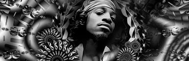
Yeah, Marzana was a cut out I did. I found the background for it so I cheated on that one a little... or a lot, whichever you prefer.
Spidey 3 was a pretty easy one. Just saturated it about two times and it came out to become what you see.
I don't really like either of my Gohan Sigs. I cannot make it feather...
Grr...!!
Could you help? I mean, when I try to feather, it is gray text in which not letting me use it.
Than, I click on one of the buttons above it, and than it lets me click feather..
Once, I click it nothing happens.....


0
Heres my newest sigs.
This one was made for Shinnok-Fan64.
This one was made for Check.

So what do you guys think? I dont think im getting any better.
p.s. Ulcatron,Awesome Marzana sig!!!
This one was made for Shinnok-Fan64.
This one was made for Check.
So what do you guys think? I dont think im getting any better.
p.s. Ulcatron,Awesome Marzana sig!!!
0
Fist one is awsome KARATE but the second one sucks cow balls.
Thats a bit harsh.
Actualy all it needs is a little more distorting.
Karate lighten or darken the background or render, and that sig will be alot better.
Or just add more.....Random lines or effects.
If its photoshop you use.
Layer>newlayer
image>apply image
Filter>distort>wave
Filter>distort>....whatever
Then erase over your render so you can see it.
And maybee in other places so that your origonal background still shows up in some places.
Try using the Dodge, or Burn tools around the background.
The problem with that particular sig....although good, is that the render looks like its trying to hide with the background....you know same colours and everything, Lighten and darken some areas and it would be super duper.
-------------------------------------------------------
i hope that helps atleast a little.
0
UlcaTron:
to farther u have to already have a selection made. like a square or a lasso selection, THEN u click on farther selection and a window will pop out askin how many pixels....
if that doest work, just go to the tool menu for selection tools (lasso, square, circle, etc.) and there will say farthered edges, and a little bar, or a slot where to write numbers... use either to make your selection blurry
Kamionero Wrote:
UlcaTron:
to farther u have to already have a selection made. like a square or a lasso selection, THEN u click on farther selection and a window will pop out askin how many pixels....
if that doest work, just go to the tool menu for selection tools (lasso, square, circle, etc.) and there will say farthered edges, and a little bar, or a slot where to write numbers... use either to make your selection blurry
I tried everything you said. And thanks for it. Either my GIMP wont work and is being a poo-face ; or I am really dumb
Thanks, though.
0
sig making is pointless

About Me

0
Dragonblade Wrote:
sig making is pointless
sig making is pointless
Me thinks you were always like that since the previous SOTW game featuring movies in 2007 as the theme. Affected by those who reacted to your post... lolz. Whatever.
Anyways, on topic:
prodigy- Yeah, I just like using c4ds although I agree about them being overused and stuff.


0
Heres my latest. Ive been taking some tuts andtheyve helped aloy.
Rate:
Rate:
0
Sprite sig. What ya'll think? oh and MINION...............amazing.

About Me

0
great sigs MINION, Prodigy,Ulcatron, and Kameniero(didn't spell your username right sorry). Here's my newest....

i like it
i like it
Very nice sprite sig, Me like.
It looks like he is summoning that power around him....exelent work !
Shinnokfan, that sig is nice,,,,looks like she just formed the ice around her.....But You have to learn how to correctly Add text...thats your FLAW Text...just look at a few other peoples and try and imitate it.
It looks like he is summoning that power around him....exelent work !
Shinnokfan, that sig is nice,,,,looks like she just formed the ice around her.....But You have to learn how to correctly Add text...thats your FLAW Text...just look at a few other peoples and try and imitate it.
About Me
0
nevermind, i thought you said something else Skinsley, thought you were talking about mine.Prodigy, i love that sig, total sprite pwnage!
0

About Me
0
thanks for the criticism Skins, i know i suck at text, but i like the sig itself minus the sig.
0
Thanks Skinsley and S-F64. I agree with Skins tho, S-F you should just work on the text and possible blending. Nonetheless I can tell your getting better.
About Me
0
thanks for the comments Prodigy, i've always sucked at text;still, i've saw a lot of people who don't excel at text, so i don't feel too bad.


© 1998-2026 Shadow Knight Media, LLC. All rights reserved. Mortal Kombat, the dragon logo and all character names are trademarks and copyright of Warner Bros. Entertainment Inc.