
0
Text can be a biatch sometimes.

About Me

0
i hear ye,lol


0
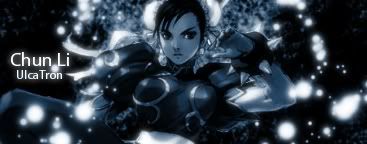
For....
QueenSindel(TheBitch)

Comments please, on my second ever GIF animation. Psyco-anylists welcomed...lol
QueenSindel(TheBitch)
Comments please, on my second ever GIF animation. Psyco-anylists welcomed...lol
0
ThePredator151 Wrote:
For....
QueenSindel(TheBitch)
Comments please, on my second ever GIF animation. Psyco-anylists welcomed...lol
For....
QueenSindel(TheBitch)
Comments please, on my second ever GIF animation. Psyco-anylists welcomed...lol
Gifs are hard for me becuase every time I make one he quality of the pic come out looking like trash. But yours came out pretty good, how tho?
ThePredator151 Wrote:
For....
QueenSindel(TheBitch)
Comments please, on my second ever GIF animation. Psyco-anylists welcomed...lol
For....
QueenSindel(TheBitch)
Comments please, on my second ever GIF animation. Psyco-anylists welcomed...lol
Awesome sid, Pred. But DUDE! I have that font... dreamscar, I think it is? Haha, never knew "bitch" would look so good in it
0
prodigy004 Wrote:
Gifs are hard for me becuase every time I make one he quality of the pic come out looking like trash. But yours came out pretty good, how tho?
Gifs are hard for me becuase every time I make one he quality of the pic come out looking like trash. But yours came out pretty good, how tho?
Look for the white/red boxes
Thanks btw.
xtactics Wrote:
Awesome sid, Pred. But DUDE! I have that font... dreamscar, I think it is? Haha, never knew "bitch" would look so good in it
Awesome sid, Pred. But DUDE! I have that font... dreamscar, I think it is? Haha, never knew "bitch" would look so good in it
Right you are. This is...I think the second font I went with cuz she wanted something more....mmm...more "appearant". I had "visitor tt1 brk" in the upper right-hand corner.

xtactics Wrote:
They're simple, but they're nice.
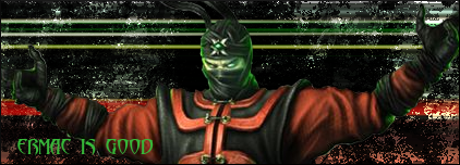
I hope I did Ermac justice..

.....
UlcaTron Wrote:


I had to break the boredom.... They suck....
I had to break the boredom.... They suck....
They're simple, but they're nice.
I hope I did Ermac justice..
.....
Very, good.
The problem is, the colors. If you made Ermac's clothes a little more red looking and have the BG Colors red and green it would look better.
Keep em' coming

0
Thanks Pred
0
OK. Heres another to rate

About Me

0
Wow Pred, that sig is great. Same goes to prodigy for his sprite sig.
Ulcatron, you're quite improving- the Sakura one is the best out of them. Sasuke looks pretty blurry.
Are you using the pixel stretching technique? The background's ok, did you use grunge brushes? The text could be a bit better though.
Ulcatron, you're quite improving- the Sakura one is the best out of them. Sasuke looks pretty blurry.
gamermk66 Wrote:
OK. Heres another to rate
OK. Heres another to rate
Are you using the pixel stretching technique? The background's ok, did you use grunge brushes? The text could be a bit better though.
0
Lol thank you Skinsley and Hikari, im glad you guys like em
Skinsley id say the best one you've done is that Silver Surfer one. I really like that one. Your Domokun sig is great aswell. Its kinda hard to say what your best one is, pretty much all the ones you make are awsome.
Skinsley id say the best one you've done is that Silver Surfer one. I really like that one. Your Domokun sig is great aswell. Its kinda hard to say what your best one is, pretty much all the ones you make are awsome.
Yeah I realy wanted to keep that Silversurfer sig...shame it was a request.
I was realy just fucking around with it and it turned out well.....
Oh yeah and for any photoshop users, I think i may have found a site where I can upload photoshop Documents.
So you can download PSD files to use for learning purpouses if you like.
You know look at each seperate layer to see how the sig was made


0
UlcaTron Wrote:
Lol yeah that looks better than my first sig too.
sean79 Wrote:
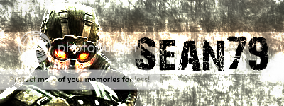
Hey guys,
This is my first attempt at a sig. I used GIMP, Here it is:

A lot better than how I started out...
Pretty good..
Hey guys,
This is my first attempt at a sig. I used GIMP, Here it is:
A lot better than how I started out...
Pretty good..
Lol yeah that looks better than my first sig too.
prodigy004 Wrote:
Well, its not better than my VERY First sig.. (Mine didn't have a human render in it. (It had the MK Logo in it))
That one, was better than this... But still, better than when I started out at least..
UlcaTron Wrote:
Lol yeah that looks better than my first sig too.
sean79 Wrote:
Hey guys,
This is my first attempt at a sig. I used GIMP, Here it is:
A lot better than how I started out...
Pretty good..
Hey guys,
This is my first attempt at a sig. I used GIMP, Here it is:
A lot better than how I started out...
Pretty good..
Lol yeah that looks better than my first sig too.
Well, its not better than my VERY First sig.. (Mine didn't have a human render in it. (It had the MK Logo in it))
That one, was better than this... But still, better than when I started out at least..
0
ThePredator151 Wrote:
For....
QueenSindel(TheBitch)
Comments please, on my second ever GIF animation. Psyco-anylists welcomed...lol
Look for the white/red boxes
Thanks btw.
For....
QueenSindel(TheBitch)
Comments please, on my second ever GIF animation. Psyco-anylists welcomed...lol
Look for the white/red boxes
Thanks btw.
Don't take all the credit for my sig, hon. Remember that this baby was my idea. ...All of it.


© 1998-2026 Shadow Knight Media, LLC. All rights reserved. Mortal Kombat, the dragon logo and all character names are trademarks and copyright of Warner Bros. Entertainment Inc.