Scorpion Swim
Fan Kreations
Pages: 1
Scorpion Swim
Artist's Remarks: | |
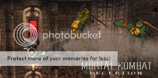
Pretty basic fake. I took the photo in the background (guess where it is) and I made the life bars.
|
Full Scale | 522x390 | Category | Drawings (Digitally coloured) | User Views | |
User Likes | User Ratings | 11 | Score |
|
0
submitted 02/20/2004 03:37 AM (UTC)by
Born-Again-Vampire

Anything war can do, peace can do better.


About Me
Anything war can do, peace can do better.
Member Since
12/12/2003 01:14 PM (UTC)

0
You should get rid of the shadows behind the life bars, because It makes the background look more like a wall.
0
I hate the background.
This fake is TOO basic.
I don't like anything about it, but the blood catches my attention.
This fake is TOO basic.
I don't like anything about it, but the blood catches my attention.


About Me
'Cause I am whatever you say I am....
0
Yeah, it looks more like a wall, and I know I've seen better from you so, try again.

0
I thought Kintaro uppercut him do the river =/. That idea could of been 10 times better and not to mention MORE creative in this fake pic.


About Me
Anything war can do, peace can do better.
0


About Me
Anything war can do, peace can do better.
0
Yeah I get that, I don't like the shadows either. I just wanted different life bars.
Bleed Wrote: You should get rid of the shadows behind the life bars, because It makes the background look more like a wall. |


About Me
0
Hmm. I'm not really sure what to say about this one.
Good points:
-You've included shadows, and the end at the correct place on the bridge, good work.
- The lifebars aren't too bad, although they remind of glass pills from Dr.Mario, so I wouldn't use them too often.
- I like the effect you've used on Scorpion falling, a nice motion blur.
- The blood on the floor is a good effect, and I like how you didn't fill the screen with blood.
Bad points :
- No timer, win marks, or win indicators at the top of the screen. MKWarehouse has all these resources, so use it wisely.
- THE BACKGROUND. Although it's a nice idea, it's not a good idea to mix gaming objects with real life pictures. Again, refer to MKW for all of the background from the games.
- Mixing elements from the games is a bad idea. For example, don't use MK4 lifebars with an MK2 timer, MK1 points, MK3 characters and MK : DA fighting styles at the bottom. Aim for consistency.
- The "Kintaro Wins!" text is a BAD font to use. And why does it have an exclaimation mark next to it? Also, use the names provided from MKW for the lifebars. If you can't extract the names, download the fonts, and give it a bash.
Take these points into consideration, and you can produce much better fakes. I'm sure of it.
Current score : 2/5
Fix the lifebars and the "Kintaro Wins!" text : 2.5/5
Use a proper background : 3.5/5
Go for consistency : 4/5
Correct the timer, win marks and win indicators : 5/5

0
Too damn basic.
The lifebars are lame and the background sucks.
Anyways, I like the dragon. :\
The lifebars are lame and the background sucks.
Anyways, I like the dragon. :\
0


About Me
Anything war can do, peace can do better.
0
Yeah that would be cool.
MaxDam Wrote: You should try to use some MK prop or parts of backgroungs and adapt it with the photo. |
Here is a good example:
As you can see, I adapt the 3rd plan of my backgroung with a real forest picture, then I add the Living forest trees with the border of the wasteland on the 2nd plan. I took the water from the deadpool for the 1st plan of the Background.
Not telling you that you have to do it exacly like that but it looks more Mortal Kombat imo.


About Me
Anything war can do, peace can do better.
0
Yeah I like it. Thanks.
MaxDam Wrote: Here is a good example: As you can see, I adapt the 3rd plan of my backgroung with a real forest picture, then I add the Living forest trees with the border of the wasteland on the 2nd plan. I took the water from the deadpool for the 1st plan of the Background. Not telling you that you have to do it exacly like that but it looks more Mortal Kombat imo. |

0
I liiked it... I though it was nice...


About Me
Anything war can do, peace can do better.
0
illu§ion Wrote: I thought Kintaro uppercut him do the river =/. |
What?
illu§ion Wrote: That idea could of been 10 times better and not to mention MORE creative in this fake pic. |
Yeah, based on common sense it could be 10 times better, 100 times better, 1000 times better, etc. Thats common sense. But you once told me that "The idea of fake pic making is to make some more original and creative and something even the MK Crew might get impressed." So really my whole point behind this is to try to impress upon any MK devs that may see this that they should use better arenas. That is really why I did this fake. Also I would not mind seeing Kintaro in another game. I see what you mean about the lack of creativity but this fake is about the background not the sprites.

0
born-again-vampire Wrote: What? |
Since you blurred Scorpion a little bit I thought you were trying to show the speed he's going down.
Yeah, based on common sense it could be 10 times better, 100 times better, 1000 times better, etc. Thats common sense. But you once told me that "The idea of fake pic making is to make some more original and creative and something even the MK Crew might get impressed." So really my whole point behind this is to try to impress upon any MK devs that may see this that they should use better arenas. |
Your forgetting this is Mortal Kombat. A game that got its reputation for being bloody and gory/violent and the same time. Try to show a bit more creativity, but heh thats just my opinion. Dont take it so personal.
That is really why I did this fake. Also I would not mind seeing Kintaro in another game. I see what you mean about the lack of creativity but this fake is about the background not the sprites |
K.
Pages: 1
© 1998-2025 Shadow Knight Media, LLC. All rights reserved. Mortal Kombat, the dragon logo and all character names are trademarks and copyright of Warner Bros. Entertainment Inc.