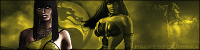
Sindel. 2010
0
10/27/2010 06:34 AM (UTC)by
Avatar
JAX007
Avatar
About Me

Member Since
09/07/2002 08:09 PM (UTC)
Avatar
RazorsEdge701
10/19/2010 05:34 AM (UTC)
0
I like the spider web motif. It definitely makes more sense and fits the character concept a lot better than the original biker chick jacket and swimsuit made of pads from MK3. Sindel with pupils in her eyes seems weird to me, though. I like her having the same blank eyed look as Scorpion in the games because they're both living dead.
Avatar
Jaded-Raven
10/19/2010 01:05 PM (UTC)
0
I hate spiders! I have such a horrible arachnophobia...

That said, the spider-theme would fit Sindel perfectly when not overdone. And you made it look very cool and subtle. As long you don't put in actual spiders, because then it would just be cheesy.

Your designs are very simple and as a whole it looks really good. There's nothing too flashy, but still with alot of subtle details. Keep up the good work. ^^
it pains me to say this as i think your work is amazing, but this is the first design of yours that im not keen on, the overall look feels a little too much like underwear, it just doesnt feel like something that would be worn for a fight,it just feels too casual. I also think the legs are far too long or the arms are too short plus she looks far too skinny and frail to even withstand a single punch.
With all that said her hair and face are beautifully done although i agree with the previous post her eyes should be solid white.
I'm sorry if that sounded overly critical, Im still a big fan of your work and style
Avatar
JAX007
Avatar
About Me

10/19/2010 02:32 PM (UTC)
0
Theres definitely stuff I would change about the design that im not diggin too much now. But I cant be bothered to go back, Ill just continue forward with different characters. Maybe ill get to make a new one in a 2011 series lol.
Avatar
LucaTurilli
10/19/2010 05:12 PM (UTC)
0
It's a very, very interesting concept. There's just something vacant about it. It's missing something, that I really can't put my finger on.
JAX007 Wrote:
Theres definitely stuff I would change about the design that im not diggin too much now. But I cant be bothered to go back, Ill just continue forward with different characters. Maybe ill get to make a new one in a 2011 series lol.

its still a great bit of work, just not the best of the series.
can't wait to see who's going to be next! personally i'd like to see your take on Sheeva, though she's not a favourite character of mine i'd love to see how you update a vey simple design
Avatar
QueenAhnka
Avatar
About Me

Rebel. Outsider. Fan Of The Obscure. Politically Incorrect. Spitfire!

10/20/2010 10:43 PM (UTC)
0
Beautiful!
Avatar
Sindel_Fan
10/21/2010 11:00 AM (UTC)
0
there is no doubt you have talent.
You and Razor are my favorite artist here.

I was waiting for you to do Sindel for so long now... and I have to say (saddly) i don,t like it.

I think she looks to young. Almost to look-alike Kitana.
The wed thing, althought very nicely done, is a bit to Halloween. Ok the Queen died, she's a sorceress... but still.. to litteral for me.
The outfit is not "royal/ enough. Even though the MK3 wasn't in anyway looking more royal, this one (again really well executed) looks incomplete.

I do love the way the head and hair flow.
The realism (just like in all your pieces) is awesome.
Love the "third-eye" you gave her.

In the end... it's the best execution i've seen in a while for Sindel, but by far the concept I like the least.

Avatar
MKKitana
10/21/2010 01:33 PM (UTC)
0
I quite like the design itsself, the spide-web thing is quite different and unusual, and i think it fits Sindel fairly well. I dont mind Sindel ahving pupila though i personally like the white eyes as it kind of reminds you that Sindel was ressurected. Like the diamond symbol on her head too.

My only problem though is that I think, like the Jade artwork, she is too slight/ skinny.
Avatar
Vomit
Avatar
About Me

10/24/2010 09:50 AM (UTC)
0
The drawing itself is great. I think the attire is simple yet effective, and the young, petite look is a nice change of pace for Sindel. I think the problem lies on her mid-section. Her waistline looks strange, like her hip-thigh ratio is off or something. She doesn't have the 'hourglass' figure I've come to expect from Sindel and the rest of the MK females. Maybe that's a good thing, and I'm simply having a hard time registering it. As of this moment, I can't say I'm used to the overall build of the character.
Avatar
Kamionero
10/26/2010 04:44 AM (UTC)
0
I have to say this design for Sindel is really refreshing!

The usual fan designs for Sindel are usually too buisy, or make her look draggy....

This outfit is simple and clean but still very interesting and a different.

Also, i appreciate the fact that her face is nice and again, not draggy. I think since she is no longer an evil character she should lose the Elvira look... so i like what u did here. Same goes for the long flowy hair as opposed to the puffy pompadour u ussually see with her.


Def. a cool, slicker Sindel option, so its a cool concept to see.


Also, on a side note, I would LOVE to see you redesign/work the post-MK3 characters, like quan chi, Reiko, Ashrah, Kira, Fujin etc.
Avatar
JAX007
Avatar
About Me

10/26/2010 06:20 AM (UTC)
0
Also, on a side note, I would LOVE to see you redesign/work the post-MK3 characters, like quan chi, Reiko, Ashrah, Kira, Fujin etc.


Thank you! I have some ideas for a few of them...
Avatar
buterbals113085
10/27/2010 06:34 AM (UTC)
0
I think it looks amazing.
Pages: 1
Download on the App StoreGet it on Google Play
© 1998-2024 Shadow Knight Media, LLC. All rights reserved. Read our Privacy Policy.
Mortal Kombat, the dragon logo and all character names are trademarks and copyright of Warner Bros. Entertainment Inc.