
Scorpion (img)
Scorpion (img)
0
posted06/25/2010 10:29 AM (UTC)by
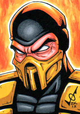
Here is an image of Scorpion I captured from one of the E3 videos in the highest resolution I could find. Just wanted to share this with all of you, let's just appreciate how badass our ninja specter really looks.
It seems like a revamped look from his MKvsDC version:

you're welcome
It seems like a revamped look from his MKvsDC version:
you're welcome
0
I like how the gold goes up and around his face the way it does. He looks so badass in this game makes his other costumes in the past look childish. They just need to fix Subs mask. Make it new.

About Me
You will die mortal. TOASTY Speed Metal will never die.
0
I may be a minority for saying this, and I don't care if I am. He looks stellar!
About Me
no one will ever be immortal
0
scorpion kicks ass!!!
0
I wonder where he goes to get such elaborately designed outfits.
About Me
You will die mortal. TOASTY Speed Metal will never die.
0
Is the end of Scorpion's sword suppossed to look like a stinger?
0
Also I'm glad they didn't overuse the yellow/gold this time around. The past games in every aspect of his outfit they'd just throw yellow and deck him out in gold. Looked so annoying.
About Me

0
~Crow~ Wrote:
Scorpion really makes Sub-Zero look disappointing, to be honest. Scorpion's new scorpion-themed mask, Sub-Zero just looks a bit boring. He needed an upgrade too. Hopefully he'll have a good alt.
Scorpion really makes Sub-Zero look disappointing, to be honest. Scorpion's new scorpion-themed mask, Sub-Zero just looks a bit boring. He needed an upgrade too. Hopefully he'll have a good alt.
Agreed. Subzero's mask has been done in 3 games already, it's time for a new one. I may be the only one to say this but I kinda wish he had the shredder helmet from MKdeception. I see it suiting this costume.
Anything would be better than the old cryo mask. C'mon netherealm studios! lol

I love how the colors are quite subdued compared to the "HEY! LOOK AT ME!" colors of past incarnations. It makes it feel more real and less, I dunno, "Power Ranger-y". Then again, perhaps it was just the bright colors of Annihilation that put me in that mindset 
I have to be honest... I ike Sub's more classic and simple outfit way more. Scorp seems a bit overplayed with details and all. He seems like a fusion of a ninja/samurai/knight... but still it looks good
Sub is plain but still has awesome details and looks like a real ninja. And I hope the mask will stay. I really love that one^^ Dunno why all the hate. Kung Lao and Johnny have changed even less and no one is complaining
Sub is plain but still has awesome details and looks like a real ninja. And I hope the mask will stay. I really love that one^^ Dunno why all the hate. Kung Lao and Johnny have changed even less and no one is complaining

About Me

0
I wonder how many drafts they did of him compared to other characters.
About Me

0
~Crow~ Wrote:
Scorpion really makes Sub-Zero look disappointing, to be honest. Scorpion's new scorpion-themed mask, Sub-Zero just looks a bit boring. He needed an upgrade too. Hopefully he'll have a good alt.
Scorpion really makes Sub-Zero look disappointing, to be honest. Scorpion's new scorpion-themed mask, Sub-Zero just looks a bit boring. He needed an upgrade too. Hopefully he'll have a good alt.
I agree. I would like to see Sub-Zero get more Labor. His outfit this game is really depressing thus far.

About Me
What do you like? Hit the Toasty thumbs up on articles and forum posts for a quick response!
0
I always get distracted by the fact that he's the only legit ninja in the series, and forget about the wacky hell power stuff. It's kinda cool to see the unrealistic mask and stuff on Scorpion. I still don't understand the lazy piece of plastic moulding on his chest, though. That just looks like nobody knew what to do and didn't want to render fabric textures, or something. :-P


About Me
0
I prefer Sub-Zero rocking the classic cloth wrappings and stuff too, personally. There's such a thing as overcomplicated, and Scorpion's chitinous bug armor look in this generation has definitely crossed that line for me.


About Me
PSN:athlos23
0
I really like it. It is unique enough and the sword hilt being a stinger is anice touch cant wait to play him
0
~Crow~ Wrote:
Scorpion really makes Sub-Zero look disappointing, to be honest. Scorpion's new scorpion-themed mask, Sub-Zero just looks a bit boring. He needed an upgrade too. Hopefully he'll have a good alt.
Scorpion really makes Sub-Zero look disappointing, to be honest. Scorpion's new scorpion-themed mask, Sub-Zero just looks a bit boring. He needed an upgrade too. Hopefully he'll have a good alt.
I couldn't agree more. Scorpion's new costume really dwarfs Sub-Zero's. I guess it pays to be Boon's favorite.
0
Honestly Scorpion always looks the same to me in every game. Now characters like Sub Zero and Reptile have had much more drastic revamps than Scorpion.
Anyways yeah Scorpion looks like Scorpion meh but he looks fine. Not like I expect revamped versions really....
Anyways yeah Scorpion looks like Scorpion meh but he looks fine. Not like I expect revamped versions really....

I do like it, but I still think its maybe a little to much?
I personally would of preferred something more simplistic, like his MKvsDC costume. Oh well, still nice design and all. I feel like Scorps had too much done, and Subs had too little. I still really like them though, there's always alts too.
I personally would of preferred something more simplistic, like his MKvsDC costume. Oh well, still nice design and all. I feel like Scorps had too much done, and Subs had too little. I still really like them though, there's always alts too.


Scorpion looks awesome. I just wish the would lose those dang shoulder pads. He DOES NOT need them. They clutter up the design. Scorpion could also lose the ropes or ties around his arms. Why are they even there?
Also throw me in with the group of people who thinks Sub-Zero looks absolutely fine the way he is. I don't want his design to get to complicated. Keep the shoulder pads and oversized belts away from him. His ninja looks in mk vs dc and especially MKDA were his best ever.
Keep it simple. His mask also looks fine to me as well.


© 1998-2026 Shadow Knight Media, LLC. All rights reserved. Mortal Kombat, the dragon logo and all character names are trademarks and copyright of Warner Bros. Entertainment Inc.