
Select Your Fighter Screen layouts
Mortal Kombat (2011)
Pages: 1
Select Your Fighter Screen layouts
Now normally, Mortal Kombat doesn't really do anything incredibly outrageous for their select screen. Normally it's either a large horizontal box or vertical.
In Capcom vs SNK 2:

You have this weird diagonal looking select screen. Granted that there's a heck of a lot of fighters, still it's quite an eye catcher since it just looks really cool.
To Mortal Kombat 2011:

I'm just giving out one example becuase I don't feel like going way too much into detail, but I'm pretty sure you're seeing a point here.
Should Mortal Kombat somewhat make their fighter select screen a bit more creative or just stick with the same layouts that it's been doing ever since?
In Capcom vs SNK 2:
You have this weird diagonal looking select screen. Granted that there's a heck of a lot of fighters, still it's quite an eye catcher since it just looks really cool.
To Mortal Kombat 2011:
I'm just giving out one example becuase I don't feel like going way too much into detail, but I'm pretty sure you're seeing a point here.
Should Mortal Kombat somewhat make their fighter select screen a bit more creative or just stick with the same layouts that it's been doing ever since?
About Me
"Never Stay Down"- Steve Rogers 
0
I say keep it simple.
I don't have a problem with just a box filled with mugshots. That's how most fighters have their select screen anyway.
I don't have a problem with just a box filled with mugshots. That's how most fighters have their select screen anyway.

About Me
0
They can do blazblue roster where the main charaters are like in a whell and all unlocked charaters go in the middle and DLC charaters go on the bottom seprate.  I always liked that one, but MK1 was cool to.
I always liked that one, but MK1 was cool to.

I prefer the MK style.
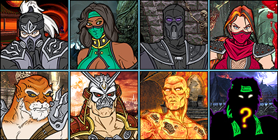
I only wish that every character box had a unique background like back in the day. Also, the background behind the entire cast box is boring in MK2011, it's just red.
I also preferred when you could see the entire body of the character on the sides when you're holding the cursor on their box and then when you select them they do a simple pose. For example they could have used those Challenge Tower poses in MK2011 for this purpose. Those poses are really cool, but you only get to see them in Challenge Tower (which I don't play anymore) and TYL (rarely play it).
Also, I didn't like it how in MKA they had "regions" of male and female characters only. I prefer when the female characters are dispersed on the select screen.


0
The character select screen isn't all tha timportant to me, but I like how MK has kept it simple and easy to go at. It doesn't have to be stylish and complicated, it's just a select screen after all.
About Me
0
if anyone wants to see the blazblue contiuum shift II select screen tell me ill find a new one
About Me
0
Nephrite Wrote:
I only wish that every character box had a unique background like back in the day. Also, the background behind the entire cast box is boring in MK2011, it's just red.
I only wish that every character box had a unique background like back in the day. Also, the background behind the entire cast box is boring in MK2011, it's just red.
I agree with this. And I liked it better how in past games, they weren't all facing straight forward.
Pages: 1


© 1998-2026 Shadow Knight Media, LLC. All rights reserved. Mortal Kombat, the dragon logo and all character names are trademarks and copyright of Warner Bros. Entertainment Inc.