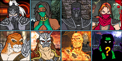
Baraka concept
0
02/05/2010 04:11 PM (UTC)by
Avatar
bleed
Avatar
Member Since
09/07/2002 09:20 PM (UTC)
Avatar
Jiro
Avatar
About Me

Kung Lao/Smoke main. Maker of puns and bad jokes.

09/29/2009 01:44 PM (UTC)
0
-One of the spikes on Baraka's left arm seem to be pointing in a weird direction.

-The way Baraka's stomach was made makes it look like he pulled his pants up too high.

-Baraka's neck muscle is to pronounced, he has never had something like that before in game.

However, it is a very good idea, so 5/5
Avatar
fedegita
09/29/2009 09:33 PM (UTC)
0
Pretty sweet. But the left half of his face (our right) looks really messed up - in the upper and lower jaws; it looks like a chunk of his face is missing or something. Shouldn't there be cheeks or something there?
Overall this looks pretty much the same as the MKDCU concept minus the chest plate. Still pretty great though, I'd love to see him coloured.
Avatar
Zombie
Avatar
About Me

10/07/2009 02:43 AM (UTC)
0
i like this alot, who cares if a spike is facing a werid direction, its a spike for christ sake,

if this was in color that would be awsome,

now you say this was in photoshop??? did you draw it on paper first then scan it in or did you draw it in photoshop? if thats the case damn very nice.
Yeah, I drew it straight in Photoshop with a tablet. It's easier to draw on paper for me, but I hardly ever do it any more.
Love it! Who cares if his face is a little asymmetric, it's BARAKA, he's supposed to be ugly!
Avatar
Zentile
01/07/2010 08:26 PM (UTC)
0
I don't get the criticism that's been made here; it's supposed to be a different design and interpretation of Baraka.

Awesome, I'd love for Baraka to look like this.
Avatar
Gho$t
01/08/2010 04:01 PM (UTC)
0
Niiiice. Looks tough enough. 5/5!
There's one of Shao Kahn I'm making now in 3D.

It's over here

http://elecbyte.com/forum/index.php?topic=55.60
bleed Wrote:
There's one of Shao Kahn I'm making now in 3D.

It's over here

http://elecbyte.com/forum/index.php?topic=55.60


Shao Kahn looks great!!! You should def. finish it!!!
Avatar
fedegita
01/10/2010 07:31 AM (UTC)
0
Interesting that you used the comic version of Shao Kahn. If you want my advice, his ears need to be fixed more firmly against his head and his neck needs to be thicker - more like your first attempt. Not just to be faithful to Tobias' drawing but to give him a more tanked and menacing look. At the moment he's too much like Nosferatu the vampire. And shame on you for hiding his cock, bleed. I wanted to see if there were black spikes and stuff sticking out of it.
EDIT: the blood splash animation is superb. The 3D elements you add to your MK animations (also like when Scorpion's broken spear flies towards the screen against Subzero) makes them really interesting
Avatar
RazorsEdge701
01/11/2010 06:29 AM (UTC)
0
fedegita Wrote:
Interesting that you used the comic version of Shao Kahn.

"The comic version" IS canon, y'know. That whole comic is. It's by Tobias himself. They even made sure to use that face when his helmet breaks off in Shaolin Monks
By the way, if you zoom in on the hi-rez model in MK vs DCU, he's got some little battle scars around his lips and chin where the helmet doesn't cover. I personally would add them, it fits his whole hands-on barbarian warlord image.
I'm also not sure about the proportions on the full body model. Maybe it's just my imagination and I'm wrong, it's hard to tell, but the head and neck seem a little small to me.
Avatar
fedegita
01/11/2010 10:57 AM (UTC)
0
RazorsEdge701 Wrote:
fedegita Wrote:
Interesting that you used the comic version of Shao Kahn.


"The comic version" IS canon, y'know.


This might come as a surprise, but when a character is portrayed in one particular style 99% of the time for fifteen years straight, some people might just be a little surprised when they are shown in that one other style that was never really popular and didn't exist outside of a kid's comic until a few years ago.

And I don't know how canon/non-canon got into this. But considering that I already stated it was Tobias' work, I'll let you play that game on your own.
Avatar
RazorsEdge701
01/11/2010 01:29 PM (UTC)
0
Well when you use the phrase "the comic version", that suggests there are other versions to choose from.
There aren't. Kahn with his helmet off can only look that one way.
Except Annihilation, I guess. But why go there?
Avatar
kingjolly
01/11/2010 09:29 PM (UTC)
0
I would stick to the helmet version. Tobias should never have revealed Shoa Kahn's face in the comic book....because he looks horrible without it.
Avatar
fedegita
01/11/2010 10:24 PM (UTC)
0
^ Agreed. It's unfortunate that a lot of the non-human/monster MK characters end up looking the same, and Kahn sans mask doesn't do anything that Goro, Baraka or Motaro haven't already done better. Plus he would have been a lot more mysterious if they'd just left the mask on - kinda like we don't really know (as far as I know) what King from Tekken looks like without his tiger head.
Avatar
lordoftheice
Avatar
About Me

kudos to LiuKangMaster

02/05/2010 04:11 PM (UTC)
0
two words kick @$$
Pages: 1
Download on the App StoreGet it on Google Play
© 1998-2024 Shadow Knight Media, LLC. All rights reserved. Read our Privacy Policy.
Mortal Kombat, the dragon logo and all character names are trademarks and copyright of Warner Bros. Entertainment Inc.