


About Me

0
Skins, that Haku sig is amazing, good job.
About Me
Rebel. Outsider. Fan Of The Obscure. Politically Incorrect. Spitfire! 
0
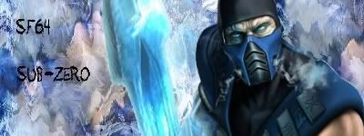
y'all like my sig?

About Me

0
skinsley Wrote:
What yall think?
What yall think?
The Haku one is my favorite.
About Me
Rebel. Outsider. Fan Of The Obscure. Politically Incorrect. Spitfire!
0
skinsley Wrote:
Not bad...but the text is terrible.
Why on earth would you cover the faces of your characters with words.
Not bad...but the text is terrible.
Why on earth would you cover the faces of your characters with words.
Umm..you can still see their faces clearly.


0
skinsley Wrote:
I think its amazing KARATE......How on earth did you do that ?
I think its amazing KARATE......How on earth did you do that ?
I downloaded new brushes. Would you believe me if i told you i didnt use a rendor? lol this sig is made with all brushes. No distorts,No nothing. I was just happy to finally get good text.
Thanks for the feedback.
BTW,Your Haku sig is UNBELIEVABLE!
I hope to one day make sigs like you.
0
0
gamermk66 Wrote:
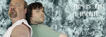
Not bad.... I like the second one more than the Tenacious D.

About Me
0
my newest sig.................

About Me
Rebel. Outsider. Fan Of The Obscure. Politically Incorrect. Spitfire!
0
torchia Wrote:
I'm sorry guys, but these signatures are just becoming lower and lower in quality.

I miss when MKO was full of talent.
And when your signature sucked, someone would tell you.
The closest person to that right now is Skinsley.
I'm sorry guys, but these signatures are just becoming lower and lower in quality.
I miss when MKO was full of talent.
And when your signature sucked, someone would tell you.
The closest person to that right now is Skinsley.
urs is not that great.
Before MK8 comes out all the good people will be back.
Some of the newer sig makers here will be alot better by then also.
And to be honest I try not to give harsh criticism even for the worst of signatures.
My only problem with this thread is that I am the only person that actualy gives decent critics.
"thats nice" "thats good" or "yeah I like it"
Is not the sort of comments everyone wants to hear...if you dont like something about it....say so, and/ or tell us how to improve.
About Me
0

I added 3 c4ds for the BG, added the render, applied image on a new layer and flipped the applied image horizontally, erasing with a splatter brush. Then I played around with clipping masks, displace filters (twice) and topped it off with layer adjustments.
Tips on improvement are welcome.
All I can say about that one is that I dont like the Kitana Text, I dont know....erm maybee try a lighter colour or something like that.
And Try and get more flow....the background is Very nice but it doesnt seem very Action like.
You see your current has alot of flow, definatly makes the sig look like its doing something.
( current one your using is B-E-A-U-T......yeah and so on.)
And Try and get more flow....the background is Very nice but it doesnt seem very Action like.
You see your current has alot of flow, definatly makes the sig look like its doing something.
( current one your using is B-E-A-U-T......yeah and so on.)


© 1998-2026 Shadow Knight Media, LLC. All rights reserved. Mortal Kombat, the dragon logo and all character names are trademarks and copyright of Warner Bros. Entertainment Inc.