
0
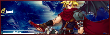
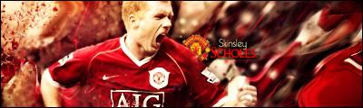
Hikari thats a sweet sig. Kind of different than your usuall. Only thing I didnt like was that there isnt really any flow, as Skinsley mentioned.
But its still a very nice sig.
But its still a very nice sig.
About Me
Rebel. Outsider. Fan Of The Obscure. Politically Incorrect. Spitfire! 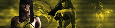
0
Skinsley dosen't know what he be talking about , he told me that the text was covering my character's faces and its not. And then when i told him it wasent he tried to get smart.
0


About Me

0
0
ProfesserAhnka Wrote:
Skinsley dosen't know what he be talking about , he told me that the text was covering my character's faces and its not. And then when i told him it wasent he tried to get smart.
Skinsley dosen't know what he be talking about , he told me that the text was covering my character's faces and its not. And then when i told him it wasent he tried to get smart.
Oh boo hoo.......

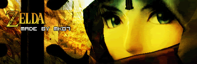
Kamionaero.... your sig style is so different that there is no way I could ever Comment...apart from telling you that It looks Amazing.
Really, you have to be blind stupid or both.....you see words clearly covering the left eye of chameleon.....what sort of dumbass are you to actually say that the text is not covering the characters faces.....the eyes are a main focal point of an image.
I don’t even need to say anything to your comments....because everything is self explanatory, you should not have even spoke at all.
You loose goodnight.
ProfesserAhnka Wrote:
Skinsley dosen't know what he be talking about , he told me that the text was covering my character's faces and its not. And then when i told him it wasent he tried to get smart.
Skinsley dosen't know what he be talking about , he told me that the text was covering my character's faces and its not. And then when i told him it wasent he tried to get smart.
Really, you have to be blind stupid or both.....you see words clearly covering the left eye of chameleon.....what sort of dumbass are you to actually say that the text is not covering the characters faces.....the eyes are a main focal point of an image.
I don’t even need to say anything to your comments....because everything is self explanatory, you should not have even spoke at all.
You loose goodnight.
About Me
0
ProfesserAhnka Wrote:
Skinsley dosen't know what he be talking about , he told me that the text was covering my character's faces and its not. And then when i told him it wasent he tried to get smart.
Skinsley dosen't know what he be talking about , he told me that the text was covering my character's faces and its not. And then when i told him it wasent he tried to get smart.
Well, the eye is a part of the face and clearly, the letter K is covering Chameleons left eye.

About Me

0
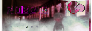
new sig, imo it sucks

About Me
0
Shinnok-fan64 Wrote:
new sig, imo it sucks
new sig, imo it sucks
Does not look great, but it looks like you may have a good concept there. Towards the center, Rain looks like he his summoning a wave of water, but the bright purple towards the left ruins it.
0
 I'm def. abusing of the color/clear circle thing... hehee...
0
Shinnok-fan64 Wrote:
new sig, imo it sucks
new sig, imo it sucks
Soz SF, but I gotta say thats one of your worst sigs yet. The colour thing is good, but you overdid it. Maybe make the colour change a bit more subtle and it would be sweet. Also, the font is horrid. It was a nice concept, but didn't turn out too good.
About Me
0
yeah i know, i really hate that one; what also annoys me is that it took a long time, and it still came out like crap.
Oh well, back to the drawing board lol; still, i do like the concept though.I should try that thing again, but take off that part on the right.
Oh well, back to the drawing board lol; still, i do like the concept though.I should try that thing again, but take off that part on the right.
I used a C4D on the right... I didn't really want it to noticeable, but like able.
Anyways, it is pretty good. I sorta like it..

Now, this one I like a lot. My third attempt on C4Ds'. But, I don't like the text positioning of "UlcaTron" on it... : /
Rate please... ON BOTH!

ProfesserAhnka Wrote:
urs is not that great.
torchia Wrote:
I'm sorry guys, but these signatures are just becoming lower and lower in quality.

I miss when MKO was full of talent.
And when your signature sucked, someone would tell you.
The closest person to that right now is Skinsley.
I'm sorry guys, but these signatures are just becoming lower and lower in quality.
I miss when MKO was full of talent.
And when your signature sucked, someone would tell you.
The closest person to that right now is Skinsley.
urs is not that great.
See? That's an honest, personal opinion. And I'm cool with that.
Because you said that, I now know what one user's opinion on my signature is, and I can think about that next time I make one.
Was it that hard?
About Me
0
my newer sigs, two of these really suck.
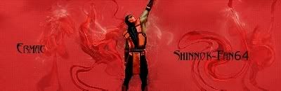
made this one much better than the rain one, and the text is better imo.
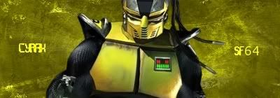 alright, i think it sucks to be honest
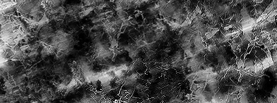
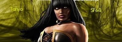 this one is really bad, but its the first time i used a grunge background, so for a first grunge bg its not terrible.
made this one much better than the rain one, and the text is better imo.
alright, i think it sucks to be honest this one is really bad, but its the first time i used a grunge background, so for a first grunge bg its not terrible. 0
That Ermac one is really cool. I cant stand the text tho on the other ones, Ermacs is decent but the other 2 I hate. You should really download more fonts. Also you should learn how blend your render in.
There still great sigs and you are improving on the backgrounds which I like.
There still great sigs and you are improving on the backgrounds which I like.

Hm. It looks you used that same Guy in your sig more than once. I saw a tutorial on how to blend the render within the BG but I lost it. I made something like that I believe. But I cannot remember for sure.
Its nice. 8/10.
Did you guys notice the "SOTW" this week was bad? Only four people posted sigs...

Its nice. 8/10.
Did you guys notice the "SOTW" this week was bad? Only four people posted sigs...


© 1998-2026 Shadow Knight Media, LLC. All rights reserved. Mortal Kombat, the dragon logo and all character names are trademarks and copyright of Warner Bros. Entertainment Inc.