

About Me

0
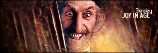
I really like this one alot.
0
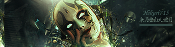
Sexy Stuff Hikari, looks great.

I wasnt so sure about this when I was making it but the more stuff I put to it it ended up looking good imo. I like it.
If enough people like maaaybe ill post a PSD for this like Skinsley had brought up earlier.
What do YOU guys think?
I wasnt so sure about this when I was making it but the more stuff I put to it it ended up looking good imo. I like it.
If enough people like maaaybe ill post a PSD for this like Skinsley had brought up earlier.
What do YOU guys think?


0
Shinnok-fan64 Wrote:
actually KARATE i've never used "Hurl" before, i usually use "Pick" instead.
anyways, can someone help me on smudging, i don't really get how to do that. i see the icon, and use brushes on there but it dosen't do much.
actually KARATE i've never used "Hurl" before, i usually use "Pick" instead.
anyways, can someone help me on smudging, i don't really get how to do that. i see the icon, and use brushes on there but it dosen't do much.
Check your PM.


About Me

0
my newest sig, i like it alot, simple but cool imo

0
Sweet SF, looks nice. Its not all messy like some of your others. The BG looks good.
0
skinsley Wrote:
An insight to how a skinsley signature is made.

An insight to how a skinsley signature is made.
YEp, there is NO WAY i can do that.
Well, freshly made this morning at around 2
>

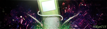
Also entered in the SOTW, i cut the image myself and played around with my GIMP system. i found out a few new tools to use and created my best sig to date IMO. And thats not just because i've only made 3.
This is a pictrure of an Ipod on a speaker deck that i croped and messed with till i got it the way i wanted it.
0
Here are my newest ones.
This is for the SOTW. I did 3 different copies....Which one you think is best?
This is the one i currently have entered. The bottom one.
So which one should i go with? The one i chose? Or one of the other 2?
This is for the SOTW. I did 3 different copies....Which one you think is best?
This is the one i currently have entered. The bottom one.
So which one should i go with? The one i chose? Or one of the other 2?


About Me
0
xtactics, i like that sig except for the box around the text; imo it looks out of place and awkward.
still, good job.
still, good job.


0
Heres my latest work.
Really been likeing this render so I made a logo for my friends band thingy. Oh yeah and sorry for making the thread from going from great sigs to bad 1's sorry
Really been likeing this render so I made a logo for my friends band thingy. Oh yeah and sorry for making the thread from going from great sigs to bad 1's sorry

0
xtactics Wrote:

Xtactics,as much as i love you,I honestly dont like it....
I think you overdid it with effects and to many lines.
I still love that Joker sig of yours.


I've been trying to avoid studying.
Here is what happens when you throw two tutorials into one. (Btw it should be noted that these were the first two tutorials I've ever read)

For those who don't know ..
Here is what happens when you throw two tutorials into one. (Btw it should be noted that these were the first two tutorials I've ever read)
For those who don't know ..
Spoilers: (Highlight to reveal)
This was my attempt at two tutorial maneuvers from MINION and skinsley. The whole backround, wave things coming off from the Garchomp sprite are located in MINION's Sprite Tut, and the only thing from skins is the "explosion" happening at the bottom of Garchomp's legs.
This was my attempt at two tutorial maneuvers from MINION and skinsley. The whole backround, wave things coming off from the Garchomp sprite are located in MINION's Sprite Tut, and the only thing from skins is the "explosion" happening at the bottom of Garchomp's legs.
0
xtactics.....dont like it. Sorry.

Daft Punk^

^Shit.
Daft Punk^
^Shit.
About Me
0
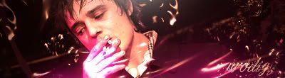
prodigy004 Wrote:
That's my favorite out of those.
SOTW entry
B+W version:

0
Yeah that batch isnt that great...ive found myself kind of bored of making sigs.
I'll be sure to post some better ones soon.
Also that Ipod sig looks great. The coloured one ofcourse. Dont like the B/W.
I'll be sure to post some better ones soon.
Also that Ipod sig looks great. The coloured one ofcourse. Dont like the B/W.


© 1998-2026 Shadow Knight Media, LLC. All rights reserved. Mortal Kombat, the dragon logo and all character names are trademarks and copyright of Warner Bros. Entertainment Inc.