
0
gamermk66 Wrote:
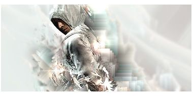
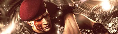
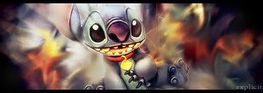
Heres my latest work.
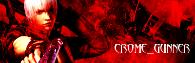
Really been likeing this render so I made a logo for my friends band thingy. Oh yeah and sorry for making the thread from going from great sigs to bad 1's sorry
Heres my latest work.
Really been likeing this render so I made a logo for my friends band thingy. Oh yeah and sorry for making the thread from going from great sigs to bad 1's sorry
Oh yeah please rate these too


0
prodigy004 Wrote:
^Shit.
^Shit.
I actually like this one alot.
Why is it called shit?

0
KARATE Wrote:
I actually like this one alot.
Why is it called shit?
prodigy004 Wrote:
^Shit.
^Shit.
I actually like this one alot.
Why is it called shit?
I just dont like it....its too messy. But im glad you like it haha.
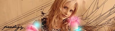
Skinsley, I feel the same way. I dont even know what to make anymore. Believe it or not. Look at my latest sigs I made......not so good.

About Me

0
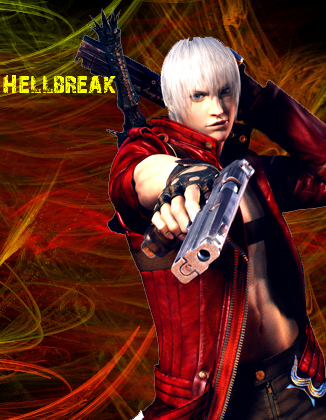
gamermk66, the first one isn't bad for a beginner but I don't like how the colors affect the Dante render. A tip, add the render above the color balance layer and try using something like the lasso tool or slightly erase some parts with a soft round px eraser on a low opacity.
The banner one isn't bad either. Render doesn't seem to blend well (The white outlines are pretty annoying). Use the above tip for simple blending.
tbh skinsley, I agree. Sometimes I make some practice sigs just to test something new but the results look crappy.
The banner one isn't bad either. Render doesn't seem to blend well (The white outlines are pretty annoying). Use the above tip for simple blending.
tbh skinsley, I agree. Sometimes I make some practice sigs just to test something new but the results look crappy.
0
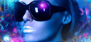
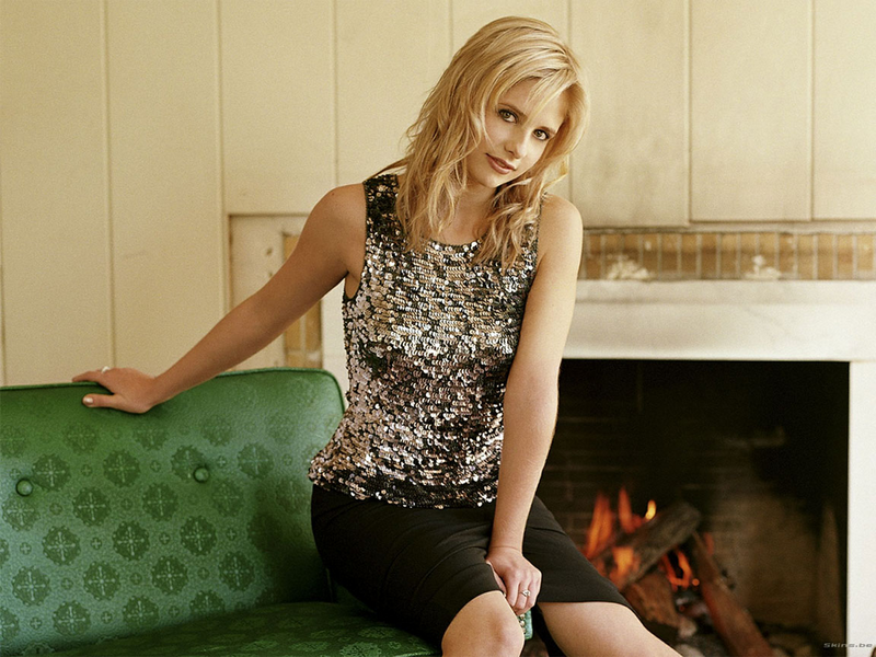
Sarah Michelle Gellar is so hot.


0
Nice sig prodigy. Its pretty damn good. When is mine coming? 
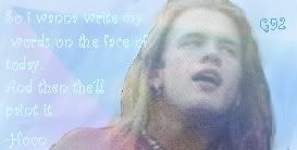
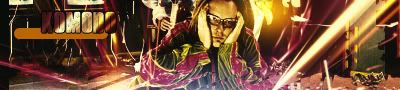
Anyway, I made a new one. OMG!

Joey Jordison. For those of you who don't know. He is the drummer for Slipknot.
Anyway, I made a new one. OMG!
Joey Jordison. For those of you who don't know. He is the drummer for Slipknot.
0
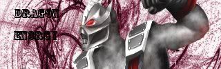
DragoNEn3rgY Wrote:
i like the whole color scheem (if i spelled it wrong, oh well) of this. And i'm a big fan of slipknot. 9/10 bro, good job
DragoNEnergY, that sig is just HOT.
I like it, it looks realy realy good. But to be honest it doesnt look anything more than a Background with 2 wireframe C4Ds (both of thich I have), a render, and a few colourd dots set to a different setting.
Appart from it looking incredibly simple, it actualy looks like a 10/10 jobby.
prodigy004 Wrote:
Sarah Michelle Gellar is so hot.
Sarah Michelle Gellar is so hot.
I like it, it looks realy realy good. But to be honest it doesnt look anything more than a Background with 2 wireframe C4Ds (both of thich I have), a render, and a few colourd dots set to a different setting.
Appart from it looking incredibly simple, it actualy looks like a 10/10 jobby.
0
Actually Skinsley I did edit the background a bit. I gave it a wave, a little clipping mask, and than I brushed it a little with a grunge brush and than lowered the opacity to give it like a texture look. I didnt know what else to do =/. Here, try and see the difference.
Original Pic
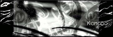
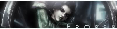
Komodo I actually forgot about you lol sorry, I'll have it ready 2NITE!.
Original Pic
Komodo I actually forgot about you lol sorry, I'll have it ready 2NITE!.
0
DragoNEn3rgY Wrote:
Nice sig prodigy. Its pretty damn good. When is mine coming?
Anyway, I made a new one. OMG!
Joey Jordison. For those of you who don't know. He is the drummer for Slipknot.
Nice sig prodigy. Its pretty damn good. When is mine coming?
Anyway, I made a new one. OMG!
Joey Jordison. For those of you who don't know. He is the drummer for Slipknot.
Wow!!!!
Im so jealous of your skill!


0
This is for SuperAwesomeness:
I kinda owe him so here's that surprise d00d.
Avatar: ("Blood Red Fire") 27.14kb

Signature: ("Black & White & Red All Over") 47.36kb

On the avatar, I had turn the fire to the side. The render(hair//pose in general) covered everything that looked good about it up.
About that render, I had to "treat it" ALOT in order to get it to look like it does. Those Rock&Roll characters are extremely hard not to make look like women. Not trying to "make a funny", it's just a consequense of them wearing all the makeup and the big hair and all.
The "pink" in his hair and the color of his skin all conflicted with the "blood red" theme. You would think a simple color swap would take care of it but nope. When I'd get the pink out, it would change the color of his skin and vise versa. I tried cutting his hair out and swapping it that way, but then it would jeaprodize the intergrity of the image....Lol So frustrating I swear.
The sig is one of my cross-over attempts into a "PhotoShopCs2 only" sig. I know PS is fully capable of really great things, but it's hard for me to completely switch so I'm still using 2 programs(PhotoImact10 and PhotoShopCs2.....Animation is done in Ulead GIF Animator.)
Comments? Suggestions?
I kinda owe him so here's that surprise d00d.
Avatar: ("Blood Red Fire") 27.14kb
Signature: ("Black & White & Red All Over") 47.36kb
On the avatar, I had turn the fire to the side. The render(hair//pose in general) covered everything that looked good about it up.
About that render, I had to "treat it" ALOT in order to get it to look like it does. Those Rock&Roll characters are extremely hard not to make look like women. Not trying to "make a funny", it's just a consequense of them wearing all the makeup and the big hair and all.
The "pink" in his hair and the color of his skin all conflicted with the "blood red" theme. You would think a simple color swap would take care of it but nope. When I'd get the pink out, it would change the color of his skin and vise versa. I tried cutting his hair out and swapping it that way, but then it would jeaprodize the intergrity of the image....Lol So frustrating I swear.
The sig is one of my cross-over attempts into a "PhotoShopCs2 only" sig. I know PS is fully capable of really great things, but it's hard for me to completely switch so I'm still using 2 programs(PhotoImact10 and PhotoShopCs2.....Animation is done in Ulead GIF Animator.)
Comments? Suggestions?


About Me
0
UlcaTron Wrote:

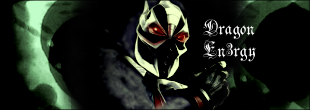
Welcome back. I like the one you gave to prodigy the most, one of your best imo.
Nice job DE and prodigy.
0
Thanx for the comments everyone. I appreciate them.
Which member of Slipknot should I do next?
Which member of Slipknot should I do next?


0
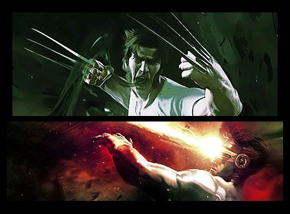
The sprite one and yellow and black ones are amazing... and the wolverine one... well... thats just one of my favs. of all time


0
An avi i made for Mattewhaddad

The sig KARATE made me

A crappy sig i made for myself
and a Avi a made for some guy

ugh, they all suck accept for that one KARATE made me, but i'm trying.
The sig KARATE made me
A crappy sig i made for myself
and a Avi a made for some guy
ugh, they all suck accept for that one KARATE made me, but i'm trying.


© 1998-2026 Shadow Knight Media, LLC. All rights reserved. Mortal Kombat, the dragon logo and all character names are trademarks and copyright of Warner Bros. Entertainment Inc.