


I created my own pattern.
Make a 3X3 pixel canvas, and zoom in fully, take a 1pixel pencil and do 3 diagonal squares from corner to corner in whatever direction you wish.
Go to Define pattern (somewhere at the top) and then save it.....there you go, you have a pattern....i did the same thing with the circles.
Its not my first sprite, its one of my first though, no tuts or anything like that used ither,,, just SKINSLEY

About Me

0
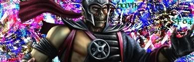
my newest sig, text is visible although i'm not sure if i like it or not

About Me
0
i agree s3ktor i dislike it as well, oh well sigs will occasionally suck now and then.
xtactics Wrote:
How many tutorials have you read in a lifetime? (btw thanks for the heads-up- I can't find the save pattern option on 7.0 though)
How many tutorials have you read in a lifetime? (btw thanks for the heads-up- I can't find the save pattern option on 7.0 though)
I skim through tutorials almost all the time, just picking out little tricks from each one.
Through that I have devised my own styles, and even created a few new tricks myself.
There are GFX sites made for Sig making, and its only polite to have a look at everyones tut to atleast apreciate all the time it takes to make those blasted things.

About Me

0
skinsley Wrote:

Ive come to notice that all my 100 percent skinsleys ideas signatures are the most favoured.
I just sat and messed around with this one, forgetting most the things ive learned and going crazy.
I myself love it, what yall think ?, enough feedback may get a tutorial for this one.
Ive come to notice that all my 100 percent skinsleys ideas signatures are the most favoured.
I just sat and messed around with this one, forgetting most the things ive learned and going crazy.
I myself love it, what yall think ?, enough feedback may get a tutorial for this one.
I really like this one. The BG and colors are great. Did you use the liquify filter option?


0
UlcaTron Wrote:
Whatch all think?

P.S. Kudos to s3Kt0r for helping find the tutorial for the above sig.
And this one.. sorta :

Tell me where I need improvement.
Thank choo.
Whatch all think?
P.S. Kudos to s3Kt0r for helping find the tutorial for the above sig.
And this one.. sorta :
Tell me where I need improvement.
Thank choo.
Something I really like about that seccond one....the text fro your name is wrong though. But idk, I just....like it.
Skinsley yurs is purrrdy! lol
UlcaTron Wrote:
Whatch all think?
P.S. Kudos to s3Kt0r for helping find the tutorial for the above sig.
And this one.. sorta :
Tell me where I need improvement.
Thank choo.
Whatch all think?
P.S. Kudos to s3Kt0r for helping find the tutorial for the above sig.
And this one.. sorta :
Tell me where I need improvement.
Thank choo.
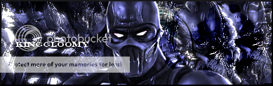
Yeah those tuts from deviantart helped me out a lot. Well here's a sig that I recently made


0
This is sexy!
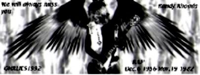
My best yet.
p.s. Im done saving my sigs as GIF. It takes away so much detail of my sigs. This one was saved as PNG. You see the difference?
My best yet.
p.s. Im done saving my sigs as GIF. It takes away so much detail of my sigs. This one was saved as PNG. You see the difference?
0
well, not great, but it's my first one, so be easy on me.
About Me
0
The text is hard to read... =\
0
I realized that after i made it. I have to adjust some stuff, but after that, i think it will be to my liking
0
Awsome. Definetly you're best yet imo.
0
Yup. The quality looks alot better than your other ones and it doesnt look ugly with those plain colours you used before. Great job.

Ulcatron, thats pretty good.
One of your best...not your actualy best, but one of them definatly.
Prodigy I dont like that one, its got potential, and alot of Skill went into making it....it just doesnt look all that good, Whats that TEXT anywhoo ?
Still need to try out ur tut, ill get round to it soon.
Sektor, thats good, a little plain, but its clear and nice on the eyes.


© 1998-2026 Shadow Knight Media, LLC. All rights reserved. Mortal Kombat, the dragon logo and all character names are trademarks and copyright of Warner Bros. Entertainment Inc.