


0
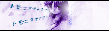
Heres my newest:
Gift for MINION:
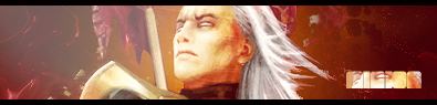
Well this was my first Tut i have ever tried and i think it was a success. All i have to say is PS is alot harder to make sigs than GIMP.
Opinions?
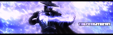
Gift for NOKLIU:

Gift for Xtactics

Well that is my 2nd tut right there.
Gift for MINION:
Well this was my first Tut i have ever tried and i think it was a success. All i have to say is PS is alot harder to make sigs than GIMP.
Opinions?
Gift for NOKLIU:
Gift for Xtactics
Well that is my 2nd tut right there.


0
Ulcatron its a little dark and could use some depth but its not bad. I have seen alot better from you bro.
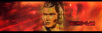
Heres my newest:
Gift:
Thats my 3rd tut.
I am proud.
Heres my newest:
Gift:
Thats my 3rd tut.
I am proud.

You are all Skullfucking this text too much, once something is whored...it begins to not look good anymore.
Ive had that font for a long time, and I use it rarely so it doesnt loose its effect, that and text looks good on certain types of signatures, but you guys use it for every sig you make.
Ive had that font for a long time, and I use it rarely so it doesnt loose its effect, that and text looks good on certain types of signatures, but you guys use it for every sig you make.


About Me

0
KARATE, that sig you made for Pred is the best out of those imo.
skinsley, you're right about the text thing- I guess I am the one to blame lol.
Prodigy- I like the ripple effects and how the trees in one of the circles look distorted.
skinsley, you're right about the text thing- I guess I am the one to blame lol.
Prodigy- I like the ripple effects and how the trees in one of the circles look distorted.
0
skinsley,Im sorry man i really like the text and i cant figure out how to make other text look good yet.
Pr0d1gY,That sig is awesome! I hope you will help me to get as good as you man! You are way to good now, fuck!
Well here is my newest:
No tut this time. I had Jago explaining to me how to do things on MSN then i went ahead and added my own stuff. So its only 50% me.
Opinions?
Pr0d1gY,That sig is awesome! I hope you will help me to get as good as you man! You are way to good now, fuck!
Well here is my newest:
No tut this time. I had Jago explaining to me how to do things on MSN then i went ahead and added my own stuff. So its only 50% me.
Opinions?


0
DevilJin,Very nice man. The blending and text is really nice. I agree with Pr0d1gY on this one. It is definitely your best yet!

0
Sweet sigs KARATE, I like the noob and raiden one the most. Now I feel like making a sig. =D
lol @ whored text >_>
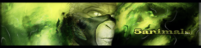
EDIT: My quest on making a sig of every Kof char continues, so far this is my fourth one.

w00t for new PB account =D
lol @ whored text >_>
EDIT: My quest on making a sig of every Kof char continues, so far this is my fourth one.
w00t for new PB account =D
0
hm
http://www.fightersgeneration.com/main.htm
just go to characters, and find the one you need. There's not that much sprites though, I still manage with it despite it being kinda limited. If I do find a new site, I'll contact you. =o
http://www.fightersgeneration.com/main.htm
just go to characters, and find the one you need. There's not that much sprites though, I still manage with it despite it being kinda limited. If I do find a new site, I'll contact you. =o

0

0

First sig I've made since April. Nothing elaborate obviously. In the end though I'm happy with it. What do y'all think?
0
Mortalfool,Excellent job on that sprite man. I love how you made certain points kinda like lighting for more depth. Very nice!
Pink_Ranger,Do you use PS or GIMP? I like it but it seems to be missing something. Hmmmm i guess you could of done a little bit more to the left with some effects or something? Although,the lighting,Text and Rendor position is really nice. All in all i would say its a really good job since you havent made one since April.
Pink_Ranger,Do you use PS or GIMP? I like it but it seems to be missing something. Hmmmm i guess you could of done a little bit more to the left with some effects or something? Although,the lighting,Text and Rendor position is really nice. All in all i would say its a really good job since you havent made one since April.
0
KARATE Wrote:
Mortalfool,Excellent job on that sprite man. I love how you made certain points kinda like lighting for more depth. Very nice!
Pink_Ranger,Do you use PS or GIMP? I like it but it seems to be missing something. Hmmmm i guess you could of done a little bit more to the left with some effects or something? Although,the lighting,Text and Rendor position is really nice. All in all i would say its a really good job since you havent made one since April.
i would agree to that bro
0
KARATE Wrote:
Here is my newest:
Gift
I found a better text! Yay!
Opinions?
Here is my newest:
Gift
I found a better text! Yay!
Opinions?
very nice dude i like it man. i like how the back of reptiles head like blends in with the BG


© 1998-2026 Shadow Knight Media, LLC. All rights reserved. Mortal Kombat, the dragon logo and all character names are trademarks and copyright of Warner Bros. Entertainment Inc.