


About Me

0
Yeah the sigs are squished and aren't appealing.
btw prodigy- the Chun Li and Mitsurugi ones are the best.
btw prodigy- the Chun Li and Mitsurugi ones are the best.

skinsley Wrote:
I like hikari's latest.
I dont like prodigy's though...there all sigs that Ive seen similar versions on Tutorials, im not saying there all 100 percent followed tutorials, but they just dont look like your own style.
I liked all your NEON effects though, they were your better sigs, these ones are all just not my thang......Appart from the Sprite Chun li one...that is brilliant.
Lol your so right dude, I did infact use a tut for the SC sig and Chun-Li. The others were all moi.
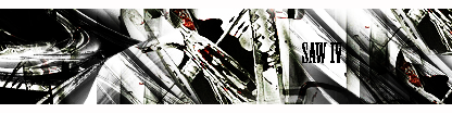
Anways heres a new one, 100% PRODIGY lol.
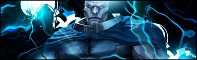
The one thing about this style is that its really hard finding a good text to go with it, trust me.
Ok, opinions?
Pr0d1gy Wrote:
Hmm .. there's something about the render that's bugging me. The effects are quite nice ... it's just that everytime I look at it, it seems that the signature is two pictures. This probably doesn't make a lot of sense, so I'll edit this later in the morning, when I'm more sober. Other than that I think I'll just steal it and put my name on it. (lol)


0
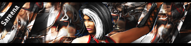
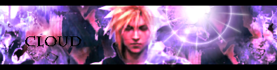
Hikari,I love your new sigs as well. I think the Pit one is my favorite.
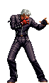
Pr0d1gY,Out of your latest that Chun Li Sprite is amazing man.
Redman,No offense,But your newest sig just looks like a Copy and paste job...You can do better than that.
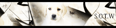
Here are my newest ones.
Gift:
Sotw:
Gift:
Stock:
I dunno if there better than my last batch of sigs,But i like them.
Pr0d1gY,Out of your latest that Chun Li Sprite is amazing man.
Redman,No offense,But your newest sig just looks like a Copy and paste job...You can do better than that.
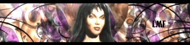
Here are my newest ones.
Gift:
Sotw:
Gift:
Stock:
I dunno if there better than my last batch of sigs,But i like them.

Pr0d1gy Wrote:
Wow I know my shit dont I lol.
(shit meaning stuff, im not calling your sigs shit lol)
Latest one, cool render, but some of the areas of "STUFF" covering him look a tad wierd.]
Redman, Do you know how to resize a render ? you have massive faces on almost all your sigs.
Wow I know my shit dont I lol.
(shit meaning stuff, im not calling your sigs shit lol)
Latest one, cool render, but some of the areas of "STUFF" covering him look a tad wierd.]
Redman, Do you know how to resize a render ? you have massive faces on almost all your sigs.

About Me

0

^ ^
Heres My newest Sig .
0
Bone,Very nice! I see now what you meant. That is definitely your best sig.
Heres my newest:
Gift:
Opinions?
Heres my newest:
Gift:
Opinions?
About Me
0

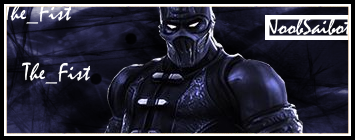
^ New One Again !
About Me
0
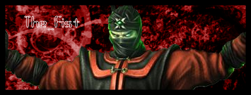
redman Wrote:
Nice improvement brah!
New one:
krayziebonethug Wrote:
^ New One Again !
^ New One Again !
Nice improvement brah!
New one:
hehe thanks man . good stuff on the ermac sig .


0
Bone and Redman, Relax on those borders.....
The walls are closing in on me!!
*heavy panting*
Let me outta here!!
*swirling despair*
OH NOES!!
lol
----------
Experiment with more contemporary borders. Look around and compare....
Ps: I'm not really claustrophobic.. hahaha
The walls are closing in on me!!
*heavy panting*
Let me outta here!!
*swirling despair*
OH NOES!!
lol
----------
Experiment with more contemporary borders. Look around and compare....
Ps: I'm not really claustrophobic.. hahaha

About Me
0
UlcaTron Wrote:
Though its a gift, I still like it a lot.

Though its a gift, I still like it a lot.
I actually like it- I don't know why but the render should be focused a bit more but still pretty nice.
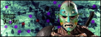
No offense redman but the dots in your Drahmin sig doesn't look great imo. I dunno if it will actually work in GIMP but try resizing your renders by holding ctrl+T. Hold the shift key while resizing it.


© 1998-2026 Shadow Knight Media, LLC. All rights reserved. Mortal Kombat, the dragon logo and all character names are trademarks and copyright of Warner Bros. Entertainment Inc.