0
redman Wrote:
That sprite sig is awesome.
I'm not too down on the Sonic one though imo, not much to it. But good.
Here's one i made for RomanK

BTW Hik, i made somethin for ya a while ago:

Sorry if it's too purple, or dark. I just wanted to make it blend.
That sprite sig is awesome.
I'm not too down on the Sonic one though imo, not much to it. But good.
Here's one i made for RomanK

BTW Hik, i made somethin for ya a while ago:

Sorry if it's too purple, or dark. I just wanted to make it blend.
lol im real late on these but whatever
they look kool man like the BG about the renders i dont know its jus somethin that doesnt look right did you use the colorize to change their color if so it makes the pic look a lil weird.
ah i found what i didnt like you should blur your images jus a lil like the BG or somethin jus to give the image some depth
other than that they look real kool gotta tell me how you make those BGS

0
skinsley Wrote:
Im gonna start making more sigs now...Ive noticed that ive become shit.
So next time I post something up, no1 go easy on me....kick my ass if you have too.
Im gonna start making more sigs now...Ive noticed that ive become shit.
So next time I post something up, no1 go easy on me....kick my ass if you have too.
I will give you some constructive criticism.
As long as you do the same for me.

0
I've been practicing a tad on sigs and need an opinion.
Proto-Sig 1:Doomguy & Frank

Proto-Sig 2: Noob-Smoke

Proto-Sig 1:Doomguy & Frank

Proto-Sig 2: Noob-Smoke


0
Jago,Wow man your sigs are amazing!!! I love how you made Ermac blend so well with the background. Just wow!
Heres my newest one:
SOTW

Any better?
Heres my newest one:
SOTW

Any better?
About Me
0


KARATE Wrote:
Jago,Wow man your sigs are amazing!!! I love how you made Ermac blend so well with the background. Just wow!
Heres my newest one:
SOTW

Any better?
Jago,Wow man your sigs are amazing!!! I love how you made Ermac blend so well with the background. Just wow!
Heres my newest one:
SOTW

Any better?
Amazing. Just that, the effect on the right shows Shinnok(Blended into the BG) a little too much. Still great though.
About Me

0


About Me

MK Online Featured User 31/3/2010 12/4/2011
-----------------------Gifts-----------------------
Shinnok-fan64 - s3Kt0r
0
SOTW
Old:
New: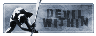
Old:

New:

Very nice ..
However, if you look hard enough, there's always something wrong with a signature. Here we go:
The first one is very plain, and the colors aren't really catching my eyes. It's very dark (in a literal sense), so maybe try putting some light sources here and there. You could definitely do something on the right side of the signature; just adding random shit in there like a vector or some pen tool work really makes the signature alive. Also, some more colors wouldn't have hurt. Maybe it was the quality of the render that limited your options, I'm not quite sure. If you can, try randomizing colors w/ gradients for a backround, not just using the color picker or using the render as the backround.
The spider man one really caught my eye, because the flow was absolutely gorgeous. I like how it looks like he's exploding right out of the ground, much less the signature. I still don't know how to do that man, and you pulled it off quite nicely. However, when I look around the rest of the signature, it's completely blank. There's too much negative space on the left and the right of the signature. Once again, we can always put some random images or vectors, and if you'd like a challenge, using the pen tool. Other than that, it is a very good signature.
(By the way, what program do you use?)
Love the Ermac one JAGO did, but I dont like the mavado one at all.
Sig I just saw from KARATE is also pretty awsome, only thing wrong with it is that I cant see the render clearly enough, thats all.
Ulcatrons signatures would be better if they werent monotone.
Love the spiderman sig from MK007
And I think devil withins origonal is better than his "improved version"
Ive tried making signatures today, all were shite so I deleted them, it seems after trying to make a perfect image for predator I have become somewhat of a perfectionist...unless I make a signature that I believe IS TOTALY AWSOME im just not going to keep it.....Im still trying to make an image out of the picture of PREDS cuz, but im having so much trouble, Ive picked just the right FUCKING TIME to have a "dry spot" in GFX.
xtactics Wrote:
Guess who made Pr0d1gy's new sig!
I'm so proud. Why? Cause he actually likes it this time!
And that sig is sex, btw.
Guess who made Pr0d1gy's new sig!
I'm so proud. Why? Cause he actually likes it this time!
And that sig is sex, btw.
I dont like it.
Spoilers: (Highlight to reveal)
I LOVE IT
I LOVE IT
UlcaTron Wrote:
Thanks muchos prod! me in wuv with it!

Your welcome...you deserved it. Glad you like it btw.Thanks muchos prod! me in wuv with it!


About Me

MK Online Featured User 31/3/2010 12/4/2011
-----------------------Gifts-----------------------
Shinnok-fan64 - s3Kt0r
0
skinsley Wrote:
I think devil withins origonal is better than his "improved version"
I think devil withins origonal is better than his "improved version"
I'm just try new stuff out like using grunge brushs and other stuff I uselly don't do in photoshop.
P.S. It's not improve version, it's remake
devilwithin Wrote:
I'm just try new stuff out like using grunge brushs and other stuff I uselly don't do in photoshop.
P.S. It's not improve version, it's remake
skinsley Wrote:
I think devil withins origonal is better than his "improved version"
I think devil withins origonal is better than his "improved version"
I'm just try new stuff out like using grunge brushs and other stuff I uselly don't do in photoshop.
P.S. It's not improve version, it's remake
Why would you remake it if your not going to make improvemtns?
and yes the older one is much better. I like the clash btw.
About Me

0
About Me
My tastes have changed since I created this account over 4 years ago. I prefer being called Siklootd and now love heavy metal music. 

0
I've been gone forever man, but here's my latest sig, I just felt like making a sig since it's been a while:


About Me
0
MK2007 uses Photoshop CS2 I think.
Anyway, I don't really like the Doom one much but the Spiderman sig is great. Nice colors and shapes.
btw Devilwithin, the older one looks better.
Anyway, I don't really like the Doom one much but the Spiderman sig is great. Nice colors and shapes.
btw Devilwithin, the older one looks better.

0
© 1998-2026 Shadow Knight Media, LLC. All rights reserved. Mortal Kombat, the dragon logo and all character names are trademarks and copyright of Warner Bros. Entertainment Inc.


