
0
DevilJin Wrote:
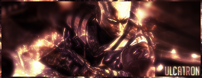
yea its alright definatly not your best.
i like that border how'd you make it
resonse at sweet tooth looks like your other cyrax sig but alittle bit darker
UlcaTron Wrote:
Eh..
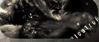
Eh..
yea its alright definatly not your best.
i like that border how'd you make it
resonse at sweet tooth looks like your other cyrax sig but alittle bit darker
What other Cyrax sig?


0

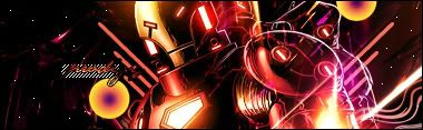
Arctic Wrote:
For Dragon En3rgY...

For Dragon En3rgY...
FUCKIN GIFT THREAD.
Sweetooth's Cyrax sig is pretty awsome...one of his best.
Ulcatrowls sig seems a little average, why do you keep doing B/W ? it does look good though.
Prod1gy's sig is amazing, that style definatly suits the render.

About Me
My tastes have changed since I created this account over 4 years ago. I prefer being called Siklootd and now love heavy metal music. 
Long live heavy metal music!
0
Here's my newest sig:

About Me

0
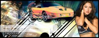
this was a request from somebody . my newest sig .


About Me

MK Online Featured User 31/3/2010 12/4/2011
-----------------------Gifts-----------------------
Shinnok-fan64 - s3Kt0r
0
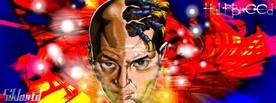
KARATE Wrote:
Devilwithin,I like that sig alot. I dunno how you make your sigs with designed borders like you do but its your style and it works out nicely. For advice with text,If you could find a way to make a clipping mask,then that would be my best advice. Ask Ulcatron,Hes really good with text now.
Devilwithin,I like that sig alot. I dunno how you make your sigs with designed borders like you do but its your style and it works out nicely. For advice with text,If you could find a way to make a clipping mask,then that would be my best advice. Ask Ulcatron,Hes really good with text now.
Thanks, I try clipping mask and I see if Ulcatroncan help as well


About Me

0
Paper Mario
0
UlcaTron Wrote:
eww...
eww...
How do you make borders that are only half way around?
0
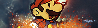
Hikari715 Wrote:
Paper Mario
Paper Mario
thats hot shit right there
0
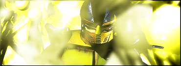
Eh, the Havik one's decent.
The other one is awesome. Very cool. Nice effects.
The other one is awesome. Very cool. Nice effects.
About Me
MK Online Featured User 31/3/2010 12/4/2011
-----------------------Gifts-----------------------
Shinnok-fan64 - s3Kt0r
0

About Me
MK Online Featured User 31/3/2010 12/4/2011
-----------------------Gifts-----------------------
Shinnok-fan64 - s3Kt0r
0
skinsley Wrote:
it looks cool, but the edges are a bit pixelated...and I can see the white background....with firefox ofcourse you cant see the white background, but some people dont use firefox.
it looks cool, but the edges are a bit pixelated...and I can see the white background....with firefox ofcourse you cant see the white background, but some people dont use firefox.
I'm not using firefox, I don't see white background and I saved it as PNG. I'll try to fix edge but I don't want it too blur.
UlcaTron Wrote:
it's ok but background is boring
About Me
My tastes have changed since I created this account over 4 years ago. I prefer being called Siklootd and now love heavy metal music.
Long live heavy metal music!
0
Here's my newest sig, I tried to give it a "hip hop" feel and match the text with that feeling. The background design came out pretty good IMO and overall I think this is one of my better sigs:

About Me
MK Online Featured User 31/3/2010 12/4/2011
-----------------------Gifts-----------------------
Shinnok-fan64 - s3Kt0r
0
sbdjuggalos Wrote:
Here's my newest sig, I tried to give it a "hip hop" feel and match the text with that feeling. The background design came out pretty good IMO and overall I think this is one of my better sigs:
Here's my newest sig, I tried to give it a "hip hop" feel and match the text with that feeling. The background design came out pretty good IMO and overall I think this is one of my better sigs:
I liked it.


0

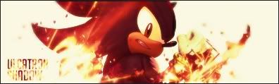
loved this very confusing movie
EDIT:

^lol i was jus messing around with brushes and thinking the whole time "would'nt this look cool if i did this..." i swear this shadow sig went from jus messing around not trying to make anything, to a cool looking sig
what are the odds of that?


© 1998-2026 Shadow Knight Media, LLC. All rights reserved. Mortal Kombat, the dragon logo and all character names are trademarks and copyright of Warner Bros. Entertainment Inc.