

About Me

0
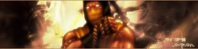
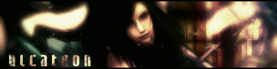
ok i havent posted a new one in a while .
heres my newest sig . i cut the pics out myslef .

heres my newest sig . i cut the pics out myslef .

About Me

MK Online Featured User 31/3/2010 12/4/2011
-----------------------Gifts-----------------------
Shinnok-fan64 - s3Kt0r
0

It's not final, I need to blur the edges more but I need help.
Does anyone know any good fonts that will look good with this?


0
That.. Shang tsung sig is amazing.
....
Amazing. Text could be better, but overall.... Freaking good.
....
Amazing. Text could be better, but overall.... Freaking good.

0
Sweet00th Wrote:
That.. Shang tsung sig is amazing.
....
Amazing. Text could be better, but overall.... Freaking good.
That.. Shang tsung sig is amazing.
....
Amazing. Text could be better, but overall.... Freaking good.
thanks man i kno that text sucks
About Me
0
nice . im feelin the shang sung one .


-Jago- Wrote:

WWWOOOOOOOOOWOWOWOWOWOWOWOWOWOWOWOWOWOWOWOWOWOWOWOWOWOWOWOOWO
WOW !!!!!

Not tryin to be modest or anything...but this is a piece of shit...remember I said I wanted you to be hard on me...but for fuck sake i cant make signatures for shit nowadays.
0

0
UlcaTron Wrote:
V1
V2
BW V3
Sorta ugly in BW.
V1
V2
BW V3
Sorta ugly in BW.
im feelin those man lovin the 1st one
btw don't be so hard on yourself your all like "thats ugly" they lookin good man everyone can agree that your sigs look great man


0
Attention everyone!
Its time for me to give you all some constructive criticism.
Lets see...
Bone,Im not really liking your Game sig. The rendors dont blend well with your background and its just to dark. I dunno what you have going across his chest and or the rendor on the left but it just doesnt look good man sorry. I like your stylwe with the Noob and Smoke sig you made. You should stick to that style but then maybe change it up a bit.
Devilwithin,I like that sig alot. I dunno how you make your sigs with designed borders like you do but its your style and it works out nicely. For advice with text,If you could find a way to make a clipping mask,then that would be my best advice. Ask Ulcatron,Hes really good with text now.
Deviljin,Well the Sonic sig is way to dark and you blurred his body and his hands but not his face,It didnt come out right. Now your Shang Tsung sig looks better but why is it so blurred out? I mean i see you were trying to blend him in but it just looks like you put the Shang rendor behind the blurred layer then just erased....As for the Shadow sig,Its better but you smudged his backside to much and used way to much blurring..Just keep practicing man. You will get better.
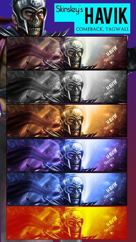
Jago,That Havik sig is AMAZING! I love the colors and flow. WAYYYY better than your Sareena sig. I cant wait till i get that good.
Ulcatron,Im happy to see you are still making sigs. I also noticve that sig has my name on it. It is for me right? Well, It is wonderful the lighting,the technique, everything. The only thing is you blurred the rendor to much. Maybe without that blur and a brightness and contrast adjustment it would of had more depth but still excellent man. As for the second one of the 3,I would say the first one. It has just the right lighting and i like the way the rendor blends so well. Excellent job.
Skinsley,You are my boy and you are a magnificent sig maker ( I cant believe what im about to say) but that sig is utter trash. Nothing is good about it. The text the blending just everything. You can do WAYYYY better then that. It looks like a copy and paste job. The design on the right just looks like a brush. and the rendor just doesnt match the background at all...
*hopes he doesnt get skulled for that*
Xtactics,Ok lets see....Well for one there is just to much text and i dont really like the text that you used either. I dunno what is going on at the bottom of your sig,but it just doesnt at all match the flow of the sig. You also made certain spots WAYY to bright and it just kills it for me man....Sorry. You can do so much better!
Ok now i would like to say a few words. Ok since you guys wanted constructive criticism and i just gave you my opinion of what i thought. Please dont hate me for telling you if i didnt like your newest sigs. I just want to see you all improve (not saying that i am a god of Sig making) but i know what i like and what i dont like and i have seen much better from a few of you and i have seen alot worse. So if you were offended im sorry and i wont say anything more.
p.s. I love you all.
*will post sig soon to get honest opinions*
As you were.
Its time for me to give you all some constructive criticism.
Lets see...
Bone,Im not really liking your Game sig. The rendors dont blend well with your background and its just to dark. I dunno what you have going across his chest and or the rendor on the left but it just doesnt look good man sorry. I like your stylwe with the Noob and Smoke sig you made. You should stick to that style but then maybe change it up a bit.
Devilwithin,I like that sig alot. I dunno how you make your sigs with designed borders like you do but its your style and it works out nicely. For advice with text,If you could find a way to make a clipping mask,then that would be my best advice. Ask Ulcatron,Hes really good with text now.
Deviljin,Well the Sonic sig is way to dark and you blurred his body and his hands but not his face,It didnt come out right.
Jago,That Havik sig is AMAZING! I love the colors and flow. WAYYYY better than your Sareena sig. I cant wait till i get that good.
Ulcatron,Im happy to see you are still making sigs.
Skinsley,You are my boy and you are a magnificent sig maker ( I cant believe what im about to say) but that sig is utter trash. Nothing is good about it. The text the blending just everything. You can do WAYYYY better then that. It looks like a copy and paste job. The design on the right just looks like a brush. and the rendor just doesnt match the background at all...
*hopes he doesnt get skulled for that*
Xtactics,Ok lets see....Well for one there is just to much text and i dont really like the text that you used either. I dunno what is going on at the bottom of your sig,but it just doesnt at all match the flow of the sig. You also made certain spots WAYY to bright and it just kills it for me man....Sorry. You can do so much better!
Ok now i would like to say a few words. Ok since you guys wanted constructive criticism and i just gave you my opinion of what i thought. Please dont hate me for telling you if i didnt like your newest sigs. I just want to see you all improve (not saying that i am a god of Sig making) but i know what i like and what i dont like and i have seen much better from a few of you and i have seen alot worse. So if you were offended im sorry and i wont say anything more.
p.s. I love you all.
*will post sig soon to get honest opinions*
As you were.
0
-Jago- Wrote:
that sig is ridic!(in the good way obv.) i love it!!!!!!

0
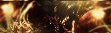
A couple of new ones.
This one is for the Sig of the Week challenge. Not fond of it all, but oh well:

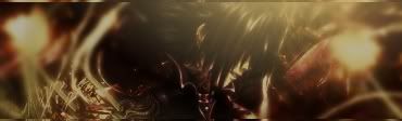
And this one was just for fun:

This one is for the Sig of the Week challenge. Not fond of it all, but oh well:
And this one was just for fun:
Love the lu lu one PR just made its pretty.
Ulca that top one is AWSOME, but your using that render a little much..let it rest and use it again some other time, mix and match skippy, mix and match.
I dont know whats happenin too me recently, but im gonna have to try and make a good sig soon, Ive lost all abilities completely. BAH.
Im gonna Skull KARATE anyway though, just for the hell of it , and its not a brush in that edge, I dont know why I did that piece of shite anyway.
Ulca that top one is AWSOME, but your using that render a little much..let it rest and use it again some other time, mix and match skippy, mix and match.
I dont know whats happenin too me recently, but im gonna have to try and make a good sig soon, Ive lost all abilities completely. BAH.
Im gonna Skull KARATE anyway though, just for the hell of it
0
KARATE Wrote:
Attention everyone!
Its time for me to give you all some constructive criticism.
Lets see...
Bone,Im not really liking your Game sig. The rendors dont blend well with your background and its just to dark. I dunno what you have going across his chest and or the rendor on the left but it just doesnt look good man sorry. I like your stylwe with the Noob and Smoke sig you made. You should stick to that style but then maybe change it up a bit.
Devilwithin,I like that sig alot. I dunno how you make your sigs with designed borders like you do but its your style and it works out nicely. For advice with text,If you could find a way to make a clipping mask,then that would be my best advice. Ask Ulcatron,Hes really good with text now.
Deviljin,Well the Sonic sig is way to dark and you blurred his body and his hands but not his face,It didnt come out right. Now your Shang Tsung sig looks better but why is it so blurred out? I mean i see you were trying to blend him in but it just looks like you put the Shang rendor behind the blurred layer then just erased....As for the Shadow sig,Its better but you smudged his backside to much and used way to much blurring..Just keep practicing man. You will get better.
Jago,That Havik sig is AMAZING! I love the colors and flow. WAYYYY better than your Sareena sig. I cant wait till i get that good.
Ulcatron,Im happy to see you are still making sigs. I also noticve that sig has my name on it. It is for me right? Well, It is wonderful the lighting,the technique, everything. The only thing is you blurred the rendor to much. Maybe without that blur and a brightness and contrast adjustment it would of had more depth but still excellent man. As for the second one of the 3,I would say the first one. It has just the right lighting and i like the way the rendor blends so well. Excellent job.
Skinsley,You are my boy and you are a magnificent sig maker ( I cant believe what im about to say) but that sig is utter trash. Nothing is good about it. The text the blending just everything. You can do WAYYYY better then that. It looks like a copy and paste job. The design on the right just looks like a brush. and the rendor just doesnt match the background at all...
*hopes he doesnt get skulled for that*
Xtactics,Ok lets see....Well for one there is just to much text and i dont really like the text that you used either. I dunno what is going on at the bottom of your sig,but it just doesnt at all match the flow of the sig. You also made certain spots WAYY to bright and it just kills it for me man....Sorry. You can do so much better!
Ok now i would like to say a few words. Ok since you guys wanted constructive criticism and i just gave you my opinion of what i thought. Please dont hate me for telling you if i didnt like your newest sigs. I just want to see you all improve (not saying that i am a god of Sig making) but i know what i like and what i dont like and i have seen much better from a few of you and i have seen alot worse. So if you were offended im sorry and i wont say anything more.
p.s. I love you all.
*will post sig soon to get honest opinions*
As you were.
Attention everyone!
Its time for me to give you all some constructive criticism.
Lets see...
Bone,Im not really liking your Game sig. The rendors dont blend well with your background and its just to dark. I dunno what you have going across his chest and or the rendor on the left but it just doesnt look good man sorry. I like your stylwe with the Noob and Smoke sig you made. You should stick to that style but then maybe change it up a bit.
Devilwithin,I like that sig alot. I dunno how you make your sigs with designed borders like you do but its your style and it works out nicely. For advice with text,If you could find a way to make a clipping mask,then that would be my best advice. Ask Ulcatron,Hes really good with text now.
Deviljin,Well the Sonic sig is way to dark and you blurred his body and his hands but not his face,It didnt come out right.
Jago,That Havik sig is AMAZING! I love the colors and flow. WAYYYY better than your Sareena sig. I cant wait till i get that good.
Ulcatron,Im happy to see you are still making sigs.
Skinsley,You are my boy and you are a magnificent sig maker ( I cant believe what im about to say) but that sig is utter trash. Nothing is good about it. The text the blending just everything. You can do WAYYYY better then that. It looks like a copy and paste job. The design on the right just looks like a brush. and the rendor just doesnt match the background at all...
*hopes he doesnt get skulled for that*
Xtactics,Ok lets see....Well for one there is just to much text and i dont really like the text that you used either. I dunno what is going on at the bottom of your sig,but it just doesnt at all match the flow of the sig. You also made certain spots WAYY to bright and it just kills it for me man....Sorry. You can do so much better!
Ok now i would like to say a few words. Ok since you guys wanted constructive criticism and i just gave you my opinion of what i thought. Please dont hate me for telling you if i didnt like your newest sigs. I just want to see you all improve (not saying that i am a god of Sig making) but i know what i like and what i dont like and i have seen much better from a few of you and i have seen alot worse. So if you were offended im sorry and i wont say anything more.
p.s. I love you all.
*will post sig soon to get honest opinions*
As you were.
alright thanks man for tell me now i can take your critisism and make my sigs look better.
i kno i fucked up with shadow didnt mean to do that much smugding to him in the back. i smudged him so that he would blend in a little but that didnt work out so well
i jus dont know wtf i was doing with sonic
and for shang tsung, you know how he like descentagrate alot in the game when ppl beat him and he turns young to old alot? i tried to give it that sort of feel but i guess i messed up
thanks again for the advice man im gonna keep trying and someday im gonna be good as ulcatron or anyone else that uses GIMP every well
About Me
0
heres my newest one . its my sotw .


0
-Jago- Wrote:
O-M-G
Can I have one?....Ever? lol Geeze that's nice.


© 1998-2026 Shadow Knight Media, LLC. All rights reserved. Mortal Kombat, the dragon logo and all character names are trademarks and copyright of Warner Bros. Entertainment Inc.