About Me
0
The Afro one is good, skins. The abstract one is great especially the colors but I personally think its a bit too chaotic for me.
My Kyosuke one (Trying a new style) I personally like it alot.

My Kyosuke one (Trying a new style) I personally like it alot.

skinsley Wrote:
Hmmm... personally, that Jennifer one is the best out of those.
The abstract CD4 renders one is just too messy.. some things don't match for me. You did an absolutely beautiful one for a SOTW a long time ago.. that one worked well for me.
AFROSAMURAI signature looks great mate, but it's really nothing much else after the smudging around him.
You already know where I stand on the Deathman sig.
So A Powerful Creature signature takes 2nd place.
You're coming back to it, but I know you can floor me with better sigs. I know it.

0

i already know X is gonna kick my ass with the criticism lol, but i like this one personally. i looks so different then what i usually make. i would normally go for dark look with a little color in it but this one has nice bright colors.
0
wow... the talent ppl have and the level they reached never ceases to amaze me!!!!
DevilJin Wrote:

i

i
Absolutely tip top notch there mate.
I would only remove the text and try and put some text somewear in the left of the Sig.
The use of Dark Space is brilliant...probably the best use of it I have seen in a while....but with the text over the Dark space...its just no longer Dark space. So remove that and find somewear else for it...and you will have an ultimate sig.

0
thanks man it took me awhile to make it. hmm move the text? i might if i get the chance. i might completely remove the text just to see what it would look like.
man i been looking at that render of iori for awhile and i knew exactly how i would have him in the sig but i could never find a good background to make it look like he was actually getting warped into a wormhole.
well thanks for the advice, now all i need to do is wait for Xtactics to take a look at it and get hella criticized
DevilJin Wrote:


Well, like skinsley said, great job. It's much better than all the other ones you've done.
HOWEVER.
(you saw this coming, didn't you?
I know that particular C4D you used.. and other than that, there's nothing else noticeable in the sig. Try to use your C4D's sparingly... and try not to make it so obvious that it's in your signature.
If you have no idea what I'm talking about, ask the other signature makers on here what I'm talking about.
That sig = 7/10. You're getting better.
Now, for my shit. (and I do deduce, literal shit. I'm still going to wear it. heh)

Thats probably the best sig I have seen from you.
The text is brilliantly done, the lighting works so well, and the way you used the pentool to make those lines is just brilliant.
Not to mention the smudge around Altaír...I might even say its flawless.
The text is brilliantly done, the lighting works so well, and the way you used the pentool to make those lines is just brilliant.
Not to mention the smudge around Altaír...I might even say its flawless.

0
xtactics Wrote:
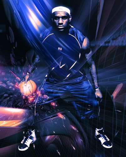
it looks cool, as a "clevelander" myself i love that you used king james
my ultimate question is how many C4Ds do you have saved on you computer?!?! it looks like you used like 10 of them. still looks cool though

0
xtactics Wrote:
I used 2 lol.
I used 2 lol.
wow that fooled me easy it seems like you used a lot.
and about your new sig it looks pretty weird on the left side. i dont know what it is but i just dont like the left side of it. but other then that its decent. not really good but at least its not terrible
About Me
0
Not bad for your first LP, X. The blending on the left side is nice but get rid of the purple c4d part at the top right because it doesn't really go with the flow imo. Still better than my crappy Hayden one (The concept pretty much screwed up imho).
About Me
0

Something I created with this interesting render.
0
I know my signature didn't take a genius to make... but is it at least something?
I
I
I
V
I
I
I
V
0
2L84ME Wrote:
Your signature sucks. There isn't enough blue or green. Absolutely ridiculous.
1/10

Your signature sucks. There isn't enough blue or green. Absolutely ridiculous.
1/10
you don't even have a signature... i wouldn't be talking. and not to mention, if you've been paying attention, this thread is for showing off, not raiting them
© 1998-2026 Shadow Knight Media, LLC. All rights reserved. Mortal Kombat, the dragon logo and all character names are trademarks and copyright of Warner Bros. Entertainment Inc.


