


About Me
My tastes have changed since I created this account over 4 years ago. I prefer being called Siklootd and now love heavy metal music. 
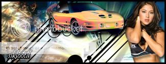
Long live heavy metal music!
0
MINION Wrote:
I love all these 3D images you've been doing lately man, they're crazy!


About Me

0


0
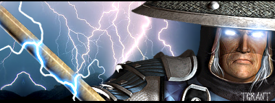
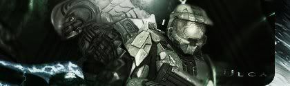
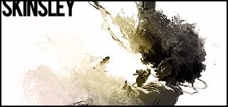
I should've kept this, but I like and respect TGrant. I really like this sig though.
I seem to be giving him the best stuff I've made in a while...haha I really like this one too.
0
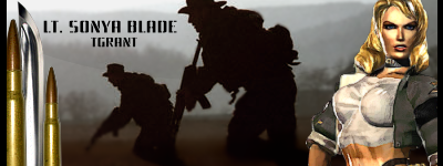
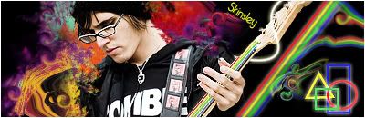
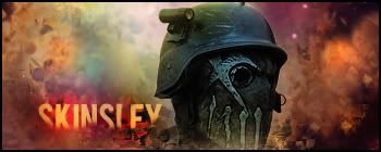
I don't know if I like this one as much as the last two. It's a little more complicated, but I think it still looks good. hm...Made the bottom border transparent on purpose out of experimentation....
This one is for TGrant too btw.

0
ThePredator151 Wrote:
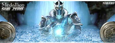
I don't know if I like this one as much as the last two. It's a little more complicated, but I think it still looks good. hm...Made the bottom border transparent on purpose out of experimentation....
This one is for TGrant too btw.
I don't know if I like this one as much as the last two. It's a little more complicated, but I think it still looks good. hm...Made the bottom border transparent on purpose out of experimentation....
This one is for TGrant too btw.
i like this one alot more then your other

Can one of you guys throw me a CS3 torrent ?...send it me through PM if you can, Im sure your not allowed to do that on the forum.
Thanks a bunch...i tried getting it myself but all the torrents I got were fakes and I just deleted them in anger.
Thanks a bunch...i tried getting it myself but all the torrents I got were fakes and I just deleted them in anger.
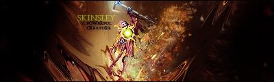
skinsley Wrote:
Can one of you guys throw me a CS3 torrent ?...send it me through PM if you can, Im sure your not allowed to do that on the forum.
Thanks a bunch...i tried getting it myself but all the torrents I got were fakes and I just deleted them in anger.
Can one of you guys throw me a CS3 torrent ?...send it me through PM if you can, Im sure your not allowed to do that on the forum.
Thanks a bunch...i tried getting it myself but all the torrents I got were fakes and I just deleted them in anger.
OH FUCK.
I TOTALLY FORGOT MATE.
Shitshit... talk to me on MSN.
NOW!!!!!!!!!!!!!!!!!!!!!!!!!!!!!!!shift+11111111
UlcaTron Wrote:
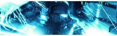
Yeaahh.
Yeaahh.
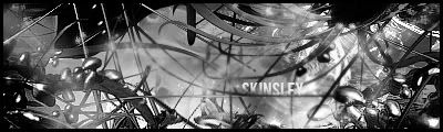
Hmmm... good sig. Some things that are bothering me:
#1 The gradient you used. It looks nice, but overtime, people tend to overkill the gradient feature by only using two colors. Try adding different colors to gradients + to your sigs, so the minimal amount of colors in your sigs is limited to 4
#2 The feel of your signature... it appears a little... rough, shall I put it? Don't get me wrong, I like the lines you've got going on in the backround of the sig... but other than that, I don't see very much else. The border being white also hurts the signature a little (for me), but it's nothing to exaggerate on.
#3 Lastly, the text. Clipping masking is great.. but don't over do it (see #1). The C and A are blended in too well with the backround. Try adding shadows (you can even add a small light source to give it a "glint"), and then skewing the text so it "flows."
All in All, I'll give this about a 6.5/10.... 7, being generous.
You can do better. I know it.
DevilJin Wrote:
i havent made a sig in awhile due to a gay virus on my computer.
heres a new quicky one to see if i still knew what i was doing:

i havent made a sig in awhile due to a gay virus on my computer.
heres a new quicky one to see if i still knew what i was doing:
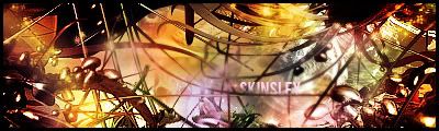
Hmmm..
I don't really like the text. It's too small and it hurts my eyes (and not because I'm asian, lol). The colors are great..... until you notice that green light at the bottom of the sig. Is that supposed to be lighting? I don't like it, personally. The signature itself is very rough, it looks like you overused one of those bloody effects that I can't seem to remember. Other than that... it's below average. What kills it (for me) is that the other two sides of the canvas are just pitch black. Don't do that unless you're working with a sprite sig (See MK2007's Spider-Man sig), or unless you're just really fucking incredible.
5/10.
NOW.
I've been working on some signatures, I want you all to assfuck me (not literally, please, figuratively) with comments and criticism. I'm going to try to give my input from here on in. Alright, bring the pain.


Let's go.
About Me
0
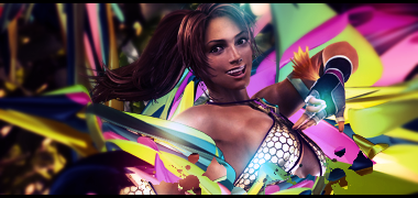
^ That football one is awesome.


^ I didn't realize the quality of the Sora stock was bad until I sharpened it, had to erase his face with a low opacity due to the grittyness-ish.
^ I didn't realize the quality of the Sora stock was bad until I sharpened it, had to erase his face with a low opacity due to the grittyness-ish.
0


0
xtactics Wrote:
I've been working on some signatures, I want you all to assfuck me (not literally, please, figuratively) with comments and criticism. I'm going to try to give my input from here on in. Alright, bring the pain.
.
I've been working on some signatures, I want you all to assfuck me (not literally, please, figuratively) with comments and criticism. I'm going to try to give my input from here on in. Alright, bring the pain.
.
hmm criticism eh?
well the only sig out of all of them that bugged me was ^^this^^ one, the effects look really weird and kinda pixelated or something. it woulda been cool if they were nice and smooth but they look really jagged.
oh and thanks for the criticism on my sig i havent had one of my sigs criticized in a while. i been trying to get the blank side thing to look good like what hikari does sometimes for awhile but i havent gotten it to work yet
Hikari715 Wrote:
^ That football one is awesome.
^ I didn't realize the quality of the Sora stock was bad until I sharpened it, had to erase his face with a low opacity due to the grittyness-ish.
^ That football one is awesome.
^ I didn't realize the quality of the Sora stock was bad until I sharpened it, had to erase his face with a low opacity due to the grittyness-ish.
The top one looked like you had it right on the button...then added some more things and runied it...its a little pixelated you see.
The bottom one is alright, but I myself tried to use that effect myself and it realy isnt a good look for a sig...especialy if you use it too many times....your best using that effect to twirl an object a little bit...but only a little bit as a little almost un noticed effect.
About Me
0
Thanks for the criticism skins. Probably should have not used the dissolve dots thing and lowered the opacity on the sharpened layer. :\
For the Sora one I admit it's overused. The twirl tool is actually a favorite of mine but yes sometimes it doesn't look good in sigs.
EDIT: My first LP(ish) art.

For the Sora one I admit it's overused. The twirl tool is actually a favorite of mine but yes sometimes it doesn't look good in sigs.
EDIT: My first LP(ish) art.
Thats HOT Hik.
Ok ive been away WAAAHAAAAY TOOO LOOOWNG!
On route to making sigs again I made this, Half arsed attempt at a sig.
Which is not all that good ofcourse......So back to the drawing board...I made this.

Ok....But no skinsley...just no
So then this.

Alrighty were getting the swing of things again.
BANG!
I AM BACK PEOPLE, And hopefully for good.!!!
Ok ive been away WAAAHAAAAY TOOO LOOOWNG!
On route to making sigs again I made this, Half arsed attempt at a sig.
Which is not all that good ofcourse......So back to the drawing board...I made this.
Ok....But no skinsley...just no
So then this.
Alrighty were getting the swing of things again.
BANG!
I AM BACK PEOPLE, And hopefully for good.!!!


© 1998-2026 Shadow Knight Media, LLC. All rights reserved. Mortal Kombat, the dragon logo and all character names are trademarks and copyright of Warner Bros. Entertainment Inc.