

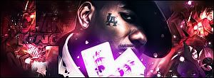
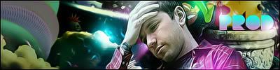
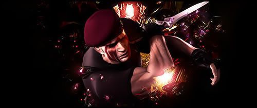
About Me

0
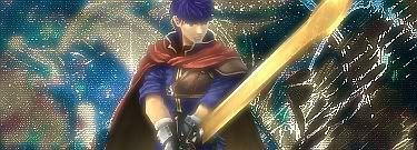
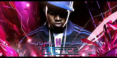
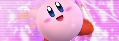
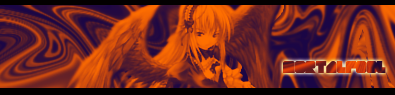
My latest sig......
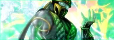


0
prodigy004 Wrote:
Good for you. Your sigs still suck.
I dont like the game btw lol, i just wanted to try something different.
redman Wrote:
Thanks, X. I use CS3. Nice sig too, btw.
Thanks, X. I use CS3. Nice sig too, btw.
Good for you. Your sigs still suck.
I dont like the game btw lol, i just wanted to try something different.


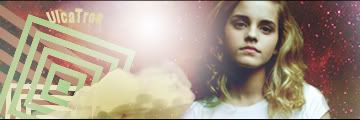
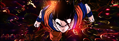
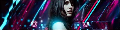
About Me
0
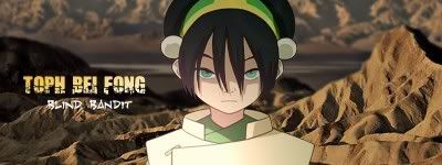
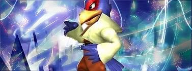
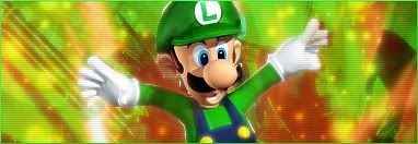
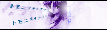
My latest.......the Sonic and Link sigs are gifts for people on another site.
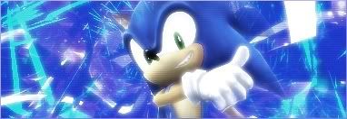
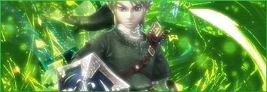

About Me

0
Shinfan, you really are improving- the Link and Sonic ones are the best out of those. Just a tip- if you sometimes think the gaussian blur is a wee too much on certain parts (Ex- the render's face or tparts are too shiny, etc), you can lower the opacity of the layer or erase the unwanted parts with an eraser on low opacity.
I suggest erasing on Link's face (50 opacity for the eraser preferably; I just think the blur didn't look good on his face) but overall nice job.
I suggest erasing on Link's face (50 opacity for the eraser preferably; I just think the blur didn't look good on his face) but overall nice job.
About Me
0
thanks Hik, yeah i noticed that especially on the Link one after i finished and saved it.

0

>_<
0
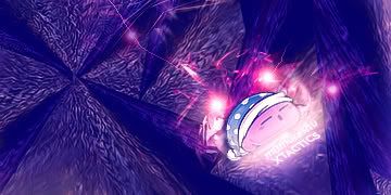
wow MINIOR... ur a total pimp @ fractals and that effect i dont even kno what u call it...
the Volume Roller Coaster is my fav.
the Volume Roller Coaster is my fav.


0
I think I just "sharted". haha
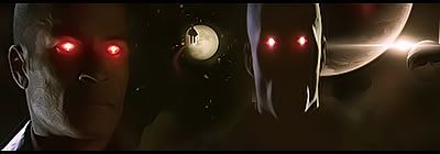
Currently:
MINION, Pr0d1gy, Xtactics, aaand Hikari.....we need to discuss your "secrets".......right -- now. Lol!
I don't know how the hell you guys are doing what you do, but I fuckin love it.
I won't even lie though, some of the shit you guys pull make me re-evaluate what I do.... I'm alright at manipulating stuff that's already there, but there's "n0 wai 1n h3llz" I can figure out what to do to make anything remotely close to what you guys are doing. aheh, Kinda erks me cuz I've spent crazy hours in both PsCs2 and PhotoImpact10, and I'm not where I think I should be, at making things "from scratch" like you guys do. So....
I think a "problem" when I work in PsCs2 is, I end up with like 1000 layers. lol Just saying it gets confusing, and I don't wanna "Merge" a punch of stuff out of skepticism.
(Ex. 1):
"Background Manipulation" all done in PhotoImpact10.
(Ex. 2):

Collaboration between PI10 & PsCs2.
(Ex. 3):
From Scratch all done in PsCs2.
Although, I really don't remember what I did to make them look like they do, I can't figure out what I'm not doing to give them better effects from scratch. hahaha. "Delema".
I guess, the only question I would have after all this ^^ is:
What are some of the things you guys see that are obviously "wrong" about the pictures I make?
1. The placement of things? Render, text, background elements?
2. Text? (like nobody ever has that problem.)
3. Blending? (smudge, blur, ect)
4. Clarity of the overall sig, Or the effects that make the overall picture "pop". (Like lighting.)
5. All the other stuff I'm not mentioning? Like "stars", glow effects and vector style effects.
Brutal honesty is what I give, so brutal honesty is what I expect from anyone who answers this question at all. Straight up.
idk.
lol
later.
________
Oh yea, ShinFan's making improvements very nicely....So is RedMan. Nothing in particular, just the overall look of you guys' sigs are getting much Much better.
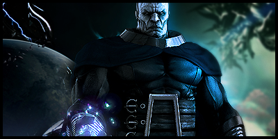
0
MINION Wrote:
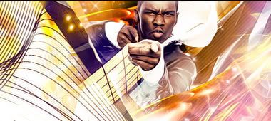
I love Apocalypse! Great job on all of em bro.
I been doing alot of LARGE CANVAS, Here are links to my recent stuff.
1
2
3
4
5
6
7
New piece coming soon.
prodigy004 Wrote:
I love Apocalypse! Great job on all of em bro.
I been doing alot of LARGE CANVAS, Here are links to my recent stuff.
1
2
3
4
5
6
7
New piece coming soon.
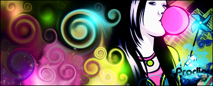
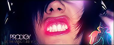
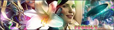
About Me
0
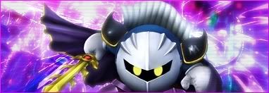
My latest sigs..... all of these BUT THE METAKNIGHT sigs are gifts to people on another site.
About Me
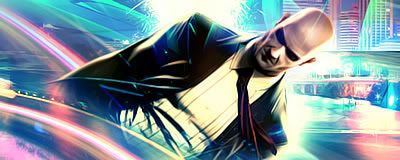
I need a new sig, something with Kabal from UMK3 would be sweet. Just imagine that here
0
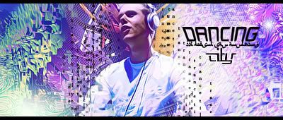
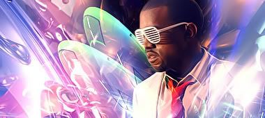
I'm wearing my newest sig, please rate.


ThePredator151 Wrote:
There's never a wrong way to make a signature bro! Truth be told, I actually love the way you can collaborate pictures and manipulate renders and backrounds, etc. Your text, render placement, lighting: basically all your methods are perfect, in my eyes at least. (I Hope that means something to you lol) Some people just have different approaches to making sigs, or different programs. Doesn't mean that your artwork is sub-par, it just means that your style is different.
Granted, some things may be more appeasing to the eye, but so what? If you feel comfortable doing what you do, then god forbid me to tell you anything is "obviously wrong" with what you're doing. It's awesome! I consider you a certified signature maker. You can't tell me shit, haha, I still think everyone here tops me.
Regarding MINION's work
Fuck you. HAHA. No I'm just kidding, bro. I know I tell ya over and over again that you're abso-fucking-lutely awesome in creating depth with your signatures. That Color one is really nice man, very nice.
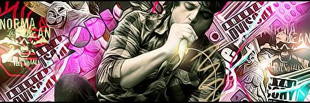
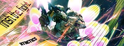
I tried a few things with these 4 here, tell me what you think guys.

I'm starting to feel as though I'm slipping away. C&C Guys.
Also, I tried my hand at fractals. This is what I got:


0
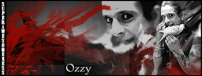
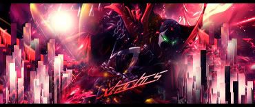
I'm wearin' my newest sig. If anyone asks, Rampage is about a triad of irradiated monsters annihilating all of the world's major cities. I tried a smudging effect on the logo to make it look like it's shaking. Any comments?
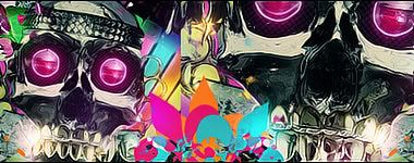
About Me
0
Another sig with another use of layer adjustments, gradients and brushing set on linear dodge... Also another vertical one...

X your fractal looks like it could be almost the same as MINIONS....like you used the same technique....but MIN added some smoothing effects to get it they way he has it.
Bah its too complicated.....It looks realy good though, all your latest are awsome.....really awsome.
Bah its too complicated.....It looks realy good though, all your latest are awsome.....really awsome.
0

New ones.
On a side note I was looking on the previous page and I saw that shit that MINION did.....omg, thats some awesome shit dude seriously. AMAZING. Nice work man.


© 1998-2026 Shadow Knight Media, LLC. All rights reserved. Mortal Kombat, the dragon logo and all character names are trademarks and copyright of Warner Bros. Entertainment Inc.