


skinsley Wrote:
Its so true Dev, its so so true.
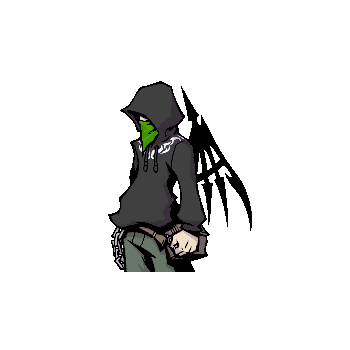
And Vash, the one you are using is the best...its good to keep similar colours but make sure you can see the render aswell, again you begun your sig but then stopped at the beggining....to make good signitures you have to elaborate on what you already have.
Its so true Dev, its so so true.
And Vash, the one you are using is the best...its good to keep similar colours but make sure you can see the render aswell, again you begun your sig but then stopped at the beggining....to make good signitures you have to elaborate on what you already have.
I don't get it, what more can I do? I felt like I finished. I mean, I'm not sure what else I can do with it. And keep in mind before you make a suggestion, I use GIMP not Photoshop, so I might not be able to do some of the stuff you may recommend.


0
I think what Skins means is that you should keep testing on different effects, lighting, colors and things like that even though you feel like the sig is done. The further you can go in a sig (or any art) the better it'll turn out.
I know exactly what Skins is saying because it happens to me all the time. I'd get pretty far within a sig and think that I was done when I could do a lot more to it.
Check this out for example:
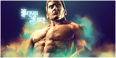
I still remember when I was making my Bryan sig and I remember getting stuck at one point. I was actually about to give up and post the sig looking like this:

Now we all know that's not a finished sig, or a remotely good looking one, so I stopped being lazy (not saying you are) and continued seeing how far I could go with it.
I knew the colors were bad and didn't look good so I started with that and got this:

Looks a little better right? So after messing around with the brightness and contrast some, added a couple little effects to let the focal stand out a little more, and threw in some nice text with a border I got my final product:
I hope this helped some. Oh and one more thing. Can you post the render you used in your latest sig for me?
I know exactly what Skins is saying because it happens to me all the time. I'd get pretty far within a sig and think that I was done when I could do a lot more to it.
Check this out for example:
I still remember when I was making my Bryan sig and I remember getting stuck at one point. I was actually about to give up and post the sig looking like this:
Now we all know that's not a finished sig, or a remotely good looking one, so I stopped being lazy (not saying you are) and continued seeing how far I could go with it.
I knew the colors were bad and didn't look good so I started with that and got this:
Looks a little better right? So after messing around with the brightness and contrast some, added a couple little effects to let the focal stand out a little more, and threw in some nice text with a border I got my final product:
I hope this helped some. Oh and one more thing. Can you post the render you used in your latest sig for me?
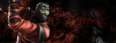
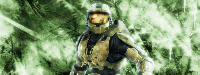
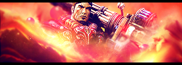
THanks, and yeah, sure, It's an editied Reaper render from The World Ends with you, just palette swapped it to match my personal color scheme. And I took of the text from the arm. The original is here first in the row second from the bottom.

About Me

MK Online Featured User 31/3/2010 12/4/2011
-----------------------Gifts-----------------------
Shinnok-fan64 - s3Kt0r
0


About Me

0
DevilJin Wrote:
Even though it's apparently an old one, it's still fucking superb man. Great job.


Gimp has similar tools to photoshop, ok PS is the superior programme but Gimp has the potential to make just as good/better sigs if in the right hands.
The sig you have made is too flat, try darkening the sides...the most simple way is a new layer, black brush and opacity change....I am sure GIMP can do these things, the lastest 2 sigs have not been as good as the current one you are using, MewTwo is blended into the background so much that it looks like it is the background, now im just thinkin up ideas here but maybe have a layer between the render and the background and add some effects...sort of like the Tekken sig that Dev just showed you.
You know good basics such as using ONE render in an image unless requested otherwise ( so as to have ONE focal point ), using similar colours and all that jazz so you are definatly on the right track.
One more little idea that you might wanna try is...coppy the image in its own layer and totaly fuck it up with whatever effects you can use...then erase parts, this way you are still using the same colour scheme.
And to edit your colour scheme a tad use colour balances/ fill a layer with a colour and then lower the opacity or set the layer type.
I think you can do very well, ofcourse you dont have to take my advice but theres alot of tutorials online you can follow....practice someone elses techniques then make up your own.....just talking about it is making me wanna have a little go and try and get back into it again
Meh, I don't like tutorials, and I made this one in a few minutes, but I like how it turned out. Maybe because I've been seeing too much softglow that some darkness really turned on the eyes.
Not too many effects, but I didn't really want to overdo it. I felt like seomthing simple can be soemthign good, so I left it as is. Currently working on some with more pizzaz
Not too many effects, but I didn't really want to overdo it. I felt like seomthing simple can be soemthign good, so I left it as is. Currently working on some with more pizzaz
I love it, good blend of light and darkness, and colour and the text is pretty good aswell.
It does not look too much different to the others but the fact this one has black where the other one was white its a hell of a better difference.
Alot better than your current....I say use it.
It does not look too much different to the others but the fact this one has black where the other one was white its a hell of a better difference.
Alot better than your current....I say use it.
Yeah same, the render realy looks infront of its background, and the background looks 3D itself.
Ofcourse using the same style each time is a no no, but for starting off perfecting it is a good way of geting a feel for things, once things like this become 2 minuite simple jobbies you will be able to learn a few more things.
I tried to make a sig last night.....it was not good...deleted it and will try again another day im not very patient lately.
Ofcourse using the same style each time is a no no, but for starting off perfecting it is a good way of geting a feel for things, once things like this become 2 minuite simple jobbies you will be able to learn a few more things.
I tried to make a sig last night.....it was not good...deleted it and will try again another day

HATE that guy to no end, but it's a good sig man.
Here's the only decent one I did at school, I forgot renders so I could only use the ones that the school didn't block, that didn't leave much. This was THE ONLY decent render available. So yeah, step backwards I know, but darkness just didn't do it for MC, and I feel it works if the render itself is in 3D
Here's the only decent one I did at school, I forgot renders so I could only use the ones that the school didn't block, that didn't leave much. This was THE ONLY decent render available. So yeah, step backwards I know, but darkness just didn't do it for MC, and I feel it works if the render itself is in 3D


0
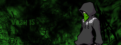
Skins- I actually like that one. I really like the depth, and the colors for some strange reason.
Ulca- Pretty nice seeing that you havent posted in a little while. I'm telling you man you should find photoshop on a torrent or something because I think you'd become really good.
Ulca- Pretty nice seeing that you havent posted in a little while. I'm telling you man you should find photoshop on a torrent or something because I think you'd become really good.
I am surprised Dev I think its acceptable but looking back I am quite disapointed in myself.
Same old story I am afraid for you Vash, I am not being mean just a bit constructive...to be honest I have been sugar coating things for a few posts but the improvements are not coming THAT often.........now have a go at just getting a STOCK and then practicing all of your Tools...just see what they do and see if any of them can work nicely along side each other...look at my HRG sig....it is not a great sig by all means, but have a little look at the lighting in the background and the areas of the renders face that are being hit by light aposed to those hit with shadow.
You will get there eventualy.
And finaly ULCA.....I am displeased by the JOKER sig...I just dont like it It could just be a personal preference but I dont like it.....however, love the NooB Saibot "with hint of colour" sig, its coverd in a sperm like sexification all over my virtual eyes.
0
Like I said man, I liked the colors and the depth "for some strange reason." I don't know why I just did lol. The effects weren't that good/appealing, and I didn't think they were supposed to be so I didn't say anything about it. It just looked like one of those sigs that didn't really focus on nice effects.
Edit: Some old ones that I don't think I ever posted here.


^Like I said those are just some old ones. Not quite ready to post my new stuff that I've been working on yet, so I just wanted to post some stuff that I've never here.
Edit: Some old ones that I don't think I ever posted here.
^Like I said those are just some old ones. Not quite ready to post my new stuff that I've been working on yet, so I just wanted to post some stuff that I've never here.
0
I've been patiently waiting for someone to post something so that I wouldn't be double posting but it's been 9 damn days and no one's posted anything so I'll just have to double post. Sorry
Alright, now that I got that out the way here's two new ones I made sometime 1 and a half weeks ago.


Do y'all like them?...
Oh and do any of you know a good GFX website? Globalsigalliance is now closed down and I'd like to show people my sigs.
Alright, now that I got that out the way here's two new ones I made sometime 1 and a half weeks ago.
Do y'all like them?...
Oh and do any of you know a good GFX website? Globalsigalliance is now closed down and I'd like to show people my sigs.


© 1998-2026 Shadow Knight Media, LLC. All rights reserved. Mortal Kombat, the dragon logo and all character names are trademarks and copyright of Warner Bros. Entertainment Inc.