


skinsley Wrote:
Download it and search on the internet for a CD key, then photoshop will be free.
I did that with CS2 and 7 so ive had photoshop twice for free.
Download it and search on the internet for a CD key, then photoshop will be free.
I did that with CS2 and 7 so ive had photoshop twice for free.
I don't want to download it. I am going to buy it just in case of any Viruses and My Computer is pretty slow itself
0
UlcaTron Wrote:I don't want to download it. I am going to buy it just in case of any Viruses and My Computer is pretty slow itself
not to be rude but why would you buy photoshop? are you just gonna make sigs? i mean the way skinsley did was fine but buying it? don't waste your money dude, its not worth it.

0
not to be rude but that's just sad. i mean paying for something just to make sigs and other stuff. i can understand if you got it free but not paying for it. that's just sad

About Me

0
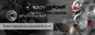
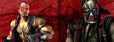
this one's decent at best.
Dragonblade Wrote:
not to be rude but why would you buy photoshop? are you just gonna make sigs? i mean the way skinsley did was fine but buying it? don't waste your money dude, its not worth it.
UlcaTron Wrote:I don't want to download it. I am going to buy it just in case of any Viruses and My Computer is pretty slow itself
not to be rude but why would you buy photoshop? are you just gonna make sigs? i mean the way skinsley did was fine but buying it? don't waste your money dude, its not worth it.
Alright I will take the advice...
Shinnok-fan64 Wrote:
this one's decent at best.
this one's decent at best.
its pretty good


0
Cosmos Wrote:
Everybody was doing it...
Everybody was doing it...
Hot shit.
Shinnok-fan64 Wrote:
this one's decent at best.
this one's decent at best.
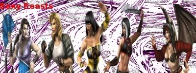
The renders are streched, and Sheeva is absent. "Sexy Beasts" was misleading.
skinsley Wrote:
What would you consider my best ?
What would you consider my best ?
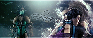
Your best... there are so many awesome ones, but my fave is that one with both Ken and Ryu in it.
Looking back at that Kenshi sig, it isnt that far off your best actually, just the size is a bit odd.
Btw...
matthewhaddad Wrote:

Opinions? Should I replace my current with it?
0
Shinnok-fan64 Wrote:
this one's decent at best.
this one's decent at best.
ummm, no.....
About Me

0
Made a shitload.
The one I'm currently using,
This:
 which sucks
This: which was an experiment
And this, which I'm not happy about how good it turned out:
I'm not happy because I despise The Black Dragon, and I think it's my best. And I was going to make a Lin Kuei one, but I couldn't find the Lin Kuei logo without text. Also, do you think I should make An OIA one?
The one I'm currently using,
This:
which sucks This:
which was an experiment And this, which I'm not happy about how good it turned out:
I'm not happy because I despise The Black Dragon, and I think it's my best. And I was going to make a Lin Kuei one, but I couldn't find the Lin Kuei logo without text. Also, do you think I should make An OIA one?
About Me
0
here's my two newest ones, both made with tutorials except for renders and text as i did that.

i actually really like this one. i think its one of my best and i might use it sometime.
 hate this one, imo my worst ever.
i actually really like this one. i think its one of my best and i might use it sometime.
hate this one, imo my worst ever.About Me
0
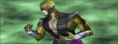
excuse me for asking, but how is that one good? it sucks terribly, the grid dosen't match Reptile at all, but i guess its not my worst yet.
Well shinok fan if you want me to be honest, the pink signature that you did like, is terrible, she is badly cut out, and does not blend in with the background, so thats why i did not like that one.
The reptile sig fits in with its background greatly, you did no blending techniques to the render, but the render colour and background colour match just enough not to clash, and the grid hides the fact that the render is also not too great.
And Cosmos, you realy do rule !!
The reptile sig fits in with its background greatly, you did no blending techniques to the render, but the render colour and background colour match just enough not to clash, and the grid hides the fact that the render is also not too great.
And Cosmos, you realy do rule !!
0
skinsley
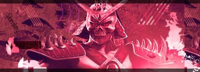
not one of your best sigs. kinda sucks.
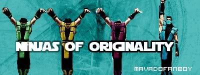
MavadoFanboy
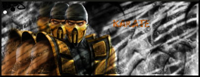
the ninjas are cut out horiibly and they do not match the background. the bush one is okay but you can't really see the text. and i personally don't like bush. the kano and kabal one is actually okay. simple but not much wrong with it except maybe the background
Shinnok-fan64
the first like skinsley said all that is needed to say. and the reptile one is okay for all the reasons skinsley had said.
Keep Practicing People
not one of your best sigs. kinda sucks.
MavadoFanboy
the ninjas are cut out horiibly and they do not match the background. the bush one is okay but you can't really see the text. and i personally don't like bush. the kano and kabal one is actually okay. simple but not much wrong with it except maybe the background
Shinnok-fan64
the first like skinsley said all that is needed to say. and the reptile one is okay for all the reasons skinsley had said.
Keep Practicing People

About Me

0
Made for this week's SOTW:
Others:


Others:


0
Well after everything was not working out for me. I just wanna say thank you very much to Megababe. She is the reason for why i was able to get my brushes and my fonts. Well here is my first GIMP sig,Honestly it didnt turn out the way the wanted but ill be experimenting more.
So tell me what you think?
So tell me what you think?


© 1998-2026 Shadow Knight Media, LLC. All rights reserved. Mortal Kombat, the dragon logo and all character names are trademarks and copyright of Warner Bros. Entertainment Inc.