


0
Here is the second sig imade with the GIMP.
I personally think this one is AWESOME! What you guys think?

I personally think this one is AWESOME! What you guys think?

About Me

0
I like that Hellraiser sig.


0
skinsley Wrote:
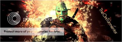
Behold !!
Behold !!
ITS SUCKS~!!!!
jk!
Very nice!!! how muuuch?
hehe... srsly... good job!!! awsome texture and lighting
0
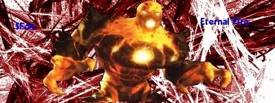
Heres my attempt at kind of a shining sig.
Tell me what you think.
Also for some reason i cant change my text to go either sideways and or diagonal. Anybody got a tip?
Tell me what you think.
Also for some reason i cant change my text to go either sideways and or diagonal. Anybody got a tip?
0
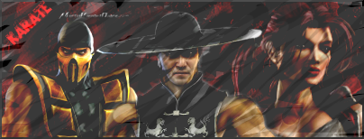
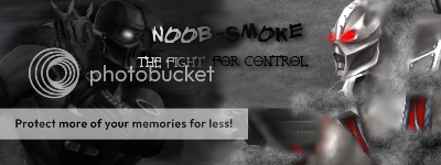
Heres my newest one.

I tryed to edit a certain layer, So it would look alot better,But i think i failed.
Thanks Skinsley.
I tryed to edit a certain layer, So it would look alot better,But i think i failed.
skinsley Wrote:
That sig , is feckin A-some !!
That sig , is feckin A-some !!
Thanks Skinsley.
0
skinsley Wrote:
Yet another great sig.
Arent you a begginer when it comes to GIMP, your already pretty advanced.
Yet another great sig.
Arent you a begginer when it comes to GIMP, your already pretty advanced.
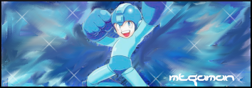
Yea im a beginner. I just redid the Megaman one. I like this one ALOT better.

0
dude! your sigs are awesome! it took me awhile to make sigs like this. good job
skinsley Wrote:
Someone give me a random render to make a sig out of...
Someone give me a random render to make a sig out of...
Umm... someones bored lol..
Heres two
http://i152.photobucket.com/albums/s180/UlcaTron_2/Baysidecutout.png
http://i152.photobucket.com/albums/s180/UlcaTron_2/UlcaTroncutout2.png
0
Here it is the best sig i have ever made!
I cant believe how great it turned out!
Look at the shine!
I cant believe how great it turned out!
Look at the shine!

0
I finally learned how to switch the words around lol. Also im trying to get better with burn and sharpen image. This is my attempt at sort of like Hikari does, but with GIMP.
Hope you like.
Hope you like.

About Me

0
this one's decent, and its pretty simple.
0
Shinnok-fan64 Wrote:
this one's decent, and its pretty simple.
this one's decent, and its pretty simple.
sorry bro but not good. the background does not fit with the blaze pic. nor does the text. try not to have your sigs clash. keep practicing dude
About Me
0
i believe i'm getting better, just very, very, very, very, very, very, very, very, very, very, very, very, very, very, very, very, very, very, very, very, very, very, very, very,very, slowly.
0
Heres my newest one and also the one that i put in the SOTW tourney.
Hope you like.
I tried to lighten it up a little bit more,But i cant figure out how to edit layers of my finalized sig man if i could it would look alot better.
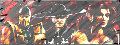
I was just messing with color balance and posterization.
Hope you like.
I tried to lighten it up a little bit more,But i cant figure out how to edit layers of my finalized sig man if i could it would look alot better.
I was just messing with color balance and posterization.
0
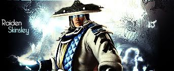
you should pick the raiden one skins


© 1998-2026 Shadow Knight Media, LLC. All rights reserved. Mortal Kombat, the dragon logo and all character names are trademarks and copyright of Warner Bros. Entertainment Inc.