
0
Shinnok-fan64 Wrote:
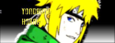
here's some of my newest sigs.......
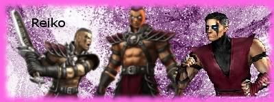
its not great, but i like it and its the first one that i added text to.
here's the other one i made recently..........
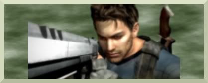
this one's cool imo, its also i added a real border instead of a fuzzy border.
here's some of my newest sigs.......
its not great, but i like it and its the first one that i added text to.
here's the other one i made recently..........
this one's cool imo, its also i added a real border instead of a fuzzy border.
the reiko one is ok. purple border would be better but it doesn't matter. sorry to be rude but the second one sucks. i mean the pic looks blurred, the border doesn't go with the sig, and worst of all, the pic is out of allignment. it would be better if the pic was on the far left so you can't see the gun cut off. of course if you blurred the pic on purpose then nevermind. overall the sig is not good.

About Me

0
Shinnok-fan64
On the Reiko sig, both Reiko's MKA render and VS pose are pretty blurry. Reiko's MK4 vs pose is pixelated. Background, it's okay I guess... font is pretty simple.
The second one, the render doesn't fit the sig and again, pretty blurry from what I see. The background is okay, too. If you intended to put the render like that, you could have tried erasing the unwanted egdes and try to blend the render in. However, if it was planned like that, I would strongly suggest putting it on the far left rather in the center.
Sorry if I sound harsh.

About Me

0
thanks for the constuctive criticism, Hikari and DB. I'll admit, the RE sig does suck and i tried to redo it but i don't have the cutout anymore.Also, i don't know how to make the pictures less blurry, at least yet.Finally, i know the text's simple, but that was the first time i put text in a sig and i wanted to keep it simple.
Here's my newest sig, its not good but the text makes it somehwhat funny...and i know the text's somewhat hard to see.

Again, thanks for the criticism, both of you.I only starting out, though, so hopefully i can sometime get pretty good.

Here's my newest sig, its not good but the text makes it somehwhat funny...and i know the text's somewhat hard to see.
Again, thanks for the criticism, both of you.I only starting out, though, so hopefully i can sometime get pretty good.

About Me
0
you're not talking about my latest sig, you can't be because its not good, its just sorta funny.

About Me
0
Shinnok-fan64 Wrote:
thanks for the constuctive criticism, Hikari and DB. I'll admit, the RE sig does suck and i tried to redo it but i don't have the cutout anymore.Also, i don't know how to make the pictures less blurry, at least yet.Finally, i know the text's simple, but that was the first time i put text in a sig and i wanted to keep it simple.
Here's my newest sig, its not good but the text makes it somehwhat funny...and i know the text's somewhat hard to see.
Again, thanks for the criticism, both of you.I only starting out, though, so hopefully i can sometime get pretty good.
I know what you've done here..And really anyone with half a brain could do it...I'll tell you how to download better fonts..Go to a font side download the font move the font to your dektop open up control panel and go to your fonts file and drag the font on your desktop into your control panel...Tomorrow I'm going to post a sig tut about brushes look out for it...-owen-

About Me
My tastes have changed since I created this account over 4 years ago. I prefer being called Siklootd and now love heavy metal music. 
Long live heavy metal music!
0
Yeah to download more fonts do the following:
Okay: First go to 1001freefonts.com , and look for the font you want to download. Let's use my favorite one as an example: :TagsXtreme. Click "T" to be taken to the fonts that begin with a "T", and now click "Win Font" (which is located right underneath the font name), then click "open". Now on the side you should have an option "Extract All Files" click that. Now after the files have been extracted copy and paste the font file into your font folder. To find your font folder, click on your C drive under "my computer", then click "Windows" now click the folder called "Fonts". Just copy and paste any font that you download into this folder and they will be available for use.
Okay: First go to 1001freefonts.com , and look for the font you want to download. Let's use my favorite one as an example: :TagsXtreme. Click "T" to be taken to the fonts that begin with a "T", and now click "Win Font" (which is located right underneath the font name), then click "open". Now on the side you should have an option "Extract All Files" click that. Now after the files have been extracted copy and paste the font file into your font folder. To find your font folder, click on your C drive under "my computer", then click "Windows" now click the folder called "Fonts". Just copy and paste any font that you download into this folder and they will be available for use.
About Me
0
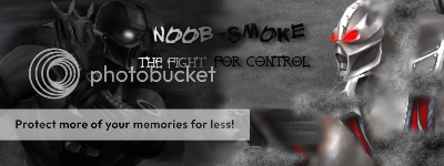
You got some grudge against Kitana?!?! lol jk
But seriously though, the Kitana sprite is terribly pixelated and the background is really plain.

But seriously though, the Kitana sprite is terribly pixelated and the background is really plain.
About Me
0
i know, sorry about that Hikari.For some reason it was really pxielated, and the background was plain because that was the first time i used that type of tool for my background.

About Me

 Thanks to flameshang for the fanbar! Pr0d for the sig, and Redman for the avy!
0
Hikari715 Wrote:
You got some grudge against Kitana?!?! lol jk
But seriously though, the Kitana sprite is terribly pixelated and the background is really plain.
You got some grudge against Kitana?!?!
But seriously though, the Kitana sprite is terribly pixelated and the background is really plain.
How do you make such eye-pleasers?
Made in GIMP:

One I made for blazefan.
This is one that I made one day.
 blazefan asked me to make this but I refuse to give it to him.
 Made in PhotoShop CS2:

LiuKangMaster Wrote:
How do you make such eye-pleasers?
Made in GIMP:
One I made for blazefan.
This is one that I made one day.
blazefan asked me to make this but I refuse to give it to him.
Made in PhotoShop CS2:
Hikari715 Wrote:
You got some grudge against Kitana?!?! lol jk
But seriously though, the Kitana sprite is terribly pixelated and the background is really plain.
You got some grudge against Kitana?!?!
But seriously though, the Kitana sprite is terribly pixelated and the background is really plain.
How do you make such eye-pleasers?
Made in GIMP:
One I made for blazefan.
This is one that I made one day.
blazefan asked me to make this but I refuse to give it to him.
Made in PhotoShop CS2:
I really like the Dragon Ball Z one...


About Me

0
Hikari715 Wrote:
You got some grudge against Kitana?!?! lol jk
But seriously though, the Kitana sprite is terribly pixelated and the background is really plain.
You got some grudge against Kitana?!?!
But seriously though, the Kitana sprite is terribly pixelated and the background is really plain.
Those are really good looking at it is like chewing gum for the eyes!...
About Me
0
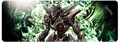
skinsley Wrote:
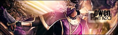
I had a little look at one of Hikari's more recent sigs.
And I came up with this, what do you think HIK ?
I had a little look at one of Hikari's more recent sigs.
And I came up with this, what do you think HIK ?
Very, very good! Nice colors, too.
About Me
Thanks to flameshang for the fanbar! Pr0d for the sig, and Redman for the avy!
0
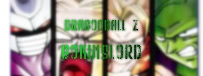
UlcaTron Wrote:
I really like the Dragon Ball Z one...
LiuKangMaster Wrote:
How do you make such eye-pleasers?
Made in GIMP:
One I made for blazefan.
This is one that I made one day.
blazefan asked me to make this but I refuse to give it to him.
Made in PhotoShop CS2:
Hikari715 Wrote:
You got some grudge against Kitana?!?! lol jk
But seriously though, the Kitana sprite is terribly pixelated and the background is really plain.
You got some grudge against Kitana?!?!
But seriously though, the Kitana sprite is terribly pixelated and the background is really plain.
How do you make such eye-pleasers?
Made in GIMP:
One I made for blazefan.
This is one that I made one day.
blazefan asked me to make this but I refuse to give it to him.
Made in PhotoShop CS2:
I really like the Dragon Ball Z one...
Thanks. That pic is from the DBZ Shin Budokai 2 cover.
About Me
0
my newest sig, text sucks.


About Me

0
About Me
0
someone actually likes that sig, cool now that i look at it again its actually pretty cool looking.
Also, i think i made it by going to Filters>Lighting Effects>Supernova(this one or sparkle)>where it says,"hue color" change it from random hur and judt move it and it'll become a rainbow.
thanks for the criticism,i might use this one. i also made my first avatar, using the sig as a tutorial. i think i'll use these sig and svys because imo they look cool.
EDIT: i would've added Quan Chi, but not enough room for text.
Also, i think i made it by going to Filters>Lighting Effects>Supernova(this one or sparkle)>where it says,"hue color" change it from random hur and judt move it and it'll become a rainbow.
thanks for the criticism,i might use this one.
EDIT: i would've added Quan Chi, but not enough room for text.
Shinnok-fan64 Wrote:
someone actually likes that sig, cool now that i look at it again its actually pretty cool looking.
Also, i think i made it by going to Filters>Lighting Effects>Supernova(this one or sparkle)>where it says,"hue color" change it from random hur and judt move it and it'll become a rainbow.
thanks for the criticism,i might use this one.
i also made my first avatar, using the sig as a tutorial. i think i'll use these sig and svys because imo they look cool.
Chea, its looks kewl; but it would be better in darker colors but still over all great!
0
Hikari715 Wrote:
You got some grudge against Kitana?!?! lol jk
But seriously though, the Kitana sprite is terribly pixelated and the background is really plain.
You got some grudge against Kitana?!?!
But seriously though, the Kitana sprite is terribly pixelated and the background is really plain.
hot. The border on the mai one looks kinda choppy, u should use paths for it
0
here's a set I just finished on request:


© 1998-2026 Shadow Knight Media, LLC. All rights reserved. Mortal Kombat, the dragon logo and all character names are trademarks and copyright of Warner Bros. Entertainment Inc.