
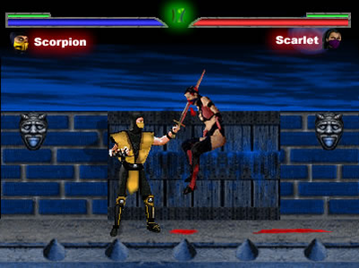
(Warehouse Contest) Scorpion and Scarlet
Fan Kreations
Pages: 1
Display Mature Content:
| Artist's Remarks: | |
|
This fake was made by me and MaRcElunbeatable for the Mkwarehouse contest. They didnt let us be in the contest because i guess we couldnt use Scorpion, w/e. So i decided to put it here and get it rated. I made the life bars, win symbols, timer, blood, sword, and scarlet. MaRcElunbeatable made the backround and scorpion. Hope you like it
|
| Full Scale | 401x300 | Category | Fakes | User Views | |
| User Likes | User Ratings | 15 | Score |
 3.0 3.0
|
0


Pages: 1


© 1998-2026 Shadow Knight Media, LLC. All rights reserved. Mortal Kombat, the dragon logo and all character names are trademarks and copyright of Warner Bros. Entertainment Inc.