
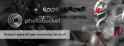
How fakes should look
0
posted01/18/2007 02:21 PM (UTC)byMember Since
01/07/2007 07:18 PM (UTC)
Rather then giving 5/5s to shitty stuff like URs fakes you guys should actually decide to reserve high ratings for things that don't suck, so people seek to improve instead of thinking they're great while they're stuff is actually steaming turds.

If I used word structure too advanced for you guys heres the version MKO can read:
Ur stuff suks ballz, lurn 2 mayke gud fakes.
If I used word structure too advanced for you guys heres the version MKO can read:
Ur stuff suks ballz, lurn 2 mayke gud fakes.
0
By the way I didn't make that, I just found it and noticed it was better then your crap here.


I'll admit, you do have a point. But most of the time, when you tell someone that they suck and should stop creating stuff, they'll just throw a tantrum, maybe question your sexuality, and continue creating terrible fakes. If you tell them the truth, they don't improve, if you smile and nod, they don't improve. So in all honesty, your damned if you do or don't rate honestly.
I agree, there are many people who are too lenient here, but does it really matter? There are good artists here, and there are bad ones. If it really troubles you that much that there are bad artists, you can just ignore them. Or tell the bad artists that they suck. But reviewing somebody's reviewing style just annoys people.
I agree, there are many people who are too lenient here, but does it really matter? There are good artists here, and there are bad ones. If it really troubles you that much that there are bad artists, you can just ignore them. Or tell the bad artists that they suck. But reviewing somebody's reviewing style just annoys people.


0
The only thing I can give this fake credit for is the blood flow and placement. The "edited" sprites are in dire need of some decent shading. The distance between the fighters and the action taking place does not fit. It seems you just mushed the action in the middle so as to draw attention away from the sparse and neglected stage details. Also, the background sky/clouds are too blurry and all the blue highlights blend together too much. Nothing really stands out because of it. 2/5


About Me

0
the blood's good, if nothing else, sorry 2/5
About Me
I need a new sig picture....
0
its okay, the background is good and the blood is the best i've seen in a long time, but the sprites are too cartoony
"The only thing I can give this fake credit for is the blood flow and placement. The "edited" sprites are in dire need of some decent shading. The distance between the fighters and the action taking place does not fit. It seems you just mushed the action in the middle so as to draw attention away from the sparse and negelected stage details. Also, the background sky/clouds are too blurry and all the blue highlights blend together too much. Nothing really stands out because of it. 2/5"
This coming from a guy who doesn't even use sprites? Try doing custom sprites that don't suck ass, then talk. And action? Please don't talk about action when there is nothing happening in your fakes. You have sub shooting an "ice projectile" at noob, who looks like he's doing some fucking 50's dance move. You won't even add blood to yours. Overall I give you[ a 2/5.
And shame on the rest of you for following the "elite members" opinion instead of thinking for yourselves. Those sprites are 100% custom, no bases used. The background is fine, and the blood is great. This forum is in serious need of someone to come in and tune it's ass up.
0
The sprites were made to fit the digitally painted background, thats why they're digital painted too.
0
Thanks for the back up, but actually I did use the base shapes of the sprites and left subs arm as it was.
0

The back background image itself, this is scratch with only 2 PS filters. (Displace and Lens Flare)

0
I hate about 98% of the 'fakes' people make, but this one in the OP is great. Good atmosphere and structure and I like what it's saying.


0
Thats prob the best fake i've seen here for ages.
-Foot
-Foot

About Me
0
Wow, this really, really sucks. This is like almost the opposite of fakes should look. Not that all fakes aren't shit and wastes of time, but this definitely is among shittiest of said shit.
Shit's a fun word to type. ^_^
Anyway, recolors, pixelated blood, and no-light-source gradients; These do not create a decent, or even good, fanmade screenshot.
Shit's a fun word to type. ^_^
Anyway, recolors, pixelated blood, and no-light-source gradients; These do not create a decent, or even good, fanmade screenshot.


0
The two of them got served and everything they've said thus far has been contradictive. Just go recuperate your losses and come back to play with the big boys at a later date. Thanks
0
Darklord_Xel Wrote:
Wow, this really, really sucks. This is like almost the opposite of fakes should look. Not that all fakes aren't shit and wastes of time, but this definitely is among shittiest of said shit.
Shit's a fun word to type. ^_^
Anyway, recolors, pixelated blood, and no-light-source gradients; These do not create a decent, or even good, fanmade screenshot.
You should really look at things for above 6 seconds, because if you would have actually looked you would notice those aren't recolors at all, its not pixelated blood at all (I'm sure even other people who have flamed this could tell you that unless they were in a mood to lie) and gradient lighting is for noobs, I'm pretty sure I've never seen anything in real life be lit by gradients.


© 1998-2025 Shadow Knight Media, LLC. All rights reserved. Mortal Kombat, the dragon logo and all character names are trademarks and copyright of Warner Bros. Entertainment Inc.