


About Me

0
ugh.....


0
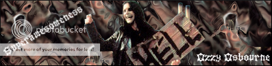
what program do you use?
If it's gimp, you could always download brushes =o
the bg looks odd, too repetitive >_>
If it's gimp, you could always download brushes =o
the bg looks odd, too repetitive >_>
mortalfool Wrote:
what program do you use?
If it's gimp, you could always download brushes =o
the bg looks odd, too repetitive >_>
what program do you use?
If it's gimp, you could always download brushes =o
the bg looks odd, too repetitive >_>
lol, thats what im always thinking. I dont know what it is with GIMP but usually all the gimp users here always have the same looking sig, BG and whatever. Not all.
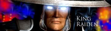
KARATE, thats your best so far. I only want to see you go up from here.

0
Pr0d1gy Wrote:
KARATE, thats your best so far. I only want to see you go up from here.
KARATE, thats your best so far. I only want to see you go up from here.
I will try my best.
Btw,Dude your newest style is AMAZING!
I love the Thor sig you made for Pred. Sexy Stuff!
You think you could make me one of those new style sigs? It can be of whatever you want.
I love your style of sig making!
Oh and also,How the hell do you guys have mirrored text? I d/led Geist RND but it doenst have the "see through effect" that you guys have....Can anybody help?

About Me

0
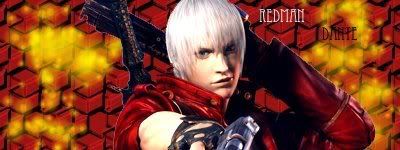
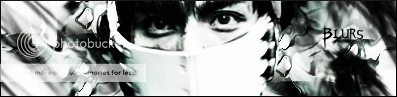
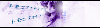
Redman, I don't like it. Here's a thing- Never use pattern backgrounds: They suck and are very boring. Nice Talim sig btw mortalfool, she's awesome, although I liked her better in SC2. :\
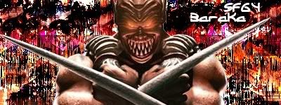
Love the BG for the Sektor one, Jago. Shin-fan, the text is readable but the BG is still no. Sorry- it doesn't really fit Baraka much imho.
btw KARATE, check your PM.
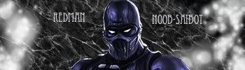
Ulcatron, your Noob saibot one is alright; the clipping mask part on the text looks a bit off imo. Colors are ok.
Love the BG for the Sektor one, Jago. Shin-fan, the text is readable but the BG is still no. Sorry- it doesn't really fit Baraka much imho.
btw KARATE, check your PM.
Ulcatron, your Noob saibot one is alright; the clipping mask part on the text looks a bit off imo. Colors are ok.
About Me
0
^i agree Hikari715, my past couple sigs have been pretty bad
^^ Hikari, the BG's suck for patterns. I can't figure out how to download brushes and upload them to gimp, so i can put them in a sig.
Anyone help me on that one?
Well anyways i tried using patterns one more time...
New one:
I never really put noob in my sigs, so i tried him...
Not one of my best, but i like it...
Anyone help me on that one?
Well anyways i tried using patterns one more time...
New one:
I never really put noob in my sigs, so i tried him...
Not one of my best, but i like it...
0
-Jago- Wrote:

riskin sounding like Paris...
Thats hot

0
Ulcatron,There is something about it i just dont like..Is that a design in the top right corner? or is that the text?
Well here is my newest sig:
Is this still good?
I like it and i think this new style is pretty neat so far.
Well here is my newest sig:
Is this still good?
I like it and i think this new style is pretty neat so far.
KARATE Wrote:
Ulcatron,There is something about it i just dont like..Is that a design in the top right corner? or is that the text?
Well here is my newest sig:
Is this still good?
I like it and i think this new style is pretty neat so far.
Ulcatron,There is something about it i just dont like..Is that a design in the top right corner? or is that the text?
Well here is my newest sig:
Is this still good?
I like it and i think this new style is pretty neat so far.
I like that text and the bg. It looks very good.
4/5.
This one i jus made:

Idk, looks good but not great...
Comments would be appreciated


© 1998-2026 Shadow Knight Media, LLC. All rights reserved. Mortal Kombat, the dragon logo and all character names are trademarks and copyright of Warner Bros. Entertainment Inc.