


About Me
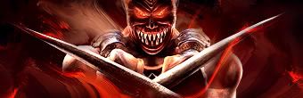
I need a new sig, something with Kabal from UMK3 would be sweet. Just imagine that here
0
This really isn't a sig, it's an avatar. I watched Code Monkeys and loved it so much that I made a pixelated version of myself:

0
I like the 2nd one's hue better... but the 1st one has way better lighting

About Me

0
MortalKombat2007 Wrote:

Looks neat. Nice use of the grass brush. btw Ulcatron, I like the 2nd one.

About Me

0
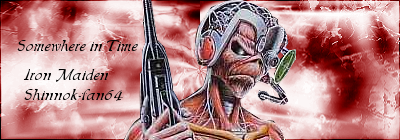
my latest sigs, some gifts and some made for me.
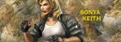 Made this one for Keith
Made this one for G_Ninja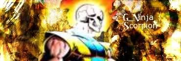
Made this one for Keith Made this one for G_Ninja


About Me
0
Awesome signature as usual -Jago-.


About Me
0
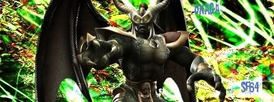
My latest sig.........meh
About Me
0
Jago, I really like your current style.
I am going to be honest- the text is hard to read (The Onaga one). The BG doesn't suit Onaga (It's quite flashy) and he seems to be just standing there.
Shinnok-fan64 Wrote:
My latest sig.........meh
My latest sig.........meh
I am going to be honest- the text is hard to read (The Onaga one). The BG doesn't suit Onaga (It's quite flashy) and he seems to be just standing there.
About Me
0
Agree 100% Hikari, it sucks hard. I was trying some new things, though, so at least it gave me some practice with new things.


0
5animals Wrote:
This is my favorite so far, please give me some criticism and advice

This is my favorite so far, please give me some criticism and advice
"Clarity". Other than that, it doesn't look like there's anything "wrong" with it.
To fix "blurry"//un focused stuff, play with "Contrast//Brightness", "Focus", or like Sharpen".
0
-Jago- Wrote:
hot shit right there!


About Me
 We've got chicken tonight. Strangest damn things. They're man made.
 0
mines text but it' was a hilarious day
0
ThePredator151 Wrote:
"Clarity". Other than that, it doesn't look like there's anything "wrong" with it.
To fix "blurry"//un focused stuff, play with "Contrast//Brightness", "Focus", or like Sharpen".
5animals Wrote:
This is my favorite so far, please give me some criticism and advice
This is my favorite so far, please give me some criticism and advice
"Clarity". Other than that, it doesn't look like there's anything "wrong" with it.
To fix "blurry"//un focused stuff, play with "Contrast//Brightness", "Focus", or like Sharpen".
I was trying to make it a bit fuzzy and nondescript, in the hopes that it would be thought provoking and offcolor. Aparently I failed hehehe Seriously though, thanks for being honest with your advice bro. I won't learn unless someone gives it to me straight.

0
 >
>About Me
0
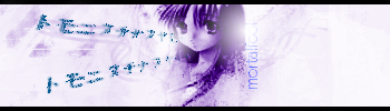
Nice mortalfool.
This really is your best- the colors are very appealing unlike your others and the effects are good.
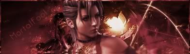
UlcaTron Wrote:
Very nice, mortalfool.
I am in love.

Very nice, mortalfool.
I am in love.
This really is your best- the colors are very appealing unlike your others and the effects are good.
About Me
0
Keith made this Beautiful Signature:

Follow your Heart, it always leads you faithfully. Click in the One in my Signature, you won't be disappointed.
Follow your Heart, it always leads you faithfully. Click in the One in my Signature, you won't be disappointed.


© 1998-2026 Shadow Knight Media, LLC. All rights reserved. Mortal Kombat, the dragon logo and all character names are trademarks and copyright of Warner Bros. Entertainment Inc.