

0
I actually like the text a lot... goes well w that type of sig


0
nice @ Pr0d1gy
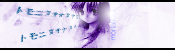
I likes that sig =o
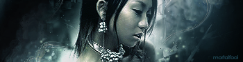
yay for random lady
I likes that sig =o
yay for random lady


skinsley Wrote:
Fan fucking tastic ulcatron...fan fucking tastic.
I want a tutorial or some way of you telling me how in pasties name you made it.
Fan fucking tastic ulcatron...fan fucking tastic.
I want a tutorial or some way of you telling me how in pasties name you made it.
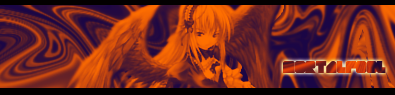
Er.. I usually don't do tutorials. More-less do I even remember step by step on how to make it. Er, I just used a lot of duplicated layers, Colour swapping, Pick and hurl features, rippling effects, and on c4d to add an abstract effect. I like it, but it can be a lot better.
-Jago- Wrote:
Dont like this JAGO, sowwi.
Ulcaturp, on your PSD that you "should" save after you make a sig, it should be easy to see what was done on each layer.
Thats how i do tutorials when people ask me to on a realy good Sig I make.


photoshop document, or are you still on gimp ?
you open the sig with all the layers intact on the programme.....you can hide and unhide a layer at a time being able to see what you did.
For example.

This shows, all the layers of a the PSD for the sig I am currently using.
I can tell every single thing I did to the sig just by looking at each layer of this.....if it werent so daym fast that is.
you open the sig with all the layers intact on the programme.....you can hide and unhide a layer at a time being able to see what you did.
For example.
This shows, all the layers of a the PSD for the sig I am currently using.
I can tell every single thing I did to the sig just by looking at each layer of this.....if it werent so daym fast that is.

About Me

0


0
Avatar:

Avatar:

These were especially easy this time. I found an animated gif of a flag that wasn't difficult, touched up the two Jax renders, and slapped everything together. Maybe 30min to make both.
Signature:
I like to show this render:
Before:

After:

Whaddaya think of everything? I know the renders could use more work, but what specifically do you guys think?
Avatar:
These were especially easy this time. I found an animated gif of a flag that wasn't difficult, touched up the two Jax renders, and slapped everything together. Maybe 30min to make both.
Signature:
I like to show this render:
Before:
After:
Whaddaya think of everything? I know the renders could use more work, but what specifically do you guys think?

About Me

0
Well, Pred I think your latest stuff is the best so far from you. I personally like the 2nd avy better and the fire effects on the sig you made for StreetKing is nicely done. The liquifying parts look ok.
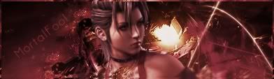
my signature is of sonyas render fighting kitana in shaolin monks.
i had two copies, one colored blue, and the other was color inverted
then i used "image arithmetic" and used the average function in PSP to make it look the way it is. (that doesnt even make sense to me lol and im the one who did it)
i had two copies, one colored blue, and the other was color inverted
then i used "image arithmetic" and used the average function in PSP to make it look the way it is. (that doesnt even make sense to me lol and im the one who did it)

About Me

0
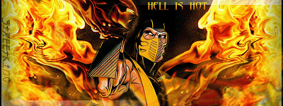
Made this for Mk2007..........

Pred, I like it. Its really good.
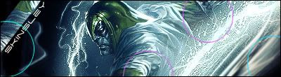
Shin, it's alright. I do like the background though. I suggest that you try and make mario fade or blend in with the BackGround more. The colours are pretty much right if that is what you're looking for. But You've made better.
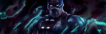
Prod, I like the Broly one ; and the Scorpion one is O.K.
___________________________________________________________

I made all the fire effects and destort effects by using a c4d background and just fucked around. I like it. But not the best. Opinions people?
Shin, it's alright. I do like the background though. I suggest that you try and make mario fade or blend in with the BackGround more. The colours are pretty much right if that is what you're looking for. But You've made better.
Prod, I like the Broly one ; and the Scorpion one is O.K.
___________________________________________________________
I made all the fire effects and destort effects by using a c4d background and just fucked around. I like it. But not the best. Opinions people?
About Me
0
ThePredator151
Fantastic. My only grip about it is the text. The "Streetking" font does not seem to fit the sig. The "Hell Is Hot" text seems out of place.
Shinnok-Fan64
To be honest, I don't like it, It is ugly but it is the thought that counts, so I linked to it anyways. Thank you.
Ulcatron
Not much to say about that one, It is not bad nor is it great. It's so-so.


0
I made a Kill Bill wallpaper for my MySpace.
Don't know how to post links so:
http://img.photobucket.com/albums/v312/Explicit1289/killbill-1.jpg
Don't know how to post links so:
http://img.photobucket.com/albums/v312/Explicit1289/killbill-1.jpg


© 1998-2026 Shadow Knight Media, LLC. All rights reserved. Mortal Kombat, the dragon logo and all character names are trademarks and copyright of Warner Bros. Entertainment Inc.