


0
I think i'm gonna upload some past work I did as well.


0
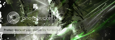
More.


0
And more.


0
And even more.


About Me

0
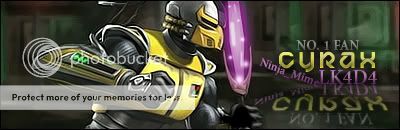
Still havent mastered sig making yet.
But here is my newest stuff:
But here is my newest stuff:


0
That's all, folks.


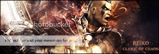
(This last sig I made for someone)

(This last sig I made for someone)

About Me

0


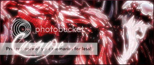
Enjoy

About Me

0
Nice sigs there Nemesis316 and Cashen.

About Me
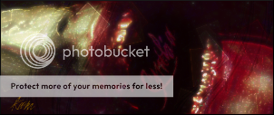
I made this! Yay!

Guess who's back!
0
Mine is the best there is.


0
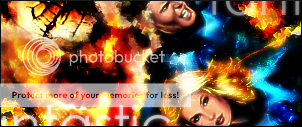
Vomit: I'm a Venom fan myself so I'll look foward to more venom sigs in the future : D
*ahem*
Last night I was playing with my photoshop and made my very own first ever sig on photoshop

Sailor V. I tried really hard on this sig. If any of you photoshop experts can give me advice on how I can become better please PM me. Cutting out this picture was a bit hard especially the hair as you can see it's all smudgy >.> I tried to use the smudge tool to fix it. It worked a little but I hear the feather tool is very helpful.
*ahem*
Last night I was playing with my photoshop and made my very own first ever sig on photoshop
Sailor V. I tried really hard on this sig. If any of you photoshop experts can give me advice on how I can become better please PM me. Cutting out this picture was a bit hard especially the hair as you can see it's all smudgy >.> I tried to use the smudge tool to fix it. It worked a little but I hear the feather tool is very helpful.
Use the magic wand to gather clean edges for you. As the edges are gathered, it creates it so that if you go through it with the background eraser, it will only erase the selected areas.
Feathering helps fade it out so the edges don't look too flat and/or rough.
If the background is too complex for the magic wand, another fairly decent option would be to try the magnet and get around the edges as best as it could.
Also you should add some sort of effect to the font, such as shadow dropping, or a simple 1 px stroke, with some bevel and embossing (I prefer Size 2 Soften 3 -- and the opacities 75%) and that will give it a more smooth 3D look. Then if you want, you can play around with the blending options, and scramble the opacities around alittle bit, so it looks more subtle and doesn't catch too much attention.
It looks pretty good for a 1st. I had a difficult time on my first time. A little adjustments and it should look perfect.
About Me
0
My signatures has been animated.

About Me

0
Look what Minion made for me:
Isn't it awesome?
Isn't it awesome?
0
uhh...
im like just starting to learn how to use paint shop pro.
i barely discovered animation shop today.
lol.
so mine isn't as impressive as the others here.
i like it though.
im like just starting to learn how to use paint shop pro.
i barely discovered animation shop today.
lol.
so mine isn't as impressive as the others here.
i like it though.
About Me
0
Vomit Wrote:


The only problem I find with these two is that the render has been done and over-used several times
The only problem I find with these two is that the render has been done and over-used several times
Try doing something other then grunge and brushing dude. Theres alot more to it then just brushing
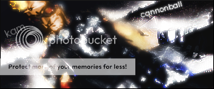
Heres my latest
0


© 1998-2026 Shadow Knight Media, LLC. All rights reserved. Mortal Kombat, the dragon logo and all character names are trademarks and copyright of Warner Bros. Entertainment Inc.