
0
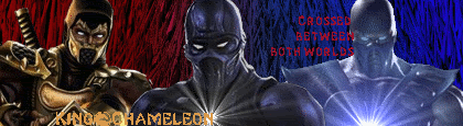
The one im using now.
About Me
o hai
0
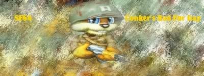
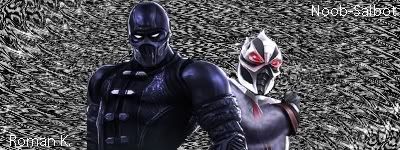
Here's mine.
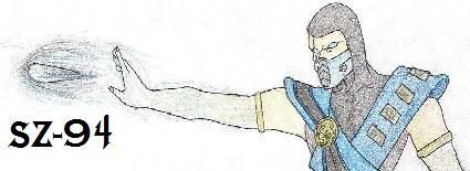
Its kinda messed up because it had to be made smaller to fit. Butn yeah i did the drawing myself.
Its kinda messed up because it had to be made smaller to fit. Butn yeah i did the drawing myself.

About Me

0
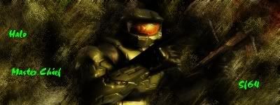
man, i'm just pulling these out left and right lol

 i like this one, pretty good imo, forgot to add text DAMN!
 this one might be my best one ever!I love this one!Text sucks though.

i like this one, pretty good imo, forgot to add text DAMN! this one might be my best one ever!I love this one!Text sucks though.
About Me
0
thanks for the comments, i like it too.
0
I made these with GIMP
I did however use other fan bars for this

I did however use other fan bars for this

About Me

0


Hmm, the left is just too dark, there is a tool I dont remember what its called, but when you click the burn tool, there is an option for another tool....use that on the dark areas.
The bottom text with your name on it is just awfull, try a different font, and dont always have to make it Black.
Here I made another one.
 C&C please........comments and criticizm.
The bottom text with your name on it is just awfull, try a different font, and dont always have to make it Black.
Here I made another one.
C&C please........comments and criticizm.About Me
0
here's my new sig, basically the same as the others but refined and barely any featheyness to be found.

skinsley Wrote:
Hmm, the left is just too dark, there is a tool I dont remember what its called, but when you click the burn tool, there is an option for another tool....use that on the dark areas.
The bottom text with your name on it is just awfull, try a different font, and dont always have to make it Black.
Here I made another one.
C&C please........comments and criticizm.
Skins, what's that option that makes those lines like that? I've seen em on your other sigs, is it in photoshop?


Shinnok-fan64 Wrote:
man, i'm just pulling these out left and right lol
i like this one, pretty good imo, forgot to add text DAMN!
this one might be my best one ever!I love this one!Text sucks though.
man, i'm just pulling these out left and right lol
i like this one, pretty good imo, forgot to add text DAMN!
this one might be my best one ever!I love this one!Text sucks though.
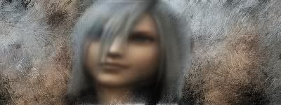
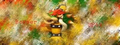
That's good that you're taking up GIMP to make your sigs, you are improving at a very rapid pace. The second sig is kinda blurry in all honesty, but the first and the Bowser sig look really nice.
I haven't posted a signature in a while and should really get back in the swing of things now that midterms are over and I'm in a more relaxed environment. Good Job everybody.
About Me
0
thanks megababe, and yeah that sig is blurry. You make great sigs,though, so you start making as quick as possible! EDIT: made a new sig....
 love this sig, probably use it some time.
 love this sig, don't care about the text. using it right now lol
love this sig, probably use it some time. love this sig, don't care about the text. using it right now lolAbout Me
0
Shinnok-fan64 Wrote:
thanks megababe, and yeah that sig is blurry. You make great sigs,though, so you start making as quick as possible!
thanks megababe, and yeah that sig is blurry. You make great sigs,though, so you start making as quick as possible!
No, absolutely not. Art should never be rushed. Look happen to MKA, it could of been a better game. Every form of art takes time, maybe, if you put more time into your sigs, they could be better.
Anyways....might as well post this up while I'm at it.

The text could be better.....

xtactics Wrote:
Skins, what's that option that makes those lines like that? I've seen em on your other sigs, is it in photoshop?
skinsley Wrote:
Hmm, the left is just too dark, there is a tool I dont remember what its called, but when you click the burn tool, there is an option for another tool....use that on the dark areas.
The bottom text with your name on it is just awfull, try a different font, and dont always have to make it Black.
Here I made another one.
C&C please........comments and criticizm.
Hmm, the left is just too dark, there is a tool I dont remember what its called, but when you click the burn tool, there is an option for another tool....use that on the dark areas.
The bottom text with your name on it is just awfull, try a different font, and dont always have to make it Black.
Here I made another one.
C&C please........comments and criticizm.
Skins, what's that option that makes those lines like that? I've seen em on your other sigs, is it in photoshop?
Which ones X tactics ? the ones outside her arms ?
Well those ones I just used the pencil tool and drew them, then coppied them and moved them, but usualy I set the brush tool to 1 pixel and i then get the pen tool and make a shape, then I right click and Stroke path, brush tool.
skinsley Wrote:
Well those ones I just used the pencil tool and drew them, then coppied them and moved them, but usualy I set the brush tool to 1 pixel and i then get the pen tool and make a shape, then I right click and Stroke path, brush tool.
Well those ones I just used the pencil tool and drew them, then coppied them and moved them, but usualy I set the brush tool to 1 pixel and i then get the pen tool and make a shape, then I right click and Stroke path, brush tool.
oh alright..... haha i still don't know how to do the pen tool. i made a new sig though *points to siggy*. however, whenever I cut out a portion of the sig (size doesn't matter), and host it on a site to use as an avatar, the avatar always shrinks and becomes very fuzzy and unreadable.
New sig:

About Me
0
Mk2007, you misunderstood what i meant. i didn't mean,"go out and make a sig in as little time as possible, and show it here." I meant this,"as soon as can start making a sig, do it. If you thought my message wasn't clear on that, sorry.
Anyways, no Megababe you're not losing your touch; that sig's awesome! I love the background, i originally didn't like the color(thought it should've been green and red), but it now fits the sig.Good job.9.5/10
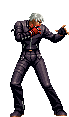
Skinsley, i like your new Jessica Alba; shes the hotness lol! Anwyays, great background and good render, i just don't like the lines around her arms, no offense.9.25/10
MK2007, i like that sig!It's very good. My only gripe with it is that it looks sorta like your other link sig.9/10
Good job everyone, keep it up.
Anyways, no Megababe you're not losing your touch; that sig's awesome! I love the background, i originally didn't like the color(thought it should've been green and red), but it now fits the sig.Good job.9.5/10
Skinsley, i like your new Jessica Alba; shes the hotness lol! Anwyays, great background and good render, i just don't like the lines around her arms, no offense.9.25/10
MK2007, i like that sig!It's very good. My only gripe with it is that it looks sorta like your other link sig.9/10
Good job everyone, keep it up.


About Me
"We have such sights to show you..."

0
Woah,85 pages of sigs...unbreakable topic!And its at the top of the list!CONGRATZIZLE!


© 1998-2026 Shadow Knight Media, LLC. All rights reserved. Mortal Kombat, the dragon logo and all character names are trademarks and copyright of Warner Bros. Entertainment Inc.