

RomanK Wrote:
UlcaTron Wrote:
It all depends, how long have you been making sigs?
For a while now.RomanK Wrote:
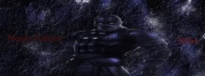
This is my newest sig I made.What do you guys think?
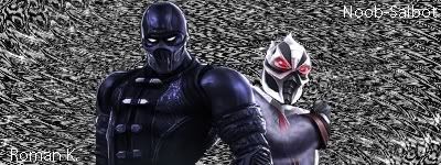
This is my newest sig I made.What do you guys think?
It all depends, how long have you been making sigs?
Well, honestly ; its not that good. It has a nice ideal to it ; but the text is bad and they don't blend that well with the background.
What program do you use?

Why do none of you guys get it?
Pattern Backgrounds Suck.
To make a great background using effects, my advice to you would be to take a real image, or make loads of different colours on your background....or even duplicate your render and make it large enough to fill your screen......and set it as background.
Once you have done this really Fuck it up...i mean get your effects and just go crazy, Smudge like crazy...whatever you want...just fuck it up.
After a few minuets or even seconds of Background mashing you may notice that you have a really good background.
And then it is all up to you, blend the signature and add a little thing I just learned called DEPTH, using your imagination find ways to make certain areas of the background look closer than others.
Example:

Look at the background....its really fucked up and I made it myself....however when you make backgrounds like this all the time you get so used to it that your no longer fucking up the background, but making a Controlled mess
Look at the top left of cloud, I made a light source, which actually looks like it is gleaming off him, I also made the left side lighter than the right.
Then look around the background and notice that I added DEPTH the background Actually looks Distant from Cloud, but he also looks like he is in the image, and not a cut and paste JOBBY.
Why?:
That’s where editing the render comes into play, I used a few things called gradient maps, and photo filters, which some people may not have on their programmes because it may be a Photoshop thing, but putting a coloured layer over the images and setting it to a layer mode and a Percent opacity can work as well.
Getting a copy of your render behind your original render and Blurring, and then erasing the edges of the top render (unblurred render), you can really make it look like your render is in the picture.
Now I know im not exactly the best person to try and give you advice on signature making, and I know i was not able to give you the perfect example of how to do the things I think you should learn, but it is still advice none the less, and some of you can do with advice like that as long as you understand how to use it......so READ CAREFULY.
And if any of you have any questions or comments just PM me or ask me here, and if you try out anything that I said and you think it was REALLY helpful and it helpt you make a good sig....show me and tell me I helped a little.
THANK YOU.
Mac Skinsleypants
Pattern Backgrounds Suck.
To make a great background using effects, my advice to you would be to take a real image, or make loads of different colours on your background....or even duplicate your render and make it large enough to fill your screen......and set it as background.
Once you have done this really Fuck it up...i mean get your effects and just go crazy, Smudge like crazy...whatever you want...just fuck it up.
After a few minuets or even seconds of Background mashing you may notice that you have a really good background.
And then it is all up to you, blend the signature and add a little thing I just learned called DEPTH, using your imagination find ways to make certain areas of the background look closer than others.
Example:
Look at the background....its really fucked up and I made it myself....however when you make backgrounds like this all the time you get so used to it that your no longer fucking up the background, but making a Controlled mess
Look at the top left of cloud, I made a light source, which actually looks like it is gleaming off him, I also made the left side lighter than the right.
Then look around the background and notice that I added DEPTH the background Actually looks Distant from Cloud, but he also looks like he is in the image, and not a cut and paste JOBBY.
Why?:
That’s where editing the render comes into play, I used a few things called gradient maps, and photo filters, which some people may not have on their programmes because it may be a Photoshop thing, but putting a coloured layer over the images and setting it to a layer mode and a Percent opacity can work as well.
Getting a copy of your render behind your original render and Blurring, and then erasing the edges of the top render (unblurred render), you can really make it look like your render is in the picture.
Now I know im not exactly the best person to try and give you advice on signature making, and I know i was not able to give you the perfect example of how to do the things I think you should learn, but it is still advice none the less, and some of you can do with advice like that as long as you understand how to use it......so READ CAREFULY.
And if any of you have any questions or comments just PM me or ask me here, and if you try out anything that I said and you think it was REALLY helpful and it helpt you make a good sig....show me and tell me I helped a little.
THANK YOU.
Mac Skinsleypants
0
skinsley Wrote:
Hmm... some interesting ideas there Mac Skinsleypants, might try some out when I can be fucked to do so.
0
Please rate these I wanna know how good im doing
>
>


UlcaTron Wrote:
Well, honestly ; its not that good. It has a nice ideal to it ; but the text is bad and they don't blend that well with the background.
What program do you use?
I use the GIMP.RomanK Wrote:
UlcaTron Wrote:
It all depends, how long have you been making sigs?
For a while now.RomanK Wrote:
This is my newest sig I made.What do you guys think?
This is my newest sig I made.What do you guys think?
It all depends, how long have you been making sigs?
Well, honestly ; its not that good. It has a nice ideal to it ; but the text is bad and they don't blend that well with the background.
What program do you use?

About Me

0
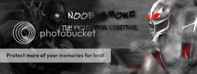
here's my newest sigs, wanted to make some MK sigs so i did.
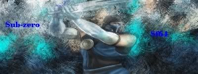
this came out the best of the three Mk sigs i made imo, i like it.
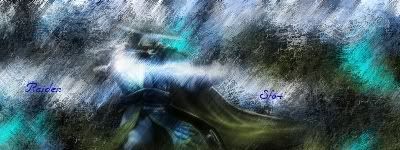 this came out the worst of the three, raiden is sorta blurry, text do not fit sig.
 this one came out good i guess, i think i accidentally strecthed the render.
  --------------------------------------------------------- Romank, to be honest, its alright. The background dosen't fit the sig well, nore does the text. good job cutting out the render though!6/10 ---------------------------------------------------------- Gamermk66, you're getting better.Just remember to make the render fit the sig, not vice versa.
this came out the best of the three Mk sigs i made imo, i like it.
this came out the worst of the three, raiden is sorta blurry, text do not fit sig. this one came out good i guess, i think i accidentally strecthed the render. 


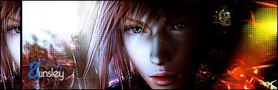
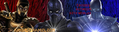
I like this sig, but i think it needs an aquired taste....i think quite a few of you wont like it.
Cozmos the text on that sig is great....if only it were a little more visable.
RomanK, that sig is very good....but you can use a little improvement.
About Me
0
i like it skinsley, not my fave by you but defintelty not your worst;good job is what i'm saying.

About Me

0


About Me
0


skinsley Wrote:
There Both Great.....the jin one is not so good, even though you used the same tecnique (I want to know how you made them BTW), the top one is better By Far, Quite amazing signatures.
-Jago- Wrote:


There Both Great.....the jin one is not so good, even though you used the same tecnique (I want to know how you made them BTW), the top one is better By Far, Quite amazing signatures.
I can send you the link to the tut if you want.
My latest, using the same style...but tried to mess with a different smudge brush:

Hell Yeah man, a tut would be awsome. !!
I love that style.
Little word of advice though, using a tut take techniques you have learnd and mix them together to make your own styles.
I realy wanna see that tut though, and your newest one is Also great.
P.S. to everyone See OLD and NEW in my sig, its god my new and my old stuff, gonna start updating it regularly now I think
Tell me what Yall think.
skinsley Wrote:
Hell Yeah man, a tut would be awsome. !!
I love that style.
Little word of advice though, using a tut take techniques you have learnd and mix them together to make your own styles.
I realy wanna see that tut though, and your newest one is Also great.
P.S. to everyone See OLD and NEW in my sig, its god my new and my old stuff, gonna start updating it regularly now I think
Tell me what Yall think.
Yeah, that's what I'm gonna do once I get comfortable enough with it. Also, these are part of a project me a friend are working on...we're trying to make sigs of all the Tekken characters. I'm doing half, and he's doing half. My next one will be Roger Jr., lol. Thanks for the comments.
BTW I sent you the tut so check your IMs.
About Me
0
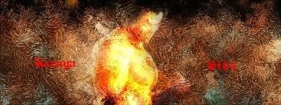
i'm not sure about this one, can't choose whether i hate it or love it.

0
xtactics Wrote:
Meh, what the hell. It was a good movie. Comments & criticism always appreciated.
Meh, what the hell. It was a good movie. Comments & criticism always appreciated.
Step Up was a great movie, and thats a great sig. Good job!
skinsley Wrote:
Mighty haddad we already know you are massively fucked :P
Mighty haddad we already know you are massively fucked :P
I dont get it...
Wait... are you saying my sigs are crap? *cries*
0
skinsley Wrote:
Awww matt the great.
You know I would never say anything bad about you...im your number one fan
Awww matt the great.
You know I would never say anything bad about you...im your number one fan
I am great, and I definitely dont deserve to have anything bad said about me, but I have a lot of fans and saying your number one is a big claim.
Anywayz, you can learn a lot about sigs from me, young one.
About Me
0

not sure if i like the text, but i like the sig itself.


© 1998-2026 Shadow Knight Media, LLC. All rights reserved. Mortal Kombat, the dragon logo and all character names are trademarks and copyright of Warner Bros. Entertainment Inc.