0
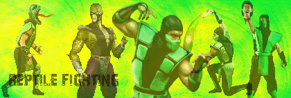
Well its not a great sig, you see there is no blending involved and the background is a tad plain.
The text is quite bad too, Try something simple and small, and put it in some space instead of over your renders.
Alot better than some begginers sigs though.
The text is quite bad too, Try something simple and small, and put it in some space instead of over your renders.
Alot better than some begginers sigs though.
About Me

0
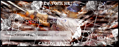
you're right, skins.i do use the render for the background. okay, the first sig i made like this was from a tut, but after that one i did the same overall theme of the tut but added and took off things here and there. Here's my usual steps in making a sig....
1.find a cool cutout pic
2.paste it all over the sig
3.go to filters>noise>pick
4.put randomization and repeat to 100%
5. take out parts of colors on sig that don't fit with three main colors
6. do the filters>noise>pick thing again
7.duplicate layer
8.go to Gimpressionist. then find a random one that i like
9.duplicate that layer
10.go to distorts>iwarp, then mess around with the tools until i like it
11.duplicate that layer, then go to filters>edge detact>edge>, then find one i like.
12.duplicate orignal background layer, then bring to the top of layers.
13.do a random Gimpressionist filter on it
14.do step #12 again
15.go to artistic>cubism, then do that on standard settings
16.do a random Gimpressionist filer on the cubist layer
17. do step #12 again
18.go to filters>blur>motion blur
19. have linear at 15 anf 307
20.do step #12 again, but don't do anything to that layer
21.make random opacties that fit for each layer, then see what bg looks like
22.make a new layer, don't duplicate it, and bring it to the top
23.paste render on that layer, then anchor it
24.duplicate that layer, then do gaussian blur at standard settings
25. set the duplicated layers type to screen at 50%, then merge down
26.duplicate that layer, then go alpha to selecttion on the botton layer
27.go to feather, any size, then invert, then cut
28.do step#27 again for the top layer
29.do filters>noise>spread
30.motion blur then at setting previously used
31. put the opacity of the two render layers to what you think works.
there you go, thats how i make a sig!I'll be making one more sig this way, then after that one i will be making them totally diffrent.
Take this advice shin fan.....work with what you know.
I assure you, your almost right when it comes to making a great background.
Only try and lighten the background layer, then adding the origonal render again, so that you can see the render properly.
Also try duplicating the render a few more times, but keep it in the same place.....do loads of different things for each render but keeping the top render normal,,,,,also change all the renders below to different modes....you know like overlay and lighten or whatever Gimp has.
Try and perfect the way your making sigs now, before trying new ways.
About Me

0
thanks for the tips skins, i jus thought people were getting tired of them, so i said i'd stop making them that way. since you said i'm doing very good at bg and need only to pefect them a little more, i'll make them this way.
Yeah you make backgrounds the same way I used to make backgrounds.
The only problem you have now....apart from TEXT which you should just try and look at my sigs to learn from (I personaly think I have almost perfected Text, but thats the only aspect) is that you have sort of gotten mixed up between Blending....and just damn right hiding your render, lol.
lighten your background so that you can atleast see the Render, the idea is to make the background out of colours similar to your render, so by lightening the background, you still have the colours from your render ONLY LIGHTER.
Catch my drift ?
There is so many things you can do when making sigs that its just unreal.....Jago showed me a place where theres people who make sigs, who shit all over anyone here makes...including pred and minion and hikari....there just amazing and WE ALL SUCK ,,,,I shit you not on that matter.
0
4
You set out the images realy well, I like where you placed them.
the background is pretty cool too, but i would reccomend trying a little bit more for a background than just two colours.
There is alot more to blending a signature than making the images slightly Opaque.
Try some Tutorials until you get past the begginer stages, then you can use some styles and mix and match to make your own style.
All it takes is time, this is better than your last sig BTW.
Keep practicing.
About Me

0
thanks again for the advice skins, and they are some people are here who just say your sigs suck and gie no adivce on how to improve.....not callling anyone out there.
EDIT: took some of your advice, and tried to add it to this sig think i did pretty good, but the text i still need to work on that aspect lol.also, didn't notice until now the render isn't fully on the bottom of the sig, my bad.
EDIT: took some of your advice, and tried to add it to this sig
 think i did pretty good, but the text i still need to work on that aspect lol.also, didn't notice until now the render isn't fully on the bottom of the sig, my bad.
Better but not by alot, try and duplicate your background.....add more effects too it and then arase some of it.....showing the origonal background behind it.
This way by using the same colours,,,,your background will not look repetative......do this as many times as you like until you get something you like.
This way by using the same colours,,,,your background will not look repetative......do this as many times as you like until you get something you like.


0

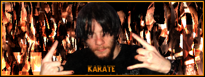
Just stopping by to show this one off..
I really like the way I did the background the most I think...those are a few months old pictures of me, so I don't look much different today.
Whadda-ya-think?
I'm going to have it rated I guess since I'm posting it up everywhere. Trying to see if it's something I should use as a concept to change the myspace over to...
0
ThePredator151 Wrote:
Nice. The pic on the far right looks cool, and you did a good job on the background. Not sure why "the falcon" is in grey tho. Oh wellz, still turned out great.
And Skins... that Beyonce sig is the shit! That Goku sig is pretty horrid tho
0
The one is my sig now. What do you guys think?
0
UlcaTron Wrote:
Really good man! What program do you use?
prodigy004 Wrote:
Really good man! What program do you use?
Thanks bud. Photoshop ofcourse.
prodigy004 Wrote:
Thanks bud. Photoshop ofcourse.
UlcaTron Wrote:
Really good man! What program do you use?
prodigy004 Wrote:
Really good man! What program do you use?
Thanks bud. Photoshop ofcourse.
I see. Well, from what I have seen Photoshop is doing better than GIMP ; Unless Hikari makes it with GIMP. Hikari is very good. But still, that is awesome it of course deserves 10/10
0
skinsley Wrote:
Prodigy, that sig is awsome.......massive improvement.
but how?
Prodigy, that sig is awsome.......massive improvement.
but how?
Turorials my friend. I do alot with diiferent styles but I usualy dont post them because I dont like the outcome. Thanks for the comment Skins.
prodigy004 Wrote:
Turorials my friend. I do alot with diiferent styles but I usualy dont post them because I dont like the outcome. Thanks for the comment Skins.
skinsley Wrote:
Prodigy, that sig is awsome.......massive improvement.
but how?
Prodigy, that sig is awsome.......massive improvement.
but how?
Turorials my friend. I do alot with diiferent styles but I usualy dont post them because I dont like the outcome. Thanks for the comment Skins.
Could you gimme the URL to the Tutorial?
About Me
0

© 1998-2026 Shadow Knight Media, LLC. All rights reserved. Mortal Kombat, the dragon logo and all character names are trademarks and copyright of Warner Bros. Entertainment Inc.


