

skinsley Wrote:
Ulcatron that sig is awsome,,, quite a few of your sigs on your site are good actualy, i like some of the black and white ones.
Though the very first sig I made you is just in the group....looks like you made it.
Ulcatron that sig is awsome,,, quite a few of your sigs on your site are good actualy, i like some of the black and white ones.
Though the very first sig I made you is just in the group....looks like you made it.
I will change that.. and I really liked that sig.. Once I am done with mine I am using that one again

About Me

0
good signature xtactics
0
Shinnok-fan64 Wrote:
i noticed that MK2007, its alot worse though in the shinnok one. you can see most of the heartless sigs text, but some is cut off.
i noticed that MK2007, its alot worse though in the shinnok one. you can see most of the heartless sigs text, but some is cut off.
In my sigs, for fonts, I usually use a colour that is on the sig, but not on the part that I am placing it. That way it goes with the sig, and also is easily seen. If there is only one colour being used mainly, either use a darker shade of that colour, or give it an outline of black or something to make it show.
And I like that Shinnok sig btw. Font let it down, but other then that Link sig (which I really like... a lot), it is my fave of yours. Great work!
0

After Affects is fucked. I added a font but than when I saved it the whole thing got fuked up.
Whatver, I dont care. The program is somewhat complicated.
About Me
0
thanks Matt, and that bg for the link sig wasn't mine, it was a fractual render, but it does look cool.
Also, the shinnok text is hard to read i know, but i love that sig! so simple to do, but great turnout imo. might use it sometime.
Finally, Matt you make great sigs. although i'm not a fan of Beyonce, she is fexy and was funny on Goldmember(lol).Keep it up,dude!
Also, the shinnok text is hard to read i know, but i love that sig! so simple to do, but great turnout imo. might use it sometime.
Finally, Matt you make great sigs. although i'm not a fan of Beyonce, she is fexy and was funny on Goldmember(lol).Keep it up,dude!
0
UlcaTron Wrote:
Could I use that sig? I will give credit
prodigy004 Wrote:
After Affects is fucked. I added a font but than when I saved it the whole thing got fuked up.
Whatver, I dont care. The program is somewhat complicated.
After Affects is fucked. I added a font but than when I saved it the whole thing got fuked up.
Whatver, I dont care. The program is somewhat complicated.
Could I use that sig? I will give credit
Ummm...... I suppose that would be ok but just wait until after the S.O.T.W is done because I added it there. But after that shes all yours. And I better get my damn credit!
I dont really like this one. Edit- Fine!
0
xtactics Wrote:

Aaccck. Sorry Diddy, but I had to get you out of my system. So long.
Aaccck. Sorry Diddy, but I had to get you out of my system. So long.
pretty good... the only thing: the 2nd diddy render looks kinda bad for that type of sig... kinda draws attention from the main render and looks sorta messy...
the font is not the best... but then again... everyone knows text sucks to do.. hehehe
4/5
prodigy004 Wrote:
Ummm...... I suppose that would be ok but just wait until after the S.O.T.W is done because I added it there. But after that shes all yours. And I better get my damn credit!
I dont really like this one.
Edit- Fine!
UlcaTron Wrote:
Could I use that sig? I will give credit
prodigy004 Wrote:
After Affects is fucked. I added a font but than when I saved it the whole thing got fuked up.
Whatver, I dont care. The program is somewhat complicated.
After Affects is fucked. I added a font but than when I saved it the whole thing got fuked up.
Whatver, I dont care. The program is somewhat complicated.
Could I use that sig? I will give credit
Ummm...... I suppose that would be ok but just wait until after the S.O.T.W is done because I added it there. But after that shes all yours. And I better get my damn credit!
I dont really like this one.
Edit- Fine!
Lol... It's cool ; but the after affect like you said didn't look great.
Thanks anyways! lol

Try and steer away from the more obviouse ways of making sigs, Using Brushes for sigs is something I did from a realy early stage, and now I dont think i use them at all.
I use the usual Default brushes but that is all, The best way to make your backgrounds is through smudging and Distorting.
I use the usual Default brushes but that is all, The best way to make your backgrounds is through smudging and Distorting.
About Me
0
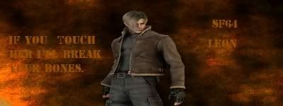
very simple, nothing special but i really like it for some reason. lol at the quote by leon on the left side.

About Me

0
Shinnok-fan64:
I had to strain my eyes to see the text on the right. Try darkening some areas in the background a liitle bit to make the text more noticable.
Once again, the render seems to be over stretched.
Shinnok fan, you are still stretching the render.....
If you stretch the render,,,,,dont contiue with the sig....just fuck it off and try again, its just not worth it.
You could make the greatest sig in the world, stretch the render and it becomes the most awfull.
You cant make good signatures if you mess up the most simple/important part.
If you stretch the render,,,,,dont contiue with the sig....just fuck it off and try again, its just not worth it.
You could make the greatest sig in the world, stretch the render and it becomes the most awfull.
You cant make good signatures if you mess up the most simple/important part.
About Me
0
i can see the text just fine actually on the right, on the left i could see someone having trouble seeing it.
Also, skins you told me how to nonstretch the renders, well i did that method and its apparently still strecthed( i can't tell if they're strecthed or not.)
Also, skins you told me how to nonstretch the renders, well i did that method and its apparently still strecthed( i can't tell if they're strecthed or not.)
Shinnok-fan64 Wrote:
Also, skins you told me how to nonstretch the renders, well i did that method and its apparently still strecthed( i can't tell if they're strecthed or not.)
Also, skins you told me how to nonstretch the renders, well i did that method and its apparently still strecthed( i can't tell if they're strecthed or not.)
Well, its when the render or object is to wide or looks out of place with the rest of the sig.
Honestly, I have never stretched a render. I don't understand what you encountering.
Though, if you'd like you could go to Deviant Art.com and find some good tutorials there. Or ask Skinsley for a Private PM session tutorial (If he agrees to it). If not ask Prodigy Directly for a link to one of the Sig Tutorials on Deviant art.com ; they help alot!
About Me
0
Shinnok-fan64 Wrote:
i can see the text just fine actually on the right, on the left i could see someone having trouble seeing it.
i can see the text just fine actually on the right, on the left i could see someone having trouble seeing it.
Did I say right? It seems I don't know left and rights, thanks for making a retard out of me.

About Me

0


^^^Lighting practice

Full Metal pwnage :p


^ Tut from another forum.
About Me
0
Mk2007, lol sorry i made you seem dumb jk.
these ones i made the same way, but imo much better as the text is visible.
 worst of the three, the render looks weird.
  second fav of the three, good imo but text is somewhat hard to see in places.
  favorite of the three, i love this one for some reason. this ain't nowhere near as good as the sigmakers here, but i like these three a lot for some unknown reason.
these ones i made the same way, but imo much better as the text is visible.
worst of the three, the render looks weird. second fav of the three, good imo but text is somewhat hard to see in places. favorite of the three, i love this one for some reason. this ain't nowhere near as good as the sigmakers here, but i like these three a lot for some unknown reason.0
Rate this!
About Me
0
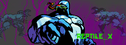
you are getting better, gamermk66(not like i'm some god of sigmaking though either lol).
the bg fits the render better than your last one, but i don't think the extra pics of venom are really neccesary; you should put text there instead.
the bg fits the render better than your last one, but i don't think the extra pics of venom are really neccesary; you should put text there instead.
About Me
0


I never knew you could get tutorials online....

I'm very upset. This sig just makes me want to rip out my hair. It's so bad it looks like Goro took a giant shit on it. I couldn't find a high-res render, so I had to work with that *points to sig*. FUCK. Don't tell me how bad it is I already know.
Brought to you by a very pissed off X.
I'm very upset. This sig just makes me want to rip out my hair. It's so bad it looks like Goro took a giant shit on it. I couldn't find a high-res render, so I had to work with that *points to sig*. FUCK. Don't tell me how bad it is I already know.
Brought to you by a very pissed off X.
About Me
0
its not as bad as you seem to think it is, xtactics.i like the bg, my only gripe is that some of the text is hard to see.


© 1998-2026 Shadow Knight Media, LLC. All rights reserved. Mortal Kombat, the dragon logo and all character names are trademarks and copyright of Warner Bros. Entertainment Inc.