

About Me
My tastes have changed since I created this account over 4 years ago. I prefer being called Siklootd and now love heavy metal music. 
Long live heavy metal music!
0
xtactics Wrote:
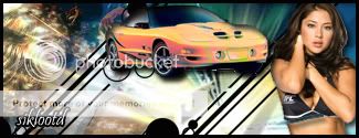
Took me ten minutes... lol. What do you guys think?

Took me ten minutes... lol. What do you guys think?
That's pretty sweet bro. I like it a lot. I haven't made a sig in a while, but my latest are:
and

About Me

0
here's my newest ones....
 not bad imo, bad cutout though
 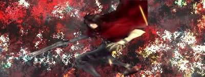 don't like this one
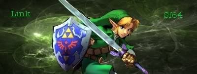
not bad imo, bad cutout though don't like this one The middle one looks like the same thing I've been seeing from you for a while; the render is just... bad, and the backround.
Anyways.
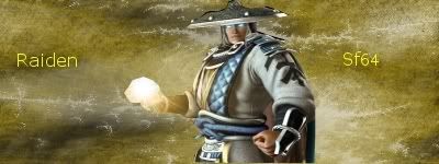
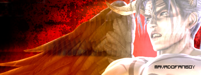
What I can say is that the other two (raiden et link) are of much improvement. Believe it or not I prefer the Link one over Raiden's
EDIT: Btw I noticed you keep the same font on every sig. Just throwing that in there.
Anyways.
What I can say is that the other two (raiden et link) are of much improvement. Believe it or not I prefer the Link one over Raiden's
EDIT: Btw I noticed you keep the same font on every sig. Just throwing that in there.
0
Shinnok Fan, you are improving, but I think you have it in your mind that a busy background with any image on top of it with any text will turn out okay. The render and the background should at least share one colour or looks similar somehow, otherwise is just doesn't fit. Also, blending will help a lot (lightly smudge the edges or something), and use more interesting fonts.
Btw, that Link sig, if the text was better, would be a great one. Best from you so far, well done! =)
Btw, that Link sig, if the text was better, would be a great one. Best from you so far, well done! =)
About Me
0

About Me

0
xtactics Wrote:
I noticed you keep the same font on every sig. Just throwing that in there.
I noticed you keep the same font on every sig. Just throwing that in there.
Look again, both fonts in the Raiden sig and Link sig are different.

About Me
0
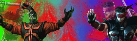
thanks for defending me MK2007, and you are right, they are diffrent but look alot alike.
Also, just so everyone knows on the link sig i didn't make the bg. i went to a website with abstract fractuals and found one that fit the link picture, so don't think i did good there.
Also,the cutouts are bad on all three, but imo the raiden is the worst.Still, the raiden one is my fav of the three.
0
I call him Bokk....
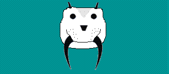
mascot of the Brotherhood of Shadow......
LOL!
mascot of the Brotherhood of Shadow......
LOL!
MortalKombat2007 Wrote:
Look again, both fonts in the Raiden sig and Link sig are different.
xtactics Wrote:
I noticed you keep the same font on every sig. Just throwing that in there.
I noticed you keep the same font on every sig. Just throwing that in there.
Look again, both fonts in the Raiden sig and Link sig are different.
You're right, they are different; I got home late last night. Still, I HAVE seen those fonts used before.


About Me
0


0


I'm really impressed with these two, gimp is a great program!
About Me
0
Any comments would help.
About Me
0


About Me
0
thanks skins......which one though?
also, could others possibly give me constructive criticism?
also, could others possibly give me constructive criticism?

About Me
0
Shinnok-fan64 Wrote:
Well, the typography isn't good in both sigs. Try experimenting Layer Style or a simiar option to find a way to make your text more visible.
About Me
0
i noticed that MK2007, its alot worse though in the shinnok one. you can see most of the heartless sigs text, but some is cut off.
0
ok rate these plz

This 1 is too big to put here http://i81.photobucket.com/albums/j230/mkvs_sf666/Untitled9.gif
This 1 is too big to put here http://i81.photobucket.com/albums/j230/mkvs_sf666/Untitled9.gif
About Me
0
gamermk66, that first sig is pretty good, or very decent. You defintely need text, and you shouldn't have darkened Noob and Sub-Zero.
the other one is pretty cool.
the other one is pretty cool.


© 1998-2026 Shadow Knight Media, LLC. All rights reserved. Mortal Kombat, the dragon logo and all character names are trademarks and copyright of Warner Bros. Entertainment Inc.