
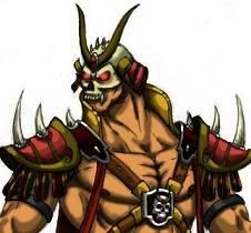
Original Sub-Zero Redesign
Fan Kreations
Pages: 1
| Artist's Remarks: | |
|
My redesign of the Original Sub-Zero. Still practincing with photoshop, but I think it came out well.
|
| Full Scale | 504x688 | Category | Drawings (Digitally coloured) | User Views | |
| User Likes | User Ratings | 7 | Score |
 5.0 5.0
|
0


Pages: 1


© 1998-2026 Shadow Knight Media, LLC. All rights reserved. Mortal Kombat, the dragon logo and all character names are trademarks and copyright of Warner Bros. Entertainment Inc.