Scorpion Coloring
Fan Kreations
Pages: 1
Scorpion Coloring
| Artist's Remarks: | |
|
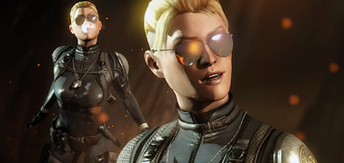
You all may remember Unleash_Your_Tongue's Scorpion drawingthat he colored in and submitted a few months back, this is my rendition of that image. And don't worry, it's not stealing, I'm the one that inked it for him to color :-P So tell me what you think :-)
|
| Full Scale | 719x780 | Category | Drawings (Digitally coloured) | User Views | |
| User Likes | User Ratings | 12 | Score |
|
0
kool make 1 of baraka!!
0
Scorp's a total hottie in this. 
5/5, the shading, lightning, and drawing overall was and is awesome.
I had a GREAT time working with it.
5/5, the shading, lightning, and drawing overall was and is awesome.
I had a GREAT time working with it.

0
Kombosus Wrote:
Nice you have imagination. But you need to work on coordination.
Nice you have imagination. But you need to work on coordination.
Wha...? Please explain your comment, because I don't understand what you're getting at by it.
I hope you don't mean color coordination, because it's all flowing well on that aspect. Grays and yellows, nothing more other than skin tone which you have to include if you want to make it look somewhat right.
Thanks efor the comments everyone though. This is the most rewarding part of making art, having others enjoy it as well.


0
nice drawing ,amazing coloring... at times like this I wish I could colour my colourless pics as good as you,....


About Me
<img src="http://i6.tinypic.com/16lxtso.jpg"
Sexy-tastic signature made by BOMBSnFISTS. My deviantART gallery
0
Great foreshortening work.

0
Looks nice but some things could use some extra work.
1 = It's not very clear where the light is coming from.
2 = the ink lines stick out too much for my taste. I think It'll look better if you blended that in.
1 = It's not very clear where the light is coming from.
2 = the ink lines stick out too much for my taste. I think It'll look better if you blended that in.
About Me

0
Excellent work.


About Me

0
Kombosus Wrote:
I meant he doesnt look like hes really feeling the action theres no emotion, he just looks like heres my hand hows it look? It's good im not saying it isn't.
I meant he doesnt look like hes really feeling the action theres no emotion, he just looks like heres my hand hows it look? It's good im not saying it isn't.
Well he didn't draw it.

0
justycist Wrote:
Well he didn't draw it.
Kombosus Wrote:
I meant he doesnt look like hes really feeling the action theres no emotion, he just looks like heres my hand hows it look? It's good im not saying it isn't.
I meant he doesnt look like hes really feeling the action theres no emotion, he just looks like heres my hand hows it look? It's good im not saying it isn't.
Well he didn't draw it.
...actually, I did draw this one, Justin
I agree with your revised comment, Kombosus, and I never took it as mean, you just used the wrong wording so I didn't understand what you meant by it had no coordination.
Thanks again for the critiques and comments everyone.

0
I've been trying to get away from the static looking poses too.
You could get some inspiration from comic books and practice more with perspective and dynamic poses.
Here's a quick sketch I made as an example.
Click here
You could get some inspiration from comic books and practice more with perspective and dynamic poses.
Here's a quick sketch I made as an example.
Click here


About Me

0
You did? Oh well I have seen better from you, but I don't think its bad at all. 
Pages: 1
© 1998-2026 Shadow Knight Media, LLC. All rights reserved. Mortal Kombat, the dragon logo and all character names are trademarks and copyright of Warner Bros. Entertainment Inc.


