

I agree to some degree with the arenas in MK9. I'm not a big fan of most of the redesings, especially the deadpool and the armory. But i think that is a matter of taste. Still, the arenas in MKD were better, and i still think a lot of the older desings were better aswell. The same with the music, it's just the old tunes with a guitar, wich takes out the great thing about MK's music wich was the fact that they were designed for the stages to get the "feel" of them. But that is not what's being argued here.
Again, not saying it looks bad, but i think the colours they are using in Injustice would've been better implemented in MK, and MK's bright colours would be better in Injustice. It would've made the game look darker.
No matter what, I'd like to see that in Mortal Kombat X: What The Hell.


Ed Boon once stated that NeRdS should go the Gears of War line of darkness and grittyness, as it was the trend at the time that Epic evidently created, but then they made MK/DC and ditched the idea of gray, sad graphics.
The last thing MK needed was "brown and bloom" graphics. I'm glad they didn't go that route.
MK9 is one of the best looking console games I've played this generation. There are some obvious problems with hair rendering and such, but the models and backgrounds are generally stellar.
The arenas in particular stand out. Colour is a good thing. Mortal Kombat doesn't need to be dark and grimy. It's always had more in common with comic books than... Diablo. Stupid comparison. How can people be so attached to the rainbow of Ninja Rangers, yet freak out that MK isn't a grey and brown shitfest?
And comparing Mortal Kombat to World of Warcraft? :| I don't think OP understands things.
I know MK is influenced by comics and I know it has a lot of comical elements, but they have never been about bright arenas and bright colored costumes. MK4 looked dark Âaand the arenas were dark in tha game and I really don't see how they were influenced by comics for that game, and MKDA-MKA.
And what's with being anime influenced ?Âa
Skarlet's ending was disgusting, stupid and cartoony as hell. Take it and compare it to Sektor's, that's the difference I have always been talking about. ÂaNot only Skarlet , but basically everything Smoke, from his costume,hair to his ending and Âaeven his battle cries.Âa
I can't say that I hated MK9's arenas, I didn't , but I wasn't as impressed with them as I was with MKDA-MKA. Those games' arenas were very creative that I would stop and look at them. Granted being 2D has limited the arenas, but there was no need for them to simply have 0 creativity.Âa
The bell tower looks dull and is so boring that I couldn't believe how they turned a once great arena into this bland and empty version. ÂaSouls Chamber wasn't Impressive either and early concept arts (found in artbook) show a much better and darker version of it. I wouldn't speak about the street or the roof, but my god those two are OFFICIALLY my LEAST favorite MK arenas ever. The Graveyard lost its appeal with it being set at down instead of night time.Âa
I loved Shang's garden, it has a huge amount of details and the effects of sun rays on the Chinese tower in front was a nice touch. Time accelerating in the tower arena is actually the most creative they could get in the game , but the golden statues look crappy and so cartoony that I wish they werent there. The Dead pool is done just right.Âa
I am not saying I want to see MK going Gears1 colors rendering, I wouldn't want to see that, Gears1 looks ugly compared to the more well thought out Âacoloring of Gears3, but MK9 simply didn't get the right direction of art.Âa
I have always defended the team's artists. I still love looking a MKDA-MKA arenas. There has always been at least one creative element in each arena and they were set in the perfect time for each arena. And that's something I couldn't say for MK9.Âa
I am not worried about MK10, I firmly believe that it will look better and the arenas will undergo the right direction. I firmly believe that the team just tried to re-imagine what are thought to be the most iconic arenas ever and they tried to simply change things in order to avoid getting criticized for simply 100% remaking the original classics. That's both respectable and understandable, but I am really not a fan of it though not necessarily hating it. Âa
I just want them either to fully follow MK4's take on the arenas or simply coming up with new original ones that have nothing to do with those, just don't try to create a re-imagined versions of them.Âa
Only time will tell...Âa
.
This thread is basically a joke becuase he basically thinks that Mortal Kombat needs to be forever dark and gritty with bland and dark colors that has nothing to do to remind him of Blizzard's games.
But what's even more ridiculous about this thread is the fact that World of Warcraft and Diablo are even being talked about in comparison with Mortal Kombat. Three games that have nothing to do with each other, that all have a completely different look from one another, and the way it was created have no similarities whatsoever within the games.
And the last thing that is laughable, is how he doesn't realize that the comics have also been dark and gritty. DC can do violence, they do have death, blood, gore, and other violent images. I guess if it isn't Mortal Kombat, it has no right to be dark. Which is laughable because I don't really see Mortal Kombat being dark that much now and days. Not saying that it totally isn't, I just think that there are much darker games out there than a Dragon eating, head ripping, gut splattering beat'em up.
Looking at all the MKs post arcade era, the last gen 3D ones especially MKD were closer to how MK2 felt than 9.�a
I know MK is influenced by comics and I know it has a lot of comical elements, but they have never been about bright arenas and bright colored costumes. MK4 looked dark �aand the arenas were dark in tha game and I really don't see how they were influenced by comics for that game, and MKDA-MKA.
And what's with being anime influenced ?�a
Skarlet's ending was disgusting, stupid and cartoony as hell. Take it and compare it to Sektor's, that's the difference I have always been talking about. �aNot only Skarlet , but basically everything Smoke, from his costume,hair to his ending and �aeven his battle cries.�a
I can't say that I hated MK9's arenas, I didn't , but I wasn't as impressed with them as I was with MKDA-MKA. Those games' arenas were very creative that I would stop and look at them. Granted being 2D has limited the arenas, but there was no need for them to simply have 0 creativity.�a
The bell tower looks dull and is so boring that I couldn't believe how they turned a once great arena into this bland and empty version. �aSouls Chamber wasn't Impressive either and early concept arts (found in artbook) show a much better and darker version of it. I wouldn't speak about the street or the roof, but my god those two are OFFICIALLY my LEAST favorite MK arenas ever. The Graveyard lost its appeal with it being set at down instead of night time.�a
I loved Shang's garden, it has a huge amount of details and the effects of sun rays on the Chinese tower in front was a nice touch. Time accelerating in the tower arena is actually the most creative they could get in the game , but the golden statues look crappy and so cartoony that I wish they werent there. The Dead pool is done just right.�a
I am not saying I want to see MK going Gears1 colors rendering, I wouldn't want to see that, Gears1 looks ugly compared to the more well thought out �acoloring of Gears3, but MK9 simply didn't get the right direction of art.�a
I have always defended the team's artists. I still love looking a MKDA-MKA arenas. There has always been at least one creative element in each arena and they were set in the perfect time for each arena. And that's something I couldn't say for MK9.�a
I am not worried about MK10, I firmly believe that it will look better and the arenas will undergo the right direction. I firmly believe that the team just tried to re-imagine what are thought to be the most iconic arenas ever and they tried to simply change things in order to avoid getting criticized for simply 100% remaking the original classics. That's both respectable and understandable, but I am really not a fan of it though not necessarily hating it. �a
I just want them either to fully follow MK4's take on the arenas or simply coming up with new original ones that have nothing to do with those, just don't try to create a re-imagined versions of them.�a
Only time will tell...�a
MK4 "dark"?
We had Shinnok as last boss fight: a guy dressed like a court jester, with a red, yellow and green attire. You call this dark and gritty?
We had "The Tomb" arena with: purple walls, red and grey floor, brown walls.
"Reptile's Lair": various tones of green.
"The hell": Brown floor, pinkish themes all-around, some skull here and there and grey walls.
The Dark prison stage and maybe Goro's lair were the only dark stages of that game. And the last one is darker in MK9.
About MK Deception...I still have nightmares of how awful those arenas were...c'mon, the Deadpool was Squared. A f'ing SQUARE and the same goes for the "The Pit" arena.
Some arenas have a great design, with their "catwalk" feeling in MK9. On your sides there's nothing but a fall in the blue. Fighitng with the illusion of falling into acid or onto a spiked floor was one of the most awesome elements of the arena design. Dueling on a tiny bridge was totally different than fighting on a SQUARE.
MK9 is one of the best looking console games I've played this generation. There are some obvious problems with hair rendering and such, but the models and backgrounds are generally stellar.
MK9 has good graphics namely in the blood effects that were the world's most realistic by the time MK9 was launched. There are still lots of games with better graphics than MK9 these days especially on the PS3 and PC (360: GoW, A. Wake & Skyrim are HQ.) The biggest "flaws" graphics-wise are probably: 1) the X-ray skeleton that is almost identical with everyone whether you're a cyborg or the queen of Edenia, 2) lame costume design with e.g. Kahn and Nightwolf, 3) honestly a rather boring select screen 4) the aforementioned hair flaws 5) vast usage of "copy-paste" in costume and arena design (that sasquatch!) and 5) some arenas (...mostly neat).
Anyway, I don't nor didn't complain about MK9's colorful graphics here – I'm satisfied with them in general. Considering that MK9 paid homage to the old school games in the sense of storyline (in a way), costume design and gameplay: it's only natural that the graphics won't make a huge makeover aside the modern 3D standard. However, what was the real issue in MK9's visuals was the way Story Mode was presented IMO. All the same, even the sun has its dark spots. I like MK9 as a fighting game.The NeRdS ́ goal was to maximize the profit and they succeeded in that department surely. I did like the GoW style no less, many did, but I'd find GoW2's slightly toned down grittiness more suitable for MKX than that of GoW1. With grittiness I'm not talking about taking away the colors really but improving e.g. the smoke, water and lighting effects, filters and all that jazz. The game will be its own individual game now and if they're about to bring the Hell on Earth; this all makes just sense. Although I don't see a possible issue in the graphics of MKX if it will be a next-gen release.
How come? I mean, that sdoulda be the more rainbow and softy game,but it doesn't!!!
Regarding the original post: But you don't know the setting of GAU, do you? Ed Boon and boys are going to add their own touch to it and the plot is expected to be something between the lines "the good guys turned really bad and the apocalypse being close." I see where you're coming from even though your delivery is y'know, what it is: the involvement of the DC universe caused MK/DC to have an ESRB rating of "Teen". Since then the DC characters have met the "New 52" treatment and a bunch of other things however, and the story is a little different now. I hope that helped.
I wonder if this Injustice thread would fit into the DC forum the best BTW.
Looking at all the MKs post arcade era, the last gen 3D ones especially MKD were closer to how MK2 felt than 9.�a
I know MK is influenced by comics and I know it has a lot of comical elements, but they have never been about bright arenas and bright colored costumes. MK4 looked dark �aand the arenas were dark in tha game and I really don't see how they were influenced by comics for that game, and MKDA-MKA.
And what's with being anime influenced ?�a
Skarlet's ending was disgusting, stupid and cartoony as hell. Take it and compare it to Sektor's, that's the difference I have always been talking about. �aNot only Skarlet , but basically everything Smoke, from his costume,hair to his ending and �aeven his battle cries.�a
I can't say that I hated MK9's arenas, I didn't , but I wasn't as impressed with them as I was with MKDA-MKA. Those games' arenas were very creative that I would stop and look at them. Granted being 2D has limited the arenas, but there was no need for them to simply have 0 creativity.�a
The bell tower looks dull and is so boring that I couldn't believe how they turned a once great arena into this bland and empty version. �aSouls Chamber wasn't Impressive either and early concept arts (found in artbook) show a much better and darker version of it. I wouldn't speak about the street or the roof, but my god those two are OFFICIALLY my LEAST favorite MK arenas ever. The Graveyard lost its appeal with it being set at down instead of night time.�a
I loved Shang's garden, it has a huge amount of details and the effects of sun rays on the Chinese tower in front was a nice touch. Time accelerating in the tower arena is actually the most creative they could get in the game , but the golden statues look crappy and so cartoony that I wish they werent there. The Dead pool is done just right.�a
I am not saying I want to see MK going Gears1 colors rendering, I wouldn't want to see that, Gears1 looks ugly compared to the more well thought out �acoloring of Gears3, but MK9 simply didn't get the right direction of art.�a
I have always defended the team's artists. I still love looking a MKDA-MKA arenas. There has always been at least one creative element in each arena and they were set in the perfect time for each arena. And that's something I couldn't say for MK9.�a
I am not worried about MK10, I firmly believe that it will look better and the arenas will undergo the right direction. I firmly believe that the team just tried to re-imagine what are thought to be the most iconic arenas ever and they tried to simply change things in order to avoid getting criticized for simply 100% remaking the original classics. That's both respectable and understandable, but I am really not a fan of it though not necessarily hating it. �a
I just want them either to fully follow MK4's take on the arenas or simply coming up with new original ones that have nothing to do with those, just don't try to create a re-imagined versions of them.�a
Only time will tell...�a
MK4 "dark"?
We had Shinnok as last boss fight: a guy dressed like a court jester, with a red, yellow and green attire. You call this dark and gritty?
We had "The Tomb" arena with: purple walls, red and grey floor, brown walls.
"Reptile's Lair": various tones of green.
"The hell": Brown floor, pinkish themes all-around, some skull here and there and grey walls.
The Dark prison stage and maybe Goro's lair were the only dark stages of that game. And the last one is darker in MK9.
About MK Deception...I still have nightmares of how awful those arenas were...c'mon, the Deadpool was Squared. A f'ing SQUARE and the same goes for the "The Pit" arena.
Some arenas have a great design, with their "catwalk" feeling in MK9. On your sides there's nothing but a fall in the blue. Fighitng with the illusion of falling into acid or onto a spiked floor was one of the most awesome elements of the arena design. Dueling on a tiny bridge was totally different than fighting on a SQUARE.
While MK4 didn't really have the darkest of colors, the design had its touches back then. It just gives you the feeling of isolation and the arenas were more mysterious than in MK9. Another factor that held MK9 back (IN MY OPINION) was the whole kinda bigger epic scale in the story that mostly covers MK3. I am not saying than any of the other MK's stories were even slightly believable, but as I said before, they had less WTF moments that are laughable.
I would take the Falling Cliffs, Golden Desert, Raiden's tower in MKD over many of MK9's arenas. The remade arenas in MKD weren't the best but I don't think we should stop there.
http://www.angelfire.com/va3/mk/mk5/arenas.htm
Really loved those ones.
Everyone is entitled to his opinion, and I highly respect personal tastes.
MK D had decent enviroment,although I believe that MK9's arenas are the best in the series.
The only remark I wanted to make to that post of yours is the point "MK4 is DARK". No, buddy, not at all. BTW, We agree on one thing: DARK or not, MK4 are among the best arenas.
The biggest "flaws" graphics-wise are probably: 1) the X-ray skeleton that is almost identical with everyone whether you're a cyborg or the queen of Edenia, 2) lame costume design with e.g. Kahn and Nightwolf, 3) honestly a rather boring select screen 4) the aforementioned hair flaws 5) vast usage of "copy-paste" in costume and arena design (that sasquatch!) and 5) some arenas (...mostly neat).
I agree, especially regarding costume design, but I'd say most of that is aesthetics, not graphics. Big difference. Also I never meant that you were the one bitching about colour in the game, I was referring to OP.
I wonder if this Injustice thread would fit into the DC forum the best BTW.
It's more of a discussion on art direction in Mortal Kombat than Injustice alone. It's fine here.

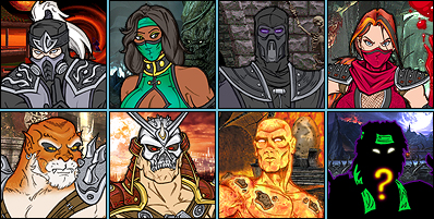
Personally, I like Nightwolf's primary. It looks like a more detailed version of what he wore in MK3. I think everybody in MK9 should've been wearing more detailed versions of their MK1 thru 3 clothes instead of anybody getting complete redesigns, like fuckin' Scorpion, Kitana, and Kahn did.
I do hate that he doesn't have that cool wolf logo on the back of his biker vest though.

Anyway, great thread and great opinions from some of you :)
Just looked at the pics of MKDA arenas, that one of you posted - masterpieces!
I have forgotten how kool really they are! I agree about MK:D square arenas :D lol at you having nightmares about them :D

Thanks to MINION for taking my Siginity!
The biggest "flaws" graphics-wise are probably: 1) the X-ray skeleton that is almost identical with everyone whether you're a cyborg or the queen of Edenia, 2) lame costume design with e.g. Kahn and Nightwolf, 3) honestly a rather boring select screen 4) the aforementioned hair flaws 5) vast usage of "copy-paste" in costume and arena design (that sasquatch!) and 5) some arenas (...mostly neat).
I agree, especially regarding costume design, but I'd say most of that is aesthetics, not graphics. Big difference. Also I never meant that you were the one bitching about colour in the game, I was referring to OP.
I wonder if this Injustice thread would fit into the DC forum the best BTW.
It's more of a discussion on art direction in Mortal Kombat than Injustice alone. It's fine here.
Okay, so I thought, but I just wanted to clear up my thoughts further after you had quoted me (just in case for everyone). No problem whatsoever.
Interesting to bring up Nightwolf in a thread about MK being too colorful. The colors in his primary are very desaturated. His jeans are so faded they're almost gray and most of the red on him is almost dark enough to be brown. I can see why you'd pick him out to complain about if you prefer color to "brown and bloom".
Personally, I like Nightwolf's primary. It looks like a more detailed version of what he wore in MK3. I think everybody in MK9 should've been wearing more detailed versions of their MK1 thru 3 clothes instead of anybody getting complete redesigns, like fuckin' Scorpion, Kitana, and Kahn did.
I do hate that he doesn't have that cool wolf logo on the back of his biker vest though.
Topics indeed proceed in peculiar ways sometimes, though opposites such as colorlessness and colorfulness can attract each other. Simply put I see Nightwolf's primary costume rather lame for the reasons: 1) it lacks detail 2) it's not very unique the artifacts aside 3) the vest seems too tight and 4) I don't think a wider color scheme could harm anyone → blandish.
It's not an issue to me though, but it seems like the design comes partially due to the fact that Nightwolf was one of the earliest characters to show up in the demos (E3 etc.), in that specific costume, and probably the earliest "uncool" character if you get what I mean thus his costume design might not be as thought-out. I am impressed by Nightwolf and Shao Kahn's alternative costumes nevertheless and Nightwolf overall in MK9.
There is nothing wrong with being gay, faggot.
Well, that's not the topic, but since you bring it..I just read that actually being gay is medical condition, that is curable ;) Good 4 you :)
I'd like to see the news article that told that. Could you provide the source?
I have other problems with this MK.I understand that Quan Chi was ready 4 download from the previews game, but what the hell is Kenshi and Scarlett doing in ?Where's Motaro, Chameleon and Khameleon ?
What's with the pit? Looks like pit 2 but it has spikes and it's called the pit..
They had to make bosses unlockable and playable when you beat the tower not that stupid costume.
Why Noob Saibot and Ermac are so unkool I mean their moves ?Fuck Kenshi and give his moves to Ermac and Noob respectably.Kenshi was rip off Ermac, but now hes a rip off Noob also ? Fuck Kenshi.
They shoulda put in Blaze, not Scarlet!Who the hell is this bitch anyway? Blaze was big rumor,Ermac was, but she is nothing.Make Blaze!!!!
I'll come up with more rants later :)
About the dark now.. Well I play Cyrax mainly,cuz Noob is boring and hard to play as and hes my fav since MK 2!
Anyway Cyrax's voice is Gay!!! He's intro is embarrassing, what he says is kool, but the voice is gay.I like Sektor's Voice!
I believe the new generation of people is really brainwashed nad zobied and pulled to enjoy gay games like WoW and that kind of rainbow corny style games.They ruined Diablo, mainly cuz the same gay guys made wow made Diablo.But I see this gay tendency take over MK.booN, what the hell man ?Bulk up and make MK BLACK AND WHITE and really realistyc.Maybe black white and red for the blood.Allright, later :)
Dude, it's not news article, it's a red book by Froid - Psychology of Sexuality.
Ugh. You stated it as a matter of fact (=actually) which is why I asked and wondered if there's a new study you had happened to "just read" about.
There is nothing wrong with being gay, faggot.
Well, that's not the topic, but since you bring it..I just read that actually being gay is medical condition, that is curable ;) Good 4 you :)
Homosexuality is not a mental disorder. Your information bases on about one-hundred-year-old information that has been updated in the late twentieth century. It's Sigmund Freud anyway, and he also told:
"Homosexuality is assuredly no advantage, but it is nothing to be ashamed of, no vice, no degradation; it cannot be classified as an illness; we consider it to be a variation of the sexual function, produced by a certain arrest of sexual development. Many highly respectable individuals of ancient and modern times have been homosexuals, several of the greatest men among them. (Plato, Michelangelo, Leonardo da Vinci, etc). It is a great injustice to persecute homosexuality as a crime – and a cruelty, too."Freud couldn't have been certain about the sexuality of those examples however. While "gay" is a slang word resembling "stupid", it's also a word for "homosexual", and you yourself used it in both ways in this thread – that should have nothing to do with homosexuality – insulting many people in a topic where you ask questions. I'm just not going to answer to the rest of your simple questions but provide you a link to an actual rant thread. I think it would satisfy everyone if you would write your rants there.Now about Shao Kahn: he had great and scary costume in early render and I don't know what happened to it (someone post pic if possible).Instead they gave him his lame ass costume and mega crappy moves.Hes not dark and scary at all.His voice i gay and moves don't look like the original ones.
I love MK 2 Shao Kahn, hes scarry and brutal.This one is clearly gay lol.
Goro looks allright, but moves are crap!
Well about Kintaro........ Hes the ULTIMATE gay and the epic fail in this game.
What the hell ?He looks like transsexual 4 armed kitty!!! OMG! One of my favs ruined.Crappy moves as well...
Allright, later :D
There is nothing wrong with being gay, faggot.
Well, that's not the topic, but since you bring it..I just read that actually being gay is medical condition, that is curable ;) Good 4 you :)
You're stupid.
Anyhoo, considering the improvement of graphics for Injustice, I really hope NRS gets down with the hair. I know it isn't easy to accomplish, but they now have both the money and the time to do their best. I hope they do.


Making steel hasn't changed for 4000 years.
Remeber those smelting pools and steel mills from the Romans and the Greeks? Boy, those were sure fun.
Dude, it's not news article, it's a red book by Froid - Psychology of Sexuality.
Froid.
Freud hasn't been mainstream psychology since decades. You skipped about, what now, the whole modern contemporary age of the development of psychology?
Stop being a factoid machine, especially when you don't know jack.
Two-Thousand plus years of evolution, and the world is still populated by people that are not even able to write Freud's name properly?????????????????


Child, you need to spend less time complaining about video games and go back to school. According to your logic, if something is "gay" it's stupid. So technically, that means you're incredibly gay. Just sayin.
I will agree with other posters that some characters costumes were a bit too bright (Mileena's bright pink primary, Cyrax's obnoxiously yellow hue and Kitana's cerulean blue primary being prime examples) but the arena's seem to hit the nail on the head with the colour schemes.
FROID???????????????????????????????
Two-Thousand plus years of evolution, and the world is still populated by people that are not even able to write Freud's name properly?????????????????
It's because we're discussing on how graphics improve over time by an imbecile who believes that fictional characters who are half breeds of dragons and tigers are transvestites. I really wouldn't take a misspelling of a guy's name so seriously when communicating with a guy who, hardly anyone on this site, believes is smarter than a rock.
Sorry, but the last few posts the OP made are downright ridiculous and sad at the same time, and as stated, this thread is nothing more but a mere joke. I'm having a difficult time understanding how he's finding it so hard to realize that Blizzard doesn't need to make all three of their best-selling games all alike and actually having the audacity to compare it to Mortal Kombat.
Re-fucking-diculous.


he arenas in particular stand out. Colour is a good thing. Mortal Kombat doesn't need to be dark and grimy. It's always had more in common with comic books than... Diablo. Stupid comparison. How can people be so attached to the rainbow of Ninja Rangers, yet freak out that MK isn't a grey and brown shitfest?


