


About Me

0
O.K what I did is look at all the other Liu Kangs of the past games and this one is the best one. Saying that tho, these are the problems I have with this render.
1. The skintone is terrible, it's like zombie Kang. Get some color.
2. The face to me it should look more disciplined instead he looks scared.
3. The arm guards are way to oversized and so is the belt.
4. Looks way to boring to me I would have liked to see some kind of pattern on this legs.
But like I said before I still think this is the best he has ever looked.

About Me
Scott Howell - Co-founder
scott@mortalkombatonline.com
Mortal Kombat Online - The Ultimate Mortal Kombat Experience
0
I think we all know the real news here... I'm on Subby's top friend's list. 
0
Garlador Wrote:
Not bad, but I want to know why all the MK characters decided to get WWE belts this go around.
Not bad, but I want to know why all the MK characters decided to get WWE belts this go around.
Maybe they're gonna do a WWE crossover next game.
0
The belt is dumb. Aside from that, nothing really noteworthy. But it's Liu Kang, so I can't say I was expecting much.

About Me
Life is a journey. Enjoy it.
0
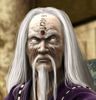
So this is the Unreal 3 Liu Kang. I think its pretty cool. To me the face looks like a combonation of Robin Shou, Ho Sung Pak, and Bruce Lee. Now thats kick assy! I also like the dragon emblem on the belt. Ive noticed the other things too like nails inside his fingers thing, the huge WWE like belt, and the traps that threaten to graze Liu,s ears(exaggeration), but these are trivial IMO.
Speaking of which, has anyone noticed something about the Deception/Armageddon Liu kang having a space separating his torso from his lower half? (The in game model, more noticeable in his alternate).
Back on topic, I think they did a decent job on Liu Kang, and like Sonya I think he'll look much cooler in combat.
0
Now that's the Liu Kang i know and love
0
i never thought i'd see him again. his new look is tight!
0
he looks taller
0
Zombie Liu Kang was gay
About Me
My Action Short Films:
http://www.youtube.com/playlist?list=PL_AJSvQq2bL3-GtOoCMTReaXAYX83SX3l
0
Scott-Howell Wrote:
I think we all know the real news here... I'm on Subby's top friend's list.
I think we all know the real news here... I'm on Subby's top friend's list.
Haha yeah, I noticed!

About Me

0
The belt don't convince me too much. But in another aspects, I like so much that render.
In my opinion, probably it's the most realistic of all the renders published. Near of the truly graphic style in the MK saga.
I don't like the comic-style graphics since MKDA. Sadly, MKvsDCU has the same style, but Liu Kang's really different of the rest in this game.
In my opinion, probably it's the most realistic of all the renders published. Near of the truly graphic style in the MK saga.
I don't like the comic-style graphics since MKDA. Sadly, MKvsDCU has the same style, but Liu Kang's really different of the rest in this game.
About Me
Love is the Energy that powers the conscience of the Soul. Take a leap of Faith, fight evil and still be safe. (♥The Way Home♥) Http://TheWayHomeOrFaceTheFire.info/
Http://JahTruth.net/
0
The logo-belt evokes Lion-o from Thundercats.
I diggit.
I diggit.


0
I'll hop into the peanut gallery and say that I don't really care for the belt either. It's just not really needed, or at least not that bulky. The Dragon logo is also just out of place, maybe another symbol could've been placed there, but the dragon logo is just too much. Otherwise, I have no complaints. The ropes actually look pretty sweet to me.
I can not WAIT to steal his soul with Shang Tsung.
I can not WAIT to steal his soul with Shang Tsung.
0
He looks like a fucking cartoon

About Me

0
soulwaker Wrote:
The logo-belt evokes Lion-o from Thundercats.
The logo-belt evokes Lion-o from Thundercats.
My thoughts exactly.
I think the render looks pretty cool though it could use a few touch ups here and there.

Nice render, simple look, classic Liu Kang. Good design. I still absolutely loathe Liu Kang. I hate the fact that we use a character slot for him instead of say Baraka or Sindel or Kung Lao or Kabal, all of whom have very distinctive and iconic looks of their own.
The only solace I take in Liu Kang returning is that this game is not canon and hopefully he won't be in mk9 and we get a more deserving and interesting mk champion. Good guy younger brother Sub-Zero would be my choice.
Good render though, I liked all the released renders and character designs so far.
0
sooooooo its just gunna be a origanl pll from mk 1 every acts like lui would be in the game next will be goro reptile kano jonny cage raiden

I have mixed feelings about this render.
The Good:
* Wu Shi Academy is back (one of the best arenas ever, I loved it how they confirmed it in MKDA with Sonya and Kenshi fighting in it)
* His boots are awesome. I love the ropes around them. It really gives give a cool look.
* His pale skin I like.
* His hair looks great.
* His face is Ok (lol on his nose though ^_^).
The Bad:
* Its not Zombie Liu...and that was the best thing that ever happened to him (after being killed).
* Wu Shi Academy looks horrible! No, Im not talking about the arena as a whole, but this is next-gen people...that design looks very poor.
* What is it with releasing renders when they have so many obvious flaws? You can say its not a big deal, but again, this is next-gen...and those fingernails make the quality of this work look bad.
* The huge belt is silly. There was really no need for that.
* The design is mostly his same classic look...nothing new, nothing fresh, nothing really jaw-dropping. Sonya, Scorpion and Shang Tsung are, so far, the best improved looks.
Overall, I like it, but it should had been more wow imo. I gove it a 7/10!
Another reason why ALTERNATES are a MUST!!!!
About Me

0
Deathbearer Wrote:
Maybe they're gonna do a WWE crossover next game.
Garlador Wrote:
Not bad, but I want to know why all the MK characters decided to get WWE belts this go around.
Not bad, but I want to know why all the MK characters decided to get WWE belts this go around.
Maybe they're gonna do a WWE crossover next game.
That's not even funny...

Ok... One thing I have to point out... If the "Bulge" is really bothering you people, then maybe you guys ought to stop looking at the High-res render zoomed in that area or something. There's nothing wrong with it. It's part of the design of the render(much like the belt you idiots keep bitching about)
Personally, I like the render(mainly for the fact that facially, he looks a lot like Robin Shou(ZOMG I SPELLED HIS LAST NAME RIGHT!!!!!!!!!!!!)
Personally, I like the render(mainly for the fact that facially, he looks a lot like Robin Shou(ZOMG I SPELLED HIS LAST NAME RIGHT!!!!!!!!!!!!)


© 1998-2026 Shadow Knight Media, LLC. All rights reserved. Mortal Kombat, the dragon logo and all character names are trademarks and copyright of Warner Bros. Entertainment Inc.