
MK9 my vision
Fan Kreations
Pages: 1
MK9 my vision
0
posted03/19/2009 09:07 PM (UTC)by
i was on my computer the other day thinking about i want MK9 to be and came up with this
http://img88.imageshack.us/img88/4254/mk9poster1.png
http://img142.imageshack.us/img142/9199/mk9boxart.png
hope everyone likes it
UPDATE 27/3
http://img87.imageshack.us/img87/1256/mk9.png
new more readable logo and i blended the eyes in a little better too
http://img88.imageshack.us/img88/4254/mk9poster1.png
http://img142.imageshack.us/img142/9199/mk9boxart.png
hope everyone likes it
UPDATE 27/3
http://img87.imageshack.us/img87/1256/mk9.png
new more readable logo and i blended the eyes in a little better too

 Made by MINION.


0
The concept is really cool. The picture doesn't look finished though.
Good job though. You may have just inspired me to do something like this too.
Good job though. You may have just inspired me to do something like this too.
About Me

0
ThePredator151 Wrote:
The concept is really cool. The picture doesn't look finished though.
Good job though. You may have just inspired me to do something like this too.
The concept is really cool. The picture doesn't look finished though.
Good job though. You may have just inspired me to do something like this too.
cool let me know how you get on or if you need any advise or whatever.
what exactly did you mean by it doesn't look finished? give me something to work with lol
Elnino Wrote:
Cool, it makes it seem that the next game won't be a bunch of temples and crap to fight in because of the cities, and the guys face at the top keeps people guessing on who it is.
i got the idea for the eyes from the MKD campaign with the dragon kings face in the background and the city came just from me wanting it to be a modern take on the restart of the franchise kinda like how MK3 was with some of its arena's. PS ........the eyes in this picture are from the mysterious new boss which in my head is an almighty female lol with lots of power and different abilities. I have an updated version of the boxart that is at a higher resolution if anyone wants to see it?Cool, it makes it seem that the next game won't be a bunch of temples and crap to fight in because of the cities, and the guys face at the top keeps people guessing on who it is.
0
Oh! Sry bout that.
- I mean that it looks too reliant on filters, or filter effects. The clouds for example, are just the start of an effect. The emboss effect on the dragon symbol, text, and your banner are a little too simplistic. Making it easy for people to tell what you did to get that effect.
- I like the placement of things in your picture, but you might wanna go in and make sure things are aligned with your "rulers". That is, if you haven't already. Should be under "View" somewhere, no matter what program you're using.
- Although we can tell that "Mortal Kombat" says "Mortal Kombat", anytime blending letters happens with the background, is usually taboo as far as typography is concerned. Not unless the creator intentionally does this as a part of a statement they are making with their piece.
- The cutout of the eyes is not good at all for quality. Even though yea, it kinda plays to the theme of the picture by being messy like that. But, it looks like you may have just used the magic wand tool, or "Extracted". Which is under the filters drop menu. Doing cutouts this way will always make you "miss the pieces" that you really didn't want, and it forces you to have to hide the blemishes in the cutout. It's almost always "less than perfect" doing it this way,and is unnecessary because it makes you work too hard for the cut out.
Can you tell I learned the hard way? lol
I always recommend using the pen tool, and feathering no more than about 1 or 2 % (I normally don't go above 0.05%. But it depends alot on what the cut out demands). Yes, it is tedious in the beginning, but the reward once you get good will be better than most cutouts you see on t.v. and on DVD covers.
Assuming you're using some version of Photoshop: If it's unreasonable to use the pen tool, then get extremely familiar with this tutorial on Cutting Hair.
Looks like that could have helped you with all the little particles around the eyes.
====
Typically man, I cut everything....and I mean EV-ER-Y-THING, if I'm gonna use pieces of pictures for a project. Some cutouts require both the pen tool, and the layer mask. I've done 4 and 5hr cutouts before, just for the hell of it. Here's the source for cutouts on MKO if you don't already know about it.
- Last thing I wanted to say is about blending. I can tell that the image of the city in the background isn't blended well. For this, for starters, I'd just say experiment more with the blending modes drop menu.
The other thing is to just get really familiar with how your layer masks work.
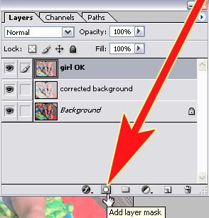
Doing this allows you to erase and edit things without actually affecting the picture on that layer. But I'm pretty sure that tutorial on cutting hair explains this well enough.
Umm...that's all I can think of at the moment based on what I was thinking when I wrote the first message. Hm... a site that doesn't hurt as a resource for all kinds of tutorials that I refer to from time to time is PSDTuts.com.
Do as many of these as you can tolerate(lol!). If nothing else, doing what other people can do helps you hon in on your particular style easier and quicker. I typically take pieces from other peoples tuts and try to get my own style to work from what they are showing me.
There we go. Let me know if you have questions or whatever. This semester with my photoshop classes is ending soon so I'll share what I can still remember.
- I mean that it looks too reliant on filters, or filter effects. The clouds for example, are just the start of an effect. The emboss effect on the dragon symbol, text, and your banner are a little too simplistic. Making it easy for people to tell what you did to get that effect.
- I like the placement of things in your picture, but you might wanna go in and make sure things are aligned with your "rulers". That is, if you haven't already. Should be under "View" somewhere, no matter what program you're using.
- Although we can tell that "Mortal Kombat" says "Mortal Kombat", anytime blending letters happens with the background, is usually taboo as far as typography is concerned. Not unless the creator intentionally does this as a part of a statement they are making with their piece.
- The cutout of the eyes is not good at all for quality. Even though yea, it kinda plays to the theme of the picture by being messy like that. But, it looks like you may have just used the magic wand tool, or "Extracted". Which is under the filters drop menu. Doing cutouts this way will always make you "miss the pieces" that you really didn't want, and it forces you to have to hide the blemishes in the cutout. It's almost always "less than perfect" doing it this way,and is unnecessary because it makes you work too hard for the cut out.
Can you tell I learned the hard way? lol
I always recommend using the pen tool, and feathering no more than about 1 or 2 % (I normally don't go above 0.05%. But it depends alot on what the cut out demands). Yes, it is tedious in the beginning, but the reward once you get good will be better than most cutouts you see on t.v. and on DVD covers.
Assuming you're using some version of Photoshop: If it's unreasonable to use the pen tool, then get extremely familiar with this tutorial on Cutting Hair.
Looks like that could have helped you with all the little particles around the eyes.
====
Typically man, I cut everything....and I mean EV-ER-Y-THING, if I'm gonna use pieces of pictures for a project. Some cutouts require both the pen tool, and the layer mask. I've done 4 and 5hr cutouts before, just for the hell of it. Here's the source for cutouts on MKO if you don't already know about it.
- Last thing I wanted to say is about blending. I can tell that the image of the city in the background isn't blended well. For this, for starters, I'd just say experiment more with the blending modes drop menu.
The other thing is to just get really familiar with how your layer masks work.
Doing this allows you to erase and edit things without actually affecting the picture on that layer. But I'm pretty sure that tutorial on cutting hair explains this well enough.
Umm...that's all I can think of at the moment based on what I was thinking when I wrote the first message. Hm... a site that doesn't hurt as a resource for all kinds of tutorials that I refer to from time to time is PSDTuts.com.
Do as many of these as you can tolerate(lol!). If nothing else, doing what other people can do helps you hon in on your particular style easier and quicker. I typically take pieces from other peoples tuts and try to get my own style to work from what they are showing me.
There we go. Let me know if you have questions or whatever. This semester with my photoshop classes is ending soon so I'll share what I can still remember.
About Me
0
My replies to your points are in the quote in bold lol sorry not very good with coding I tried to get them seperate to your quote but this all i could get lol.
Thanks for all of your help I have been using Photoshop for a few years now from college and Uni but im just no expert lol but I do enjoy designing things and getting feed back on my work so that i can improve my skills so I thank you for that too.
Just incase you wanted to see any other work that i have done here is a link to my past and present work that I have created in my time since i left Uni in September.
http://www.vgboxart.com/author/bigwillystyle/
ThePredator151 Wrote:
Oh! Sry bout that.
- I mean that it looks too reliant on filters, or filter effects. The clouds for example, are just the start of an effect. The emboss effect on the dragon symbol, text, and your banner are a little too simplistic. Making it easy for people to tell what you did to get that effect.
I did use a few filters on the front but its no quite as obvious as you think. I didn't use the emboss on the dragon that was something i id on my own to make it look blood like lol. The clouds were just some rendered clouds that were darkened to blend in with the eyes.
- I like the placement of things in your picture, but you might wanna go in and make sure things are aligned with your "rulers". That is, if you haven't already. Should be under "View" somewhere, no matter what program you're using.
Done that lol
- Although we can tell that "Mortal Kombat" says "Mortal Kombat", anytime blending letters happens with the background, is usually taboo as far as typography is concerned. Not unless the creator intentionally does this as a part of a statement they are making with their piece.
Done that on purpose so that the clouds text and dragon come together almost as one image if you see what i mean just so that its not a plain solid colour and just been plonked there as the title.
- The cutout of the eyes is not good at all for quality. Even though yea, it kinda plays to the theme of the picture by being messy like that. But, it looks like you may have just used the magic wand tool, or "Extracted". Which is under the filters drop menu. Doing cutouts this way will always make you "miss the pieces" that you really didn't want, and it forces you to have to hide the blemishes in the cutout. It's almost always "less than perfect" doing it this way,and is unnecessary because it makes you work too hard for the cut out.
I also did the eyes that way intensionally too as when i was making it and sorting out the eyes with the grainy bit where its roughly cut out i thought it looked almost like the eyes where coming together bit by bit out of the clouds sort of thing and looking down on the pathetic mortals lol. I should have made the eyes a little darker anyways so that it didn't look a little crappy but its men't to be like that with the eyes coming out of the clouds.
Can you tell I learned the hard way? lol
I always recommend using the pen tool, and feathering no more than about 1 or 2 % (I normally don't go above 0.05%. But it depends alot on what the cut out demands). Yes, it is tedious in the beginning, but the reward once you get good will be better than most cutouts you see on t.v. and on DVD covers.
Assuming you're using some version of Photoshop: If it's unreasonable to use the pen tool, then get extremely familiar with this tutorial on Cutting Hair.
Looks like that could have helped you with all the little particles around the eyes.
L am using Photoshop CS2 on my mac
====
Typically man, I cut everything....and I mean EV-ER-Y-THING, if I'm gonna use pieces of pictures for a project. Some cutouts require both the pen tool, and the layer mask. I've done 4 and 5hr cutouts before, just for the hell of it. Here's the source for cutouts on MKO if you don't already know about it.
- Last thing I wanted to say is about blending. I can tell that the image of the city in the background isn't blended well. For this, for starters, I'd just say experiment more with the blending modes drop menu.
The other thing is to just get really familiar with how your layer masks work.
Doing this allows you to erase and edit things without actually affecting the picture on that layer. But I'm pretty sure that tutorial on cutting hair explains this well enough.
I used a gradient mask to blend the city image in so im ok with that.
Umm...that's all I can think of at the moment based on what I was thinking when I wrote the first message. Hm... a site that doesn't hurt as a resource for all kinds of tutorials that I refer to from time to time is PSDTuts.com.
Do as many of these as you can tolerate(lol!). If nothing else, doing what other people can do helps you hon in on your particular style easier and quicker. I typically take pieces from other peoples tuts and try to get my own style to work from what they are showing me.
There we go. Let me know if you have questions or whatever. This semester with my photoshop classes is ending soon so I'll share what I can still remember.
Oh! Sry bout that.
- I mean that it looks too reliant on filters, or filter effects. The clouds for example, are just the start of an effect. The emboss effect on the dragon symbol, text, and your banner are a little too simplistic. Making it easy for people to tell what you did to get that effect.
I did use a few filters on the front but its no quite as obvious as you think. I didn't use the emboss on the dragon that was something i id on my own to make it look blood like lol. The clouds were just some rendered clouds that were darkened to blend in with the eyes.
- I like the placement of things in your picture, but you might wanna go in and make sure things are aligned with your "rulers". That is, if you haven't already. Should be under "View" somewhere, no matter what program you're using.
Done that lol
- Although we can tell that "Mortal Kombat" says "Mortal Kombat", anytime blending letters happens with the background, is usually taboo as far as typography is concerned. Not unless the creator intentionally does this as a part of a statement they are making with their piece.
Done that on purpose so that the clouds text and dragon come together almost as one image if you see what i mean just so that its not a plain solid colour and just been plonked there as the title.
- The cutout of the eyes is not good at all for quality. Even though yea, it kinda plays to the theme of the picture by being messy like that. But, it looks like you may have just used the magic wand tool, or "Extracted". Which is under the filters drop menu. Doing cutouts this way will always make you "miss the pieces" that you really didn't want, and it forces you to have to hide the blemishes in the cutout. It's almost always "less than perfect" doing it this way,and is unnecessary because it makes you work too hard for the cut out.
I also did the eyes that way intensionally too as when i was making it and sorting out the eyes with the grainy bit where its roughly cut out i thought it looked almost like the eyes where coming together bit by bit out of the clouds sort of thing and looking down on the pathetic mortals lol. I should have made the eyes a little darker anyways so that it didn't look a little crappy but its men't to be like that with the eyes coming out of the clouds.
Can you tell I learned the hard way? lol
I always recommend using the pen tool, and feathering no more than about 1 or 2 % (I normally don't go above 0.05%. But it depends alot on what the cut out demands). Yes, it is tedious in the beginning, but the reward once you get good will be better than most cutouts you see on t.v. and on DVD covers.
Assuming you're using some version of Photoshop: If it's unreasonable to use the pen tool, then get extremely familiar with this tutorial on Cutting Hair.
Looks like that could have helped you with all the little particles around the eyes.
L am using Photoshop CS2 on my mac
====
Typically man, I cut everything....and I mean EV-ER-Y-THING, if I'm gonna use pieces of pictures for a project. Some cutouts require both the pen tool, and the layer mask. I've done 4 and 5hr cutouts before, just for the hell of it. Here's the source for cutouts on MKO if you don't already know about it.
- Last thing I wanted to say is about blending. I can tell that the image of the city in the background isn't blended well. For this, for starters, I'd just say experiment more with the blending modes drop menu.
The other thing is to just get really familiar with how your layer masks work.
Doing this allows you to erase and edit things without actually affecting the picture on that layer. But I'm pretty sure that tutorial on cutting hair explains this well enough.
I used a gradient mask to blend the city image in so im ok with that.
Umm...that's all I can think of at the moment based on what I was thinking when I wrote the first message. Hm... a site that doesn't hurt as a resource for all kinds of tutorials that I refer to from time to time is PSDTuts.com.
Do as many of these as you can tolerate(lol!). If nothing else, doing what other people can do helps you hon in on your particular style easier and quicker. I typically take pieces from other peoples tuts and try to get my own style to work from what they are showing me.
There we go. Let me know if you have questions or whatever. This semester with my photoshop classes is ending soon so I'll share what I can still remember.
Thanks for all of your help I have been using Photoshop for a few years now from college and Uni but im just no expert lol but I do enjoy designing things and getting feed back on my work so that i can improve my skills so I thank you for that too.
Just incase you wanted to see any other work that i have done here is a link to my past and present work that I have created in my time since i left Uni in September.
http://www.vgboxart.com/author/bigwillystyle/
About Me
0
UPDATE:
http://img87.imageshack.us/img87/1256/mk9.png
new more readable logo and i blended the eyes in better too
http://img87.imageshack.us/img87/1256/mk9.png
new more readable logo and i blended the eyes in better too
About Me
For the most in-depth, in-detail, Mortal Kombat lore analysis vids, there's only one source:

0
One thing I'd recommend is that the left side of Sub-Zero's Iceball is very sharp, and ends abruptly, where the right half of it has a shimmering effect on his clothes, skin, effect.
You should try and duplicate that effect that's part of the render on the left side of the iceball, so that it does the same thing on the background.
Other than that, you've arranged MK vs DC graphics around pretty nicely but it seems like pretty generic stuff, almost bland even. I enjoy your fakes & animations more.
You should try and duplicate that effect that's part of the render on the left side of the iceball, so that it does the same thing on the background.
Other than that, you've arranged MK vs DC graphics around pretty nicely but it seems like pretty generic stuff, almost bland even. I enjoy your fakes & animations more.
About Me
0
thanks do you ike the idea of the eyes peering over and that?

About Me
Luc-Mac
0
it looks very nice and realistic!
About Me
0
lukiLucMac Wrote:
it looks very nice and realistic!
it looks very nice and realistic!
thank you
Pages: 1


© 1998-2026 Shadow Knight Media, LLC. All rights reserved. Mortal Kombat, the dragon logo and all character names are trademarks and copyright of Warner Bros. Entertainment Inc.