
0
Ulcatron those are amazing! your best yet imo. Nice.

0
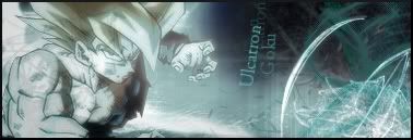
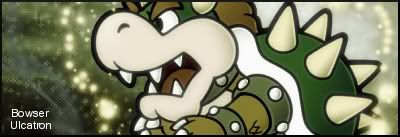
Obviously the Goku one  . I aslo like the Bowser one. Although im not feeling those little "plus signs" or whatever the hell they are, buts its still very nice.


0
UlcaTron Wrote:
Not true. KARATE Made and used one. It should only be a few pages back...
BTW, what do you people think of mine?
Not true. KARATE Made and used one. It should only be a few pages back...
BTW, what do you people think of mine?
Your right.
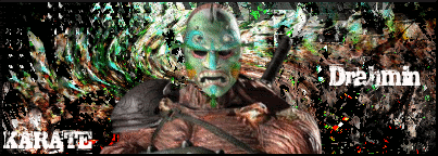
Here is my Drahmin sig again. Check it out Shinnok-fan64.
This one was made a little while back but i never posted it.
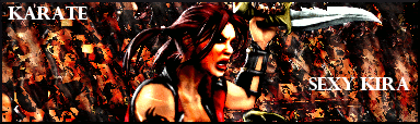
Heres a Kira sig i made.
Heres a sig i made for Barakaz_cuz.
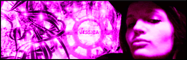
p.s. I love that Jessica Alba sig you made Ulcatron,Nice job!
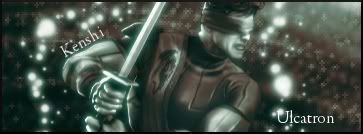
Thanks. But still, I made my newer sigs I posted above. I like the Goku and Kenshi ones the most.
Those are somewhat better than my, Jessica Alba sig.
BTW, I am making some gifts for some people... I might post them here If I like them that much.
Those are somewhat better than my, Jessica Alba sig.
BTW, I am making some gifts for some people... I might post them here If I like them that much.

0
I dont like that pattern in the BG.
0
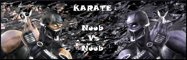
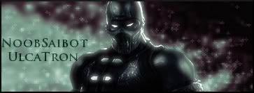
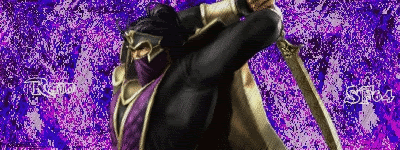
I like your Noob Saibot sig alot,But i have to agree with Prodigy. The Background design is killing it, but the shadowing and lighting of the rendor is E X C E L L E N T!
0
Yeah the sig is nice.

0
UlcaTron Wrote:
Honestly,I liked your other Noob Saibot sig alot more.
Well here is my newest one that was made for you bro.
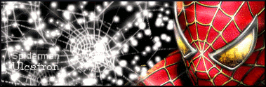
What do you guys think? To bright? Or just right?
Like it K, but try not to use black and white/dark backgrounds with a render as bright as that.
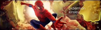
As you can see not only is spiderman colourfull, but there is a hell of alot of light bouncing of him, yet the sig does not show where the light comes from nor does it show if its going anywear else.
Like the text, but there is simple...then too simple, ULCATRON looks a little pixelated too.
As you can see not only is spiderman colourfull, but there is a hell of alot of light bouncing of him, yet the sig does not show where the light comes from nor does it show if its going anywear else.
Like the text, but there is simple...then too simple, ULCATRON looks a little pixelated too.
0
i was bored, alright! --


UlcaTron Wrote:
Yeah, it was the Text KARATE Chose.
skinsley Wrote:
Like the text, but there is simple...then too simple, ULCATRON looks a little pixelated too.
Like the text, but there is simple...then too simple, ULCATRON looks a little pixelated too.
Yeah, it was the Text KARATE Chose.
What ?
Yes that is quite obviouse...you know considering that KARATE made the sig.
Fuck
0
skinsley Wrote:
What ?
Yes that is quite obviouse...you know considering that KARATE made the sig.
Fuck
What ?
Yes that is quite obviouse...you know considering that KARATE made the sig.
Fuck
LOL!
Thanks for the kind words Skinsley. I think i truly make better sigs without rendors. I wonder why that is??
Atleast, im getting better.
Edit:I made this one for a friend of mine. She wanted me to make her a sig, so i did. Is this alot better or.....

About Me

0
not sure about this one, can't say if i like or hate it.
text ain't too great
text ain't too great

UlcaTron Wrote:
That is up to you.
Anyways, here :
skinsley Wrote:
Or is it just the best sig that you have Actualy made ?
Or is it just the best sig that you have Actualy made ?
That is up to you.
Anyways, here :
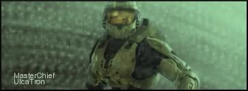
The master cheif one would go with my avy...


About Me
0
i really like this one, came out very good imo.


© 1998-2026 Shadow Knight Media, LLC. All rights reserved. Mortal Kombat, the dragon logo and all character names are trademarks and copyright of Warner Bros. Entertainment Inc.