

0
During the past months, I made a few sigs, I thought I would share them with you guys.

Made this one I think more than 2 months ago. I used so many gradients maps until I got what I wanted. This resulted. I added the green plasma effect to his hand before I put in the text.


I made these sigs for a different MK forum. They're more like pair sigs. They go together, it's something that I usually do now. I grab a character and it's opposite, then I make a signature of them. Made them a month ago.

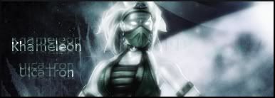
Made this Khameleon sig when the render was released, which was about a little more than a 2 weeks back. I got a nice C4D, the rest I did myself. I like how this came out. I was priorly using the sig recently.

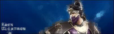
I made this one recently, I think a week ago. I added the black border today. I like this one. The perfect C4D's made it appear as if the forceball is powerful and made a tremor of force, I also made the sig's border rectangular-rounded. It took a while to do so, but then I got the hang of it.
That's it.
Made this one I think more than 2 months ago. I used so many gradients maps until I got what I wanted. This resulted. I added the green plasma effect to his hand before I put in the text.
I made these sigs for a different MK forum. They're more like pair sigs. They go together, it's something that I usually do now. I grab a character and it's opposite, then I make a signature of them. Made them a month ago.
Made this Khameleon sig when the render was released, which was about a little more than a 2 weeks back. I got a nice C4D, the rest I did myself. I like how this came out. I was priorly using the sig recently.
I made this one recently, I think a week ago. I added the black border today. I like this one. The perfect C4D's made it appear as if the forceball is powerful and made a tremor of force, I also made the sig's border rectangular-rounded. It took a while to do so, but then I got the hang of it.
That's it.
0
I hate them all except the reptile one. Thats good stuff. I hope Im not being a bitch or anything, I just dont like the others at all.
0
prodigy004 Wrote:
I hate them all except the reptile one. Thats good stuff. I hope Im not being a bitch or anything, I just dont like the others at all.
I hate them all except the reptile one. Thats good stuff. I hope Im not being a bitch or anything, I just dont like the others at all.
I'm not gonna be against your opinion. Thanx for being honest.
0
Arctic Wrote:
I'm not gonna be against your opinion. Thanx for being honest.
prodigy004 Wrote:
I hate them all except the reptile one. Thats good stuff. I hope Im not being a bitch or anything, I just dont like the others at all.
I hate them all except the reptile one. Thats good stuff. I hope Im not being a bitch or anything, I just dont like the others at all.
I'm not gonna be against your opinion. Thanx for being honest.
lol cool. Im glad you appreciate the honesty even when it isnt what you want to hear. I aslo expect the same from you people!!!.


About Me
Rebel. Outsider. Fan Of The Obscure. Politically Incorrect. Spitfire! 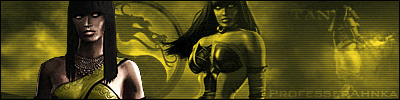
0
UlcaTron Wrote:
How did you make it an animation? BTW, the main problem with your sigs, is usually the Background. They should blend, at least, a bit better.
Here :
How did you make it an animation? BTW, the main problem with your sigs, is usually the Background. They should blend, at least, a bit better.
Here :
excelent!
0
ProfesserAhnka Wrote:
excelent!
UlcaTron Wrote:
How did you make it an animation? BTW, the main problem with your sigs, is usually the Background. They should blend, at least, a bit better.
Here :
How did you make it an animation? BTW, the main problem with your sigs, is usually the Background. They should blend, at least, a bit better.
Here :
excelent!
lol no, its not that great. Its too plain.

About Me

0
skinsley, that's nice. I like the S, is it from a font?
Ulcatron, the 'reflected' text is pretty bad. The BG's kinda plain, too.
Arctic, the Master Chief and Reptile ones are the only good ones. The others imho are pretty bad especially the Daegon one =| I don't like the bright part in front of Master Chief though. The Reptile one is your best one yet but it's probably me but it's a tad too bright.
0

0
The text is horrible, but the BG is nice. Although it wouldve looked better in purple imo. Its still a likeable sig. NVM.
0
5/10. Its still very plain.
0


About Me

0


About Me
0
skinsley:
- Excellent Text.
- Great Render; Where did you find it?
- Excellent Background, but I expect something better from you.
- All that blue ruins it. It doesn't seem to work.


© 1998-2026 Shadow Knight Media, LLC. All rights reserved. Mortal Kombat, the dragon logo and all character names are trademarks and copyright of Warner Bros. Entertainment Inc.