0
MINION Wrote:
Awesome!
@SubZero999666, Great work!
prodigy004 Wrote:

Awesome!
@SubZero999666, Great work!
Thanks man, i love your render edits ahah,I'll make some more in a bit after my doobie snack.
0
New 1-

Credit to a very good teacher Skinsley for teaching me how to make the BG.

Credit to a very good teacher Skinsley for teaching me how to make the BG.
0
Indeed, credit to him aswell for coming up with the style lol.

0
I wanna learn how to do that so bad! Can someone post a tutorial or some thing on how to do that?
New:


EDIT:
Made one more...


Y'all already know what I want!
Opinions?!
New:


EDIT:
Made one more...


Y'all already know what I want!
Opinions?!
About Me
0
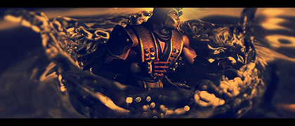
Me likes the Mitsurugi (Soul Calibur) and Scorpion in the water tags, Prodigy.  The blur on lighten actually looks good on the focal for the SC one.

0
skinsley Wrote:
Nice cigs....they look like tutorials ive seen though...I hope your not fully following tutorials, that is not the way to learn.
But they are good.
Nice cigs....they look like tutorials ive seen though...I hope your not fully following tutorials, that is not the way to learn.
But they are good.
Oh, hell no. I may get inspired by a tutorial sometimes but never actually use them. Makes me feel like I didn't do anything but follow some instructions, and not really making anything. Both of those were 100% from my head
For a matter of fact, I hate doing tutorials. They are all too long to do, and most of the time I have no clue what the hell they're talking about so I just stick to my own style.


0
Got a new one recently. MINION made it for me as a gift. Even though I didn't make it myself, I wanted to show it off since it's so good.
0
Hikari715 Wrote:
Me likes the Mitsurugi (Soul Calibur) and Scorpion in the water tags, Prodigy. The blur on lighten actually looks good on the focal for the SC one.
Me likes the Mitsurugi (Soul Calibur) and Scorpion in the water tags, Prodigy.
Thanks.
New-
prodigy004 Wrote:
Thanks.
New-

Hikari715 Wrote:
Me likes the Mitsurugi (Soul Calibur) and Scorpion in the water tags, Prodigy. The blur on lighten actually looks good on the focal for the SC one.
Me likes the Mitsurugi (Soul Calibur) and Scorpion in the water tags, Prodigy.
Thanks.
New-

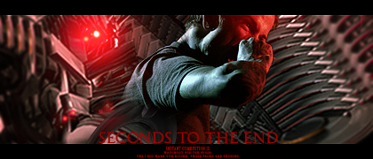
Pretty cool I like it, nice colors and lighting. The background kinda looks weird that blurry though, and maybe do something to the text to make it not clash as much, maybe a black glow/shadow around it.
1. The render looks a little pixelated, dunno what you did to it, but sometimes things like gradientmaps and stuff can mess up your render somehow, it happens alot with me.
2. The colour in the top right of ninja's head and the bits coming off the left of him just dont look good....the render goes with the wonderfully made background, but then the additions of colour dont go.
3. I couldnt see the third one somehow.
4. Couldnt see much wrong with this one, its pretty good, but needs more depth, its a good sig but if i were to advise you to make it better I would say to blur in places and sharpen in others.
About Me
0
^ Agreed on the entire post.
After you went to filter > sharpen > sharpen or when you are finished with the sharpen tool, you can always go to edit > fade sharpen (tool) and play with the opacity to avoid an oversharpened result.
You can also try to slightly erase the edges of the render a bit.
After you went to filter > sharpen > sharpen or when you are finished with the sharpen tool, you can always go to edit > fade sharpen (tool) and play with the opacity to avoid an oversharpened result.
You can also try to slightly erase the edges of the render a bit.

0
Thanks for the opinions, and that tip about the sharpening Hikari.
-I fixed the 1st ones link so you can see it now. The only reason it was messed up because I changed the purple thing I made around the sword with the pen tool as you might of already noticed.
-About the blending some parts of it, I was actually gonna do that but then I completely forgot to do it when I finished the sig.
-The 1st and 2nd ones I honestly don't even really like but I posted them up anyway so I can get a little feed back.
-Plus, I need help on how to make my sigs look cleaner. Theres just something about it that makes them look a little weird. Can one of y'all give me some advice about how to do that?
Again, thanks for the comments and I'll just keep on trying.
EDIT:
I fixed some stuff. I blurred some parts of the BG more so that you set your eyes on the focal more, blurred the C4D on the sword and parts of the samurai more, and sharpened his face a little more.


About Me

0
Just finished this Deadpool signature. I think it looks good, but beauty is in the eye of the beholder.


About Me

0
I know it's bad quality but what do you think of it


0
^Dont save your sigs as a jpg. Its part of your bad quality situation. Save it as a PNG.
As for the sig, I don't want to state anything too obvious or nothing like that, so just keep on trying and you'll get better and better as time goes on.
As for the sig, I don't want to state anything too obvious or nothing like that, so just keep on trying and you'll get better and better as time goes on.


About Me

0
Well I've made two more attempts these ones in better quality


These sigs were made in the Gimp and all I have used to make the background is a gradient and I've put together a lot of the same render using different effects.


These sigs were made in the Gimp and all I have used to make the background is a gradient and I've put together a lot of the same render using different effects.

0
A lot better quality on those. Using just gradients on the background and using the flame tool (I think thats what ts called) won't really give you good results. I personally like to smudge or use C4Ds (If you dont know what what it is just image search it on google or photobucket.com) Sadly I after looking a numerous tutorials I still dont know how to make good backgrounds . But Anyway, work on your BG, and Render blending skills for now (and no, just colorizing the render to the color of the BG won't cut it)
Yeah I like the darker version and I do think you are improving. The text isn't too bad but I'd move it closer to the render and the glow on the K is bad make it like the rest of the glow. I have a tut I wrote that I think would help your style a lot, you want it?
© 1998-2026 Shadow Knight Media, LLC. All rights reserved. Mortal Kombat, the dragon logo and all character names are trademarks and copyright of Warner Bros. Entertainment Inc.







 Lol, I don't know about y'all but I think that I'm getting much better at this


